Trussardi changes logo after 49 years The famous greyhound logo evolves on the eve of the debut of the new creative directors
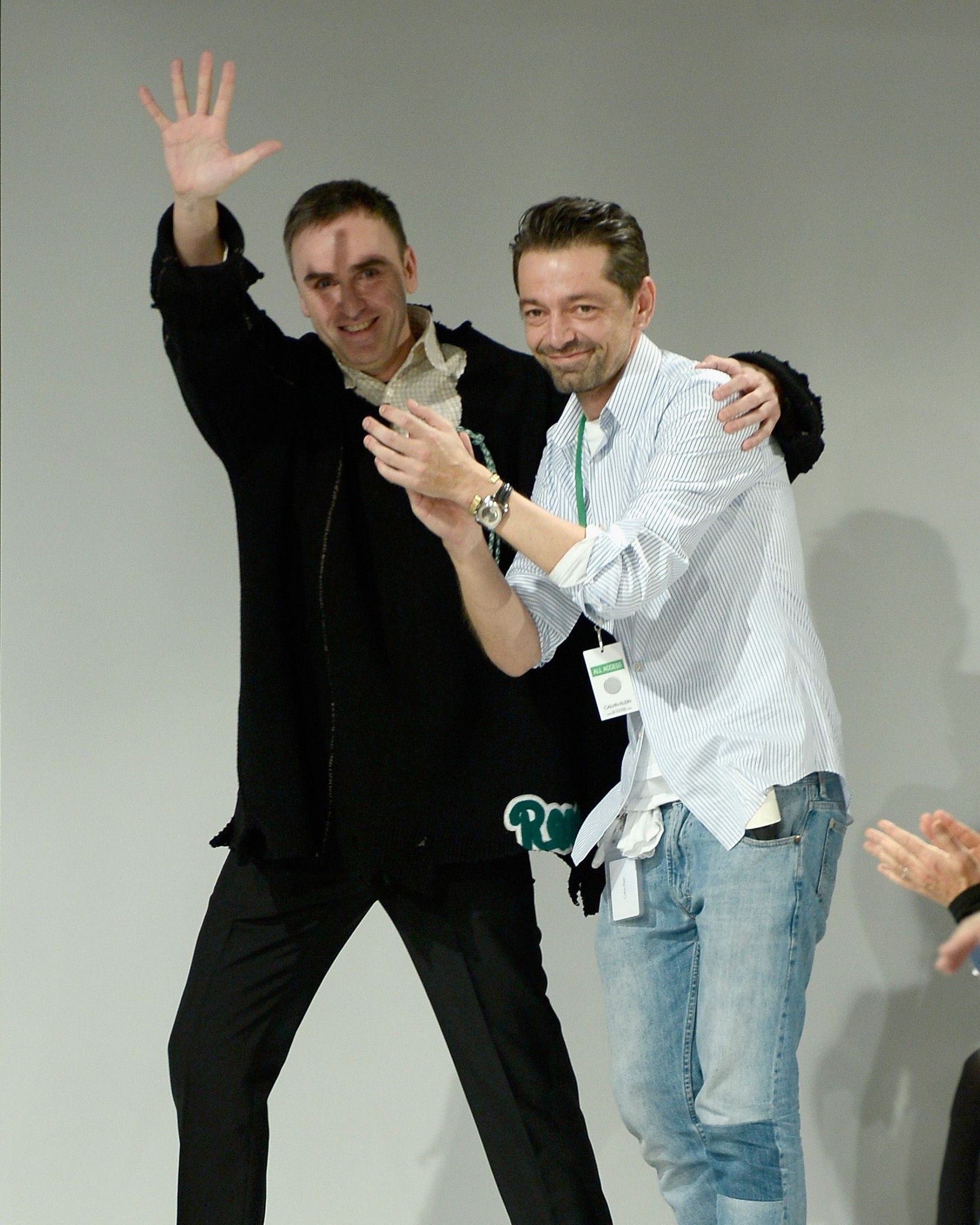
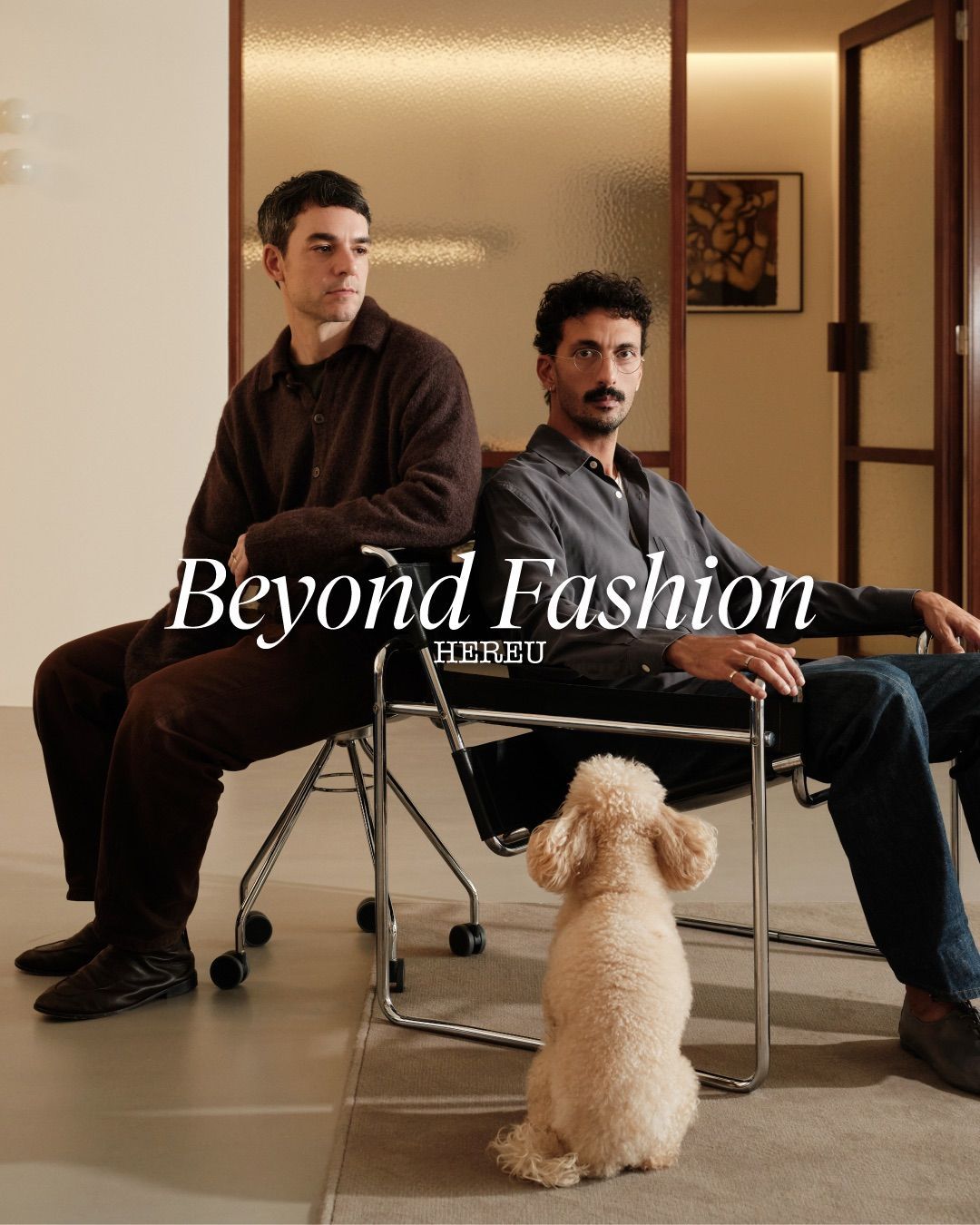
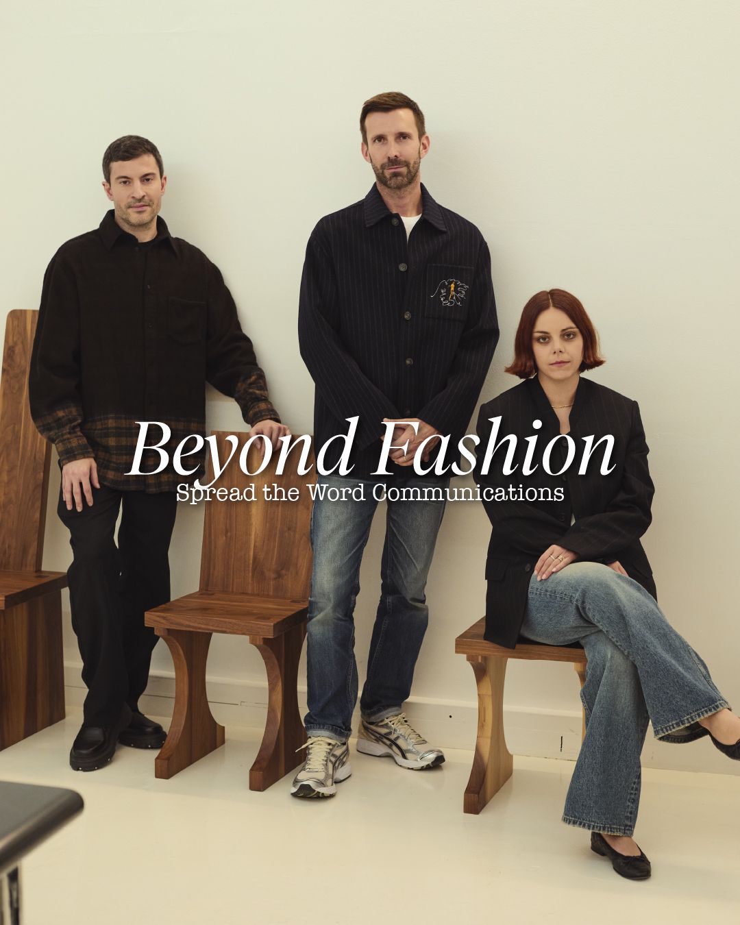
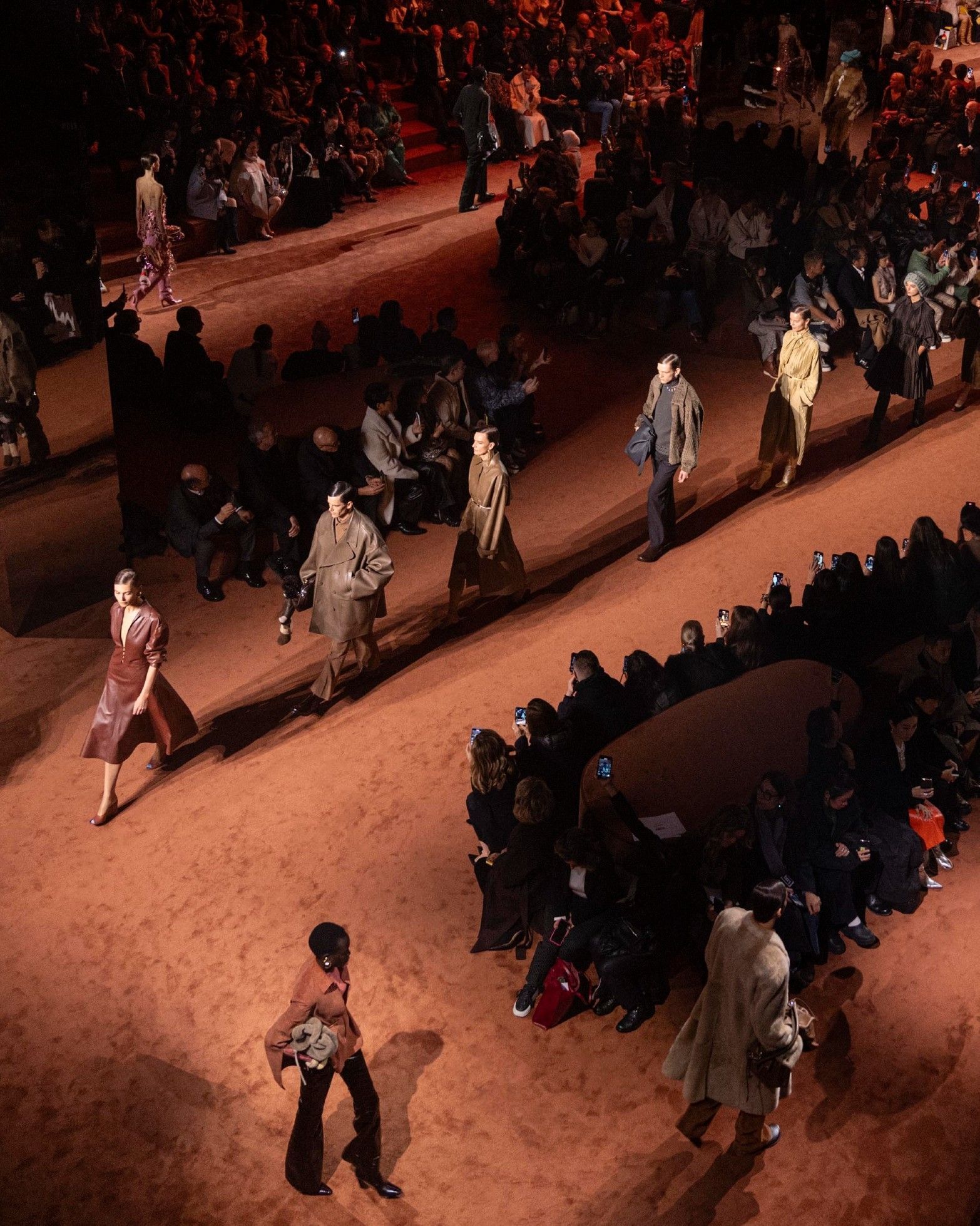
Trussardi, a historic brand founded in Bergamo in 1911, has been one of the household names of Italian fashion since 1973 when Nicola Trussardi expanded the brand's original leather goods collections by introducing prêt-à-porter together with a new logo, the greyhound. The logo represented the speed and dynamism of the new life of the brand but was also a symbol of nobility – the greyhound is in fact a dog traditionally used in the hunt for the hare and favored by the aristocratic classes of the whole world, just think of the many portraits of aristocrats together with their greyhounds made by Giovanni Boldini in the early '900. Trussardi's greyhound logo has been updated on the eve of the debut of the brand's new creative directors, Benjamin A. Huseby and Serhat Işık, which will be held on February 26 during Milan Fashion Week.
The new logo and font, more essential and linear, want to be a reference to the timelessness of the brand under the new creative direction of the duo already responsible for the success of GmbH. The new design sees the greyhound become similar to the ouroboros, the ancient symbol of the snake that eats its tail, a symbol of renewal and eternal life. The stylization of the logo and font also reflects the elimination of the various sub-labels of the brand – the work of CEO Sebastian Suhl already responsible, during his three years at Marc Jacobs, for the elimination of the diffusion line of the Marc by Marc Jacobs brand. The expansion of the brand will not only stop at Milan Fashion Week but will also involve furniture, with a further presentation to be held during the new Salone del Mobile.


