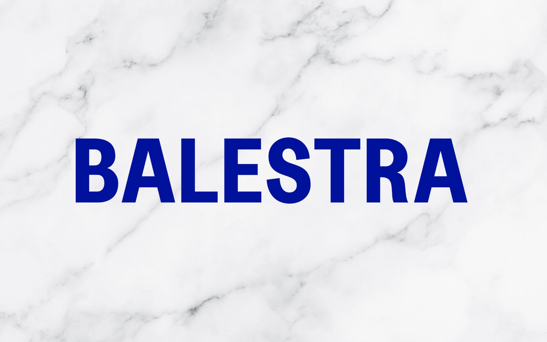
Renato Balestra's new logo is strangely familiar Balestr-iaga?
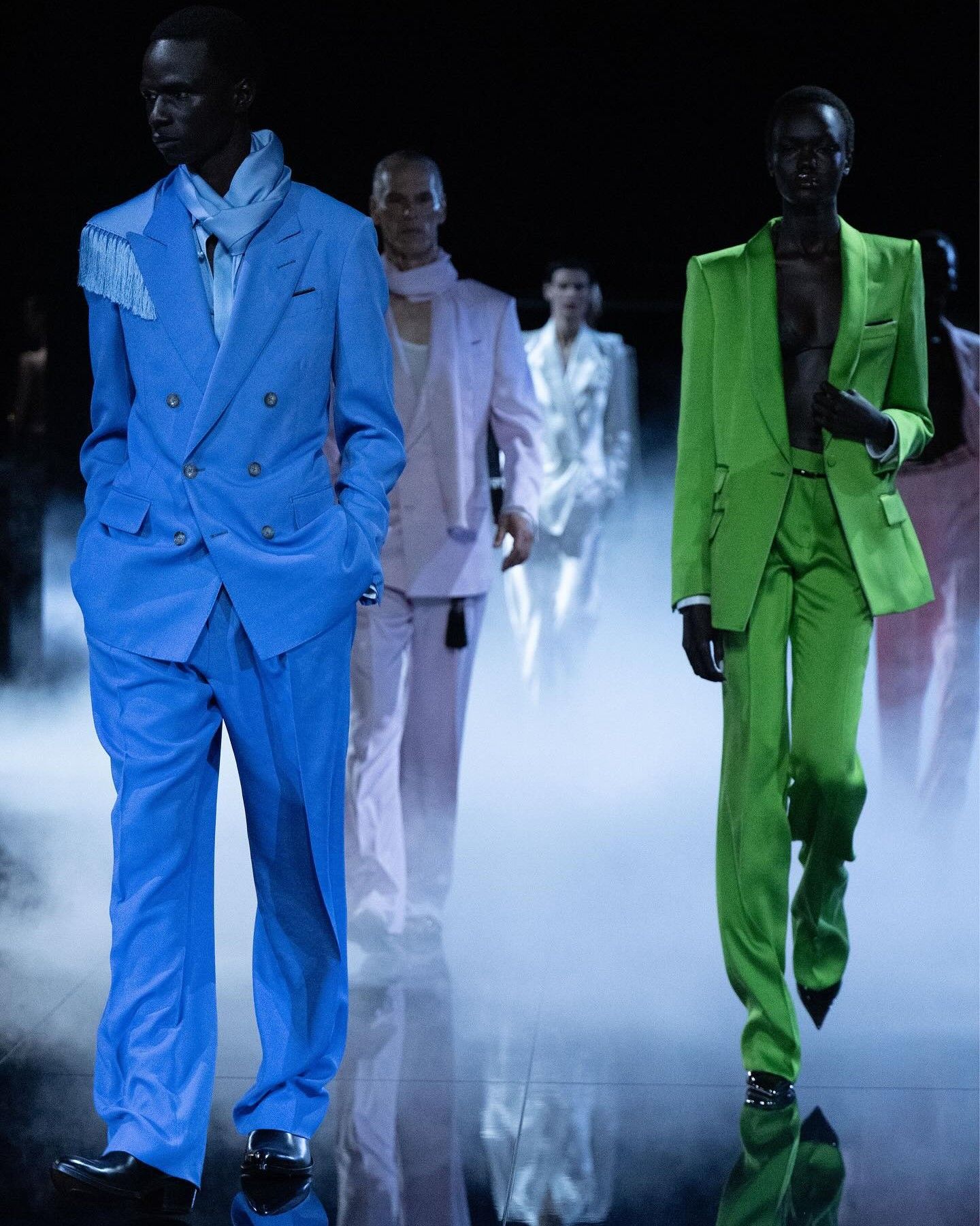
Today, Fabiana and Federica Balestra, together with Sofia Bertolli Balestra, respectively the daughters and granddaughter of the great Italian couturier Renato Balestra, announced in an interview with WWDthat the family brand is ready to return to the ready-to-wear catwalks with a new show to be held during the next Milan Fashion Week, a new brand name that will include only the surname of the founder and a new logo. The latter, was written in the particular shade of color that has become synonymous with the work of the desigenr, the Balestra Blue, and using a font very very familiar to anyone who has browsed a fashion magazine in the last five years. The font of the new logo, which would seem to be a Utah Condensed Bold, is in fact almost identical to that of Balenciaga, which was changed in 2017 using a font developed in-house (which is basically a Utah Condensed Bold) and inspired by the style of urban signage – an impression accentuated by the fact that the first four letters of the name of both brands are also the same.
It is however true that in recent years, between 2016 and 2017, many fonts of fashion logos have been changed to bold and sans serif fonts in an operation that was called "blanding" and that led many brands to lose their distinctive typographic identity in favor of an all-caps sans serif that, while varying from brand to brand, it gave the impression that all places were becoming equal to each other. Among these, the Balenciaga logo was perhaps the most famous if only because it was physically used and printed more than the others on many of the brand's items. And surely the transformation of Renato Balestra's logo follows the desire to create a new and bold identity for the brand – although it is incredible how no one realized how identical the logo was to that of the most famous brand in the world.


