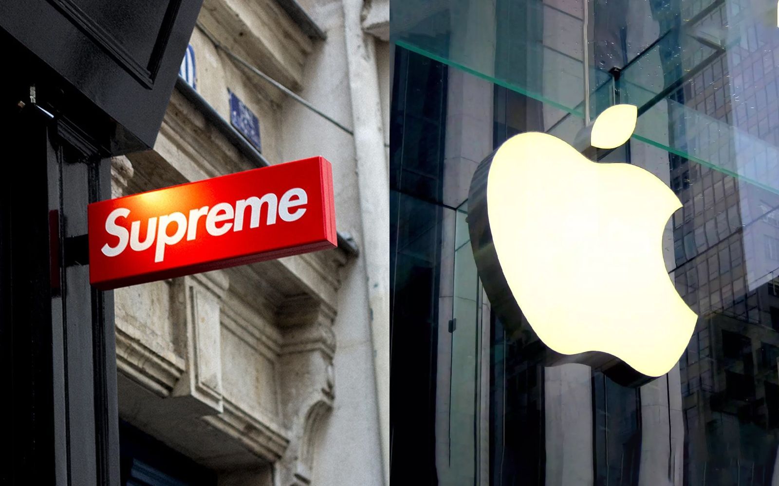
5 things in common between an Apple and a Supreme store From stained glass to the use of wood, what Jebbia and Jobs have in common
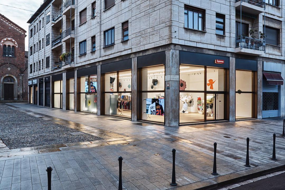
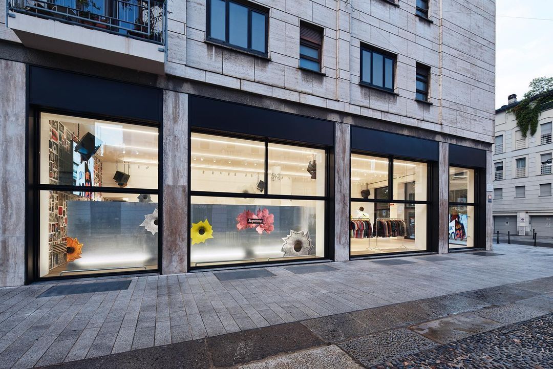
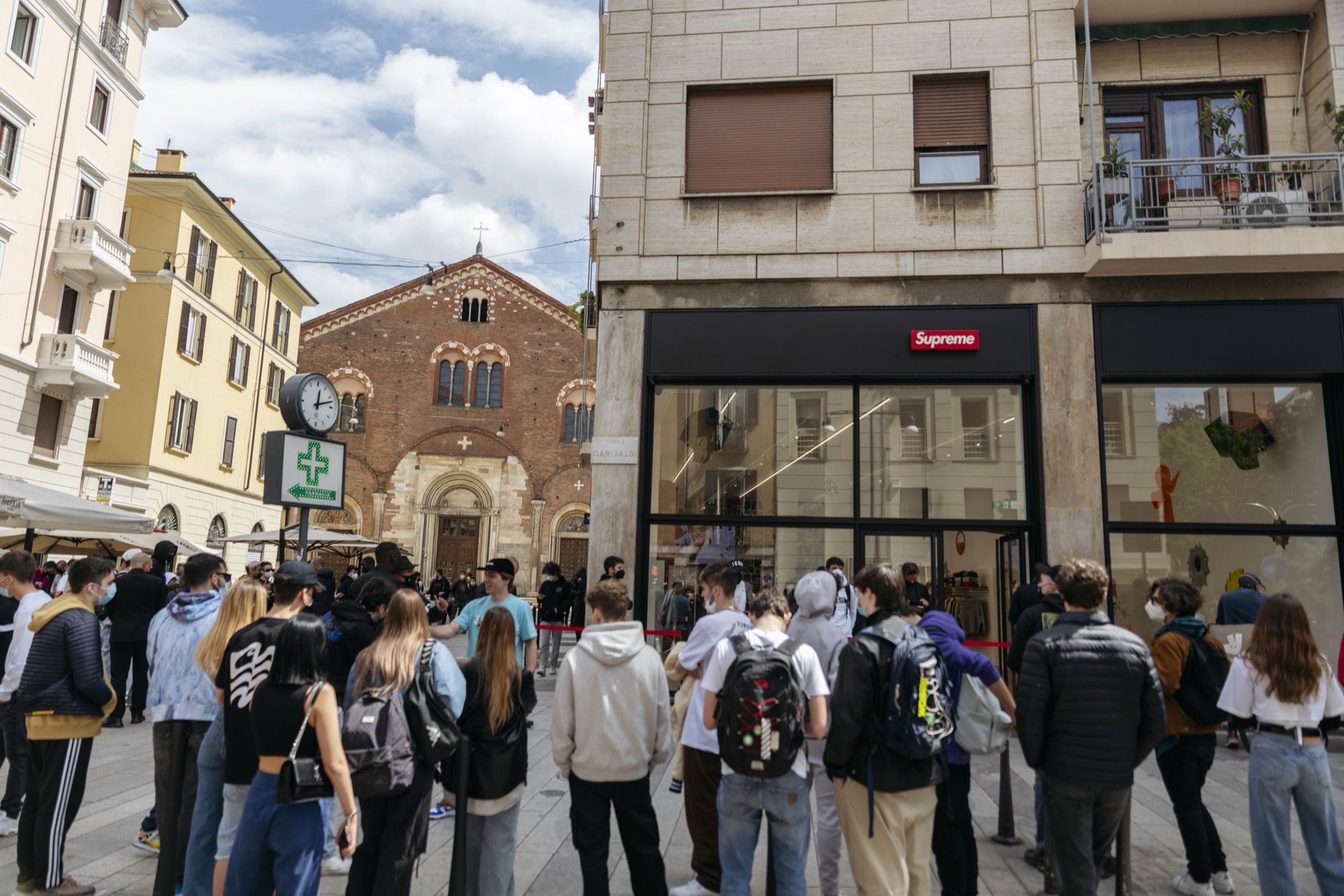
With the opening of the first Supreme store in Corso Garibaldi in Milan, it was impossible not to focus on the world built by James Jebbia in that shopping corner in the Milanese city. Like Apple, Supreme also uses a precise structure when it comes to thinking and designing a store, creating a window into a world whose philosophy is written between the lines between the windows and shelves that present the products on sale, whether it be of the latest iPhone or a logo box.
1. The location
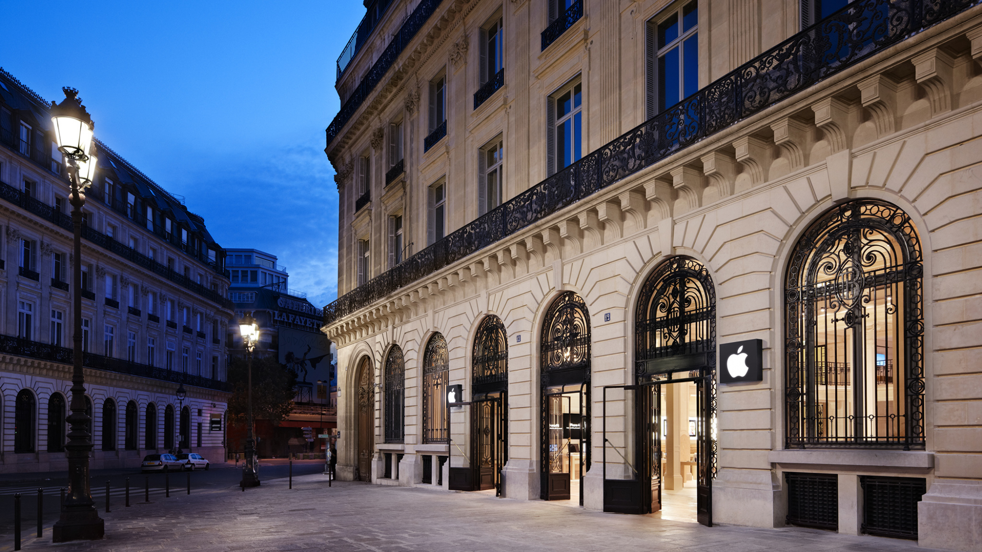
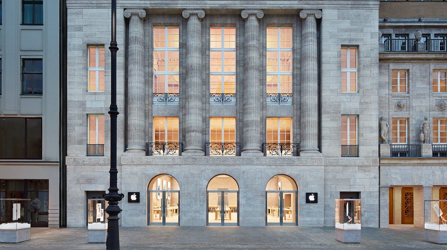
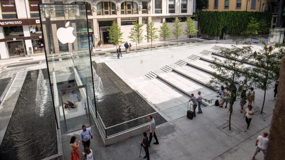
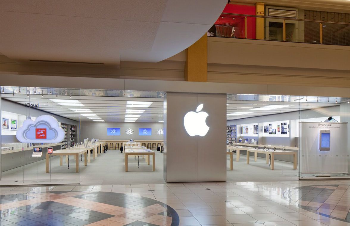
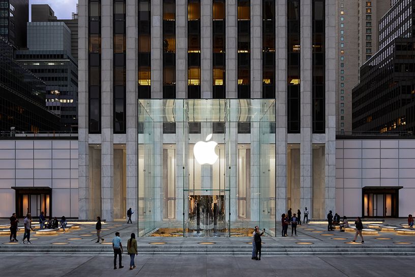
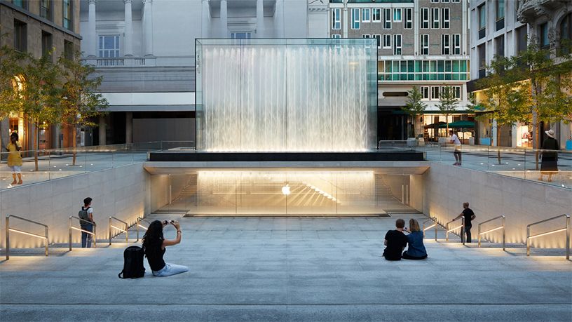
Despite a fair numerical difference, the Apple and Supreme stores share the same idea behind the choice of locations. Top cities and always crowded streets are the favourite points of the two brands, which try to attract as many customers as possible through a strategic choice in the positioning of their stores. Although Apple often chooses shopping malls as a strategic place for its stores, there are many stores scattered throughout the world capitals and located in the historic centre or the shopping streets.
2. The interiors
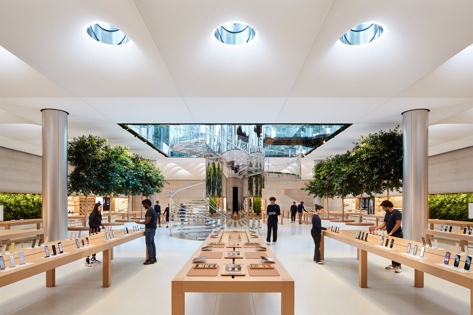
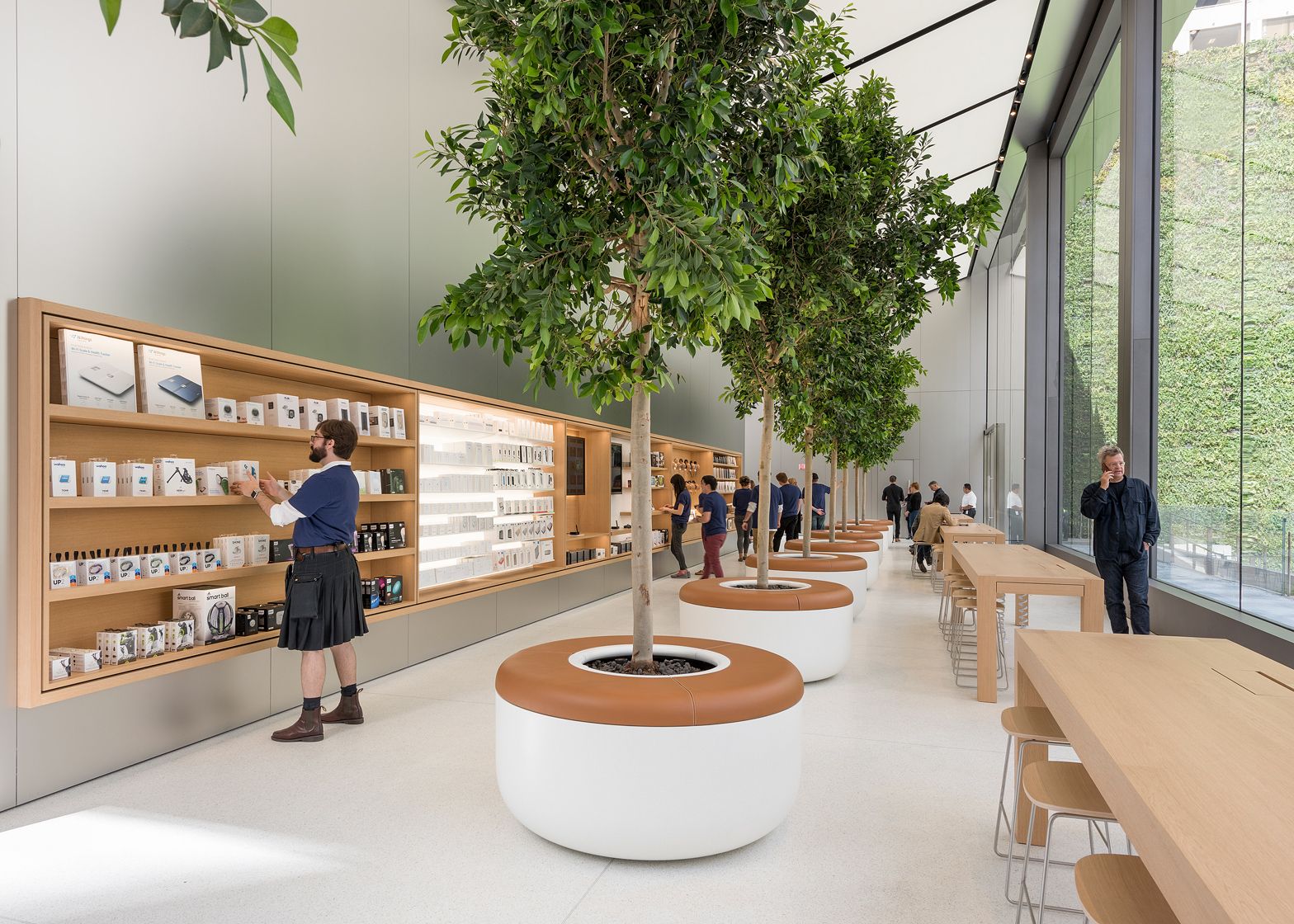
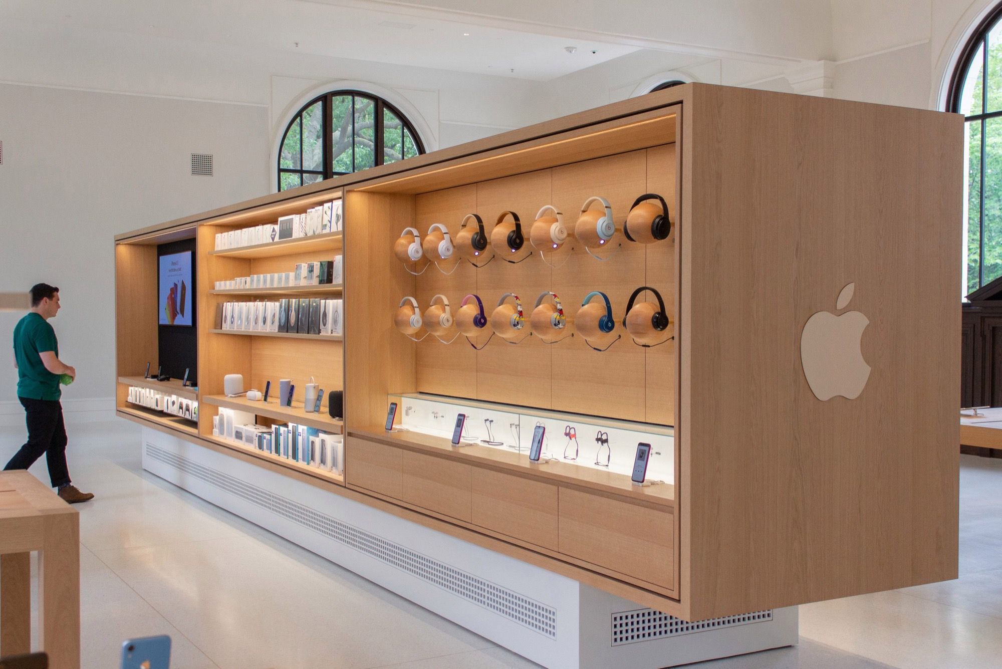
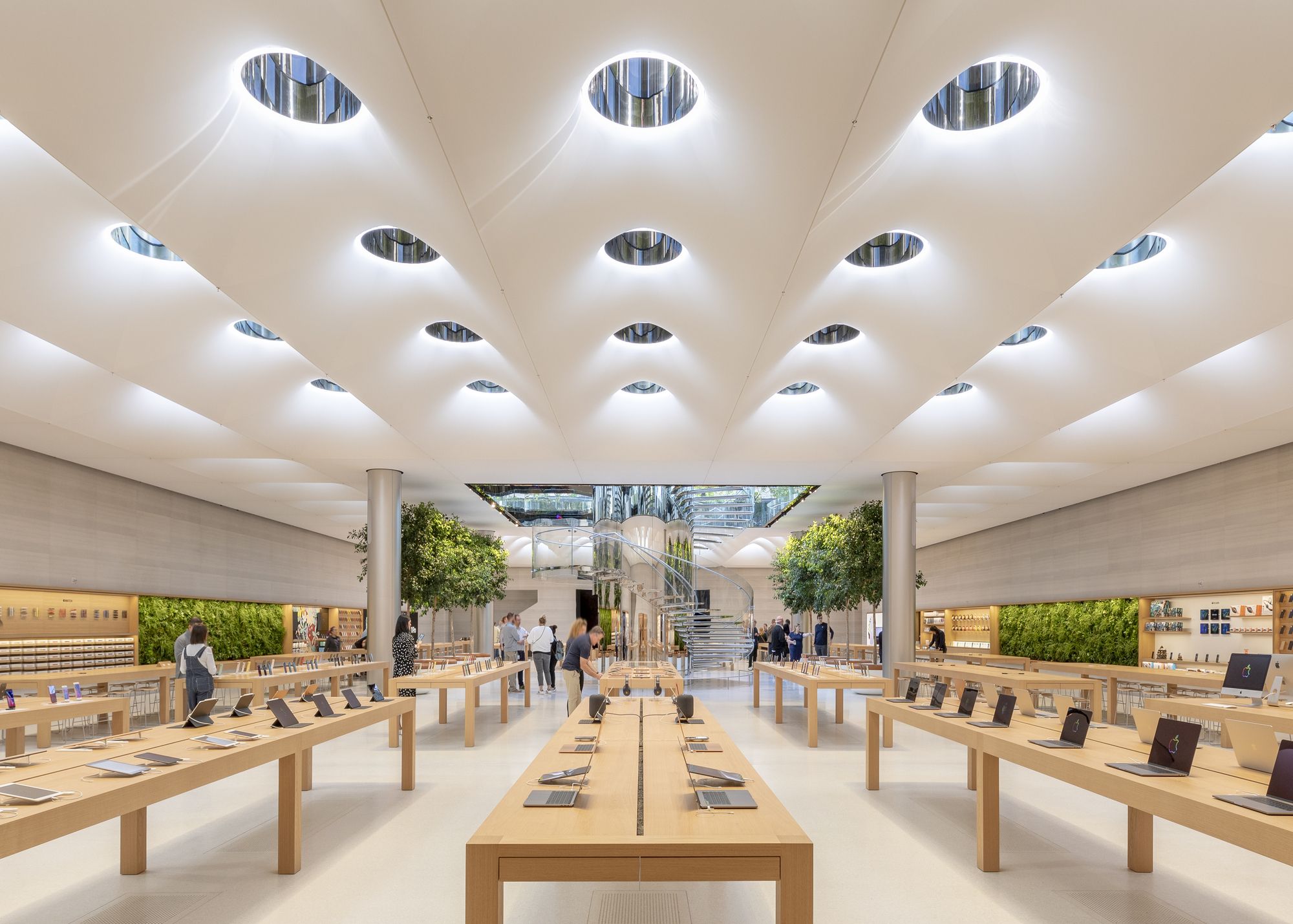
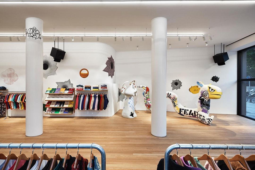
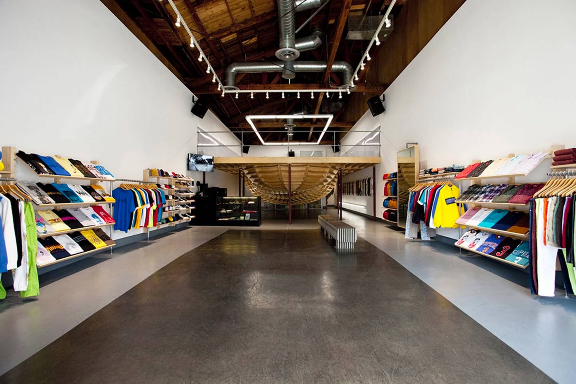
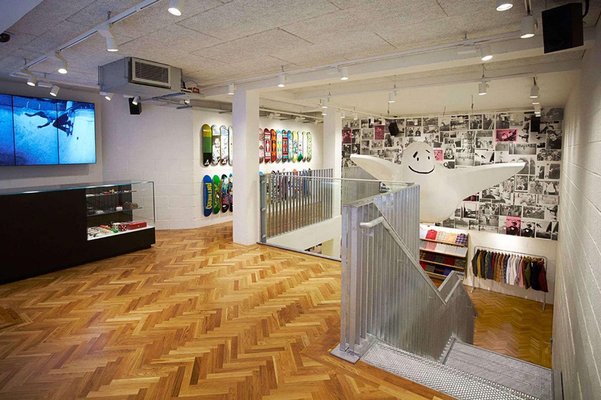
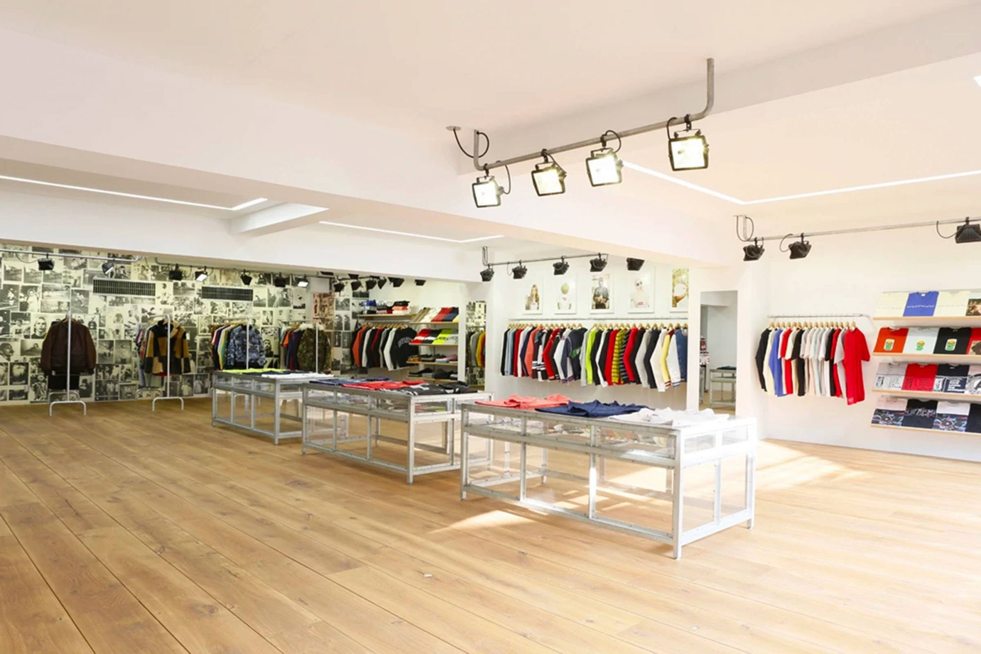
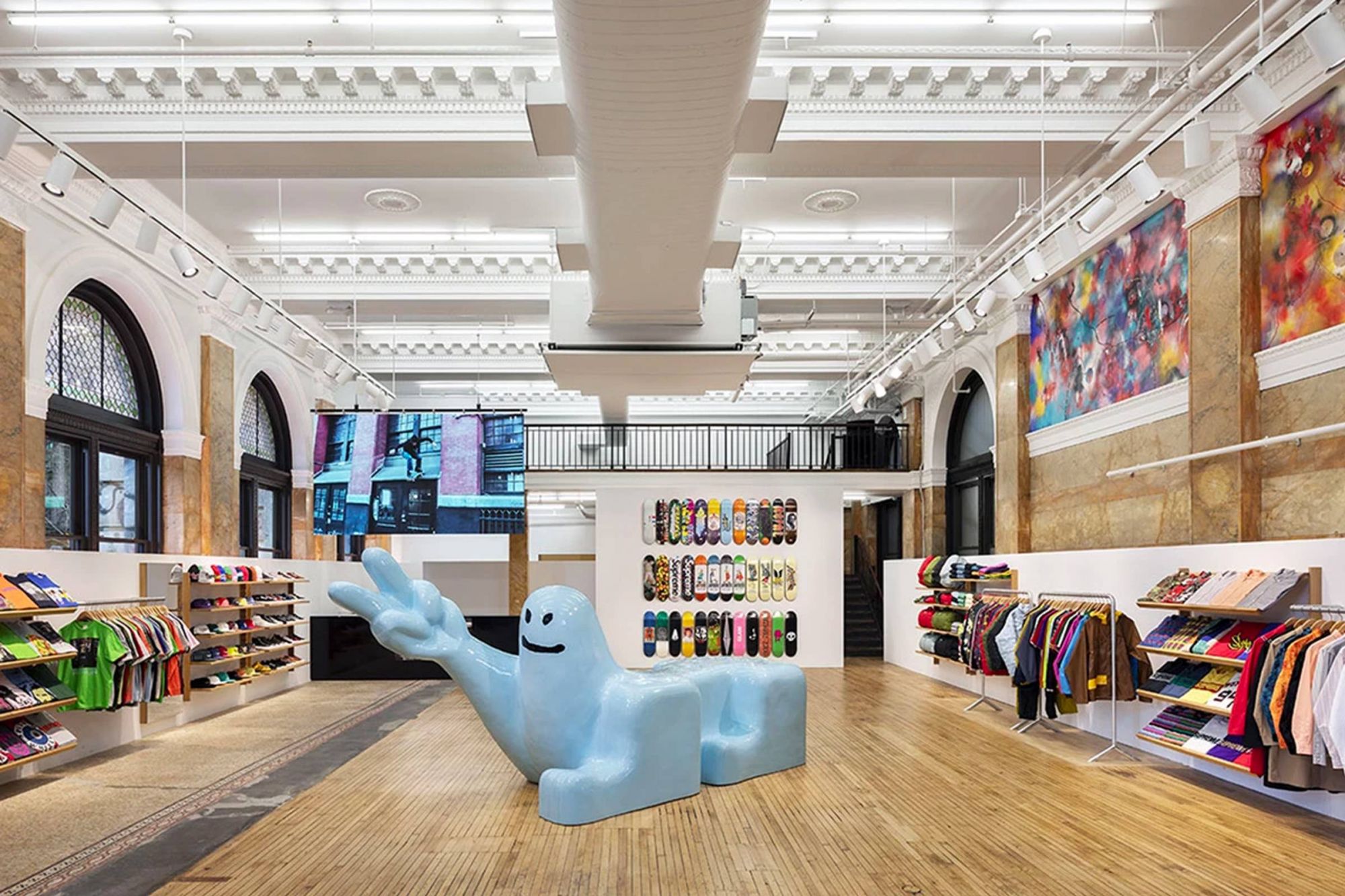
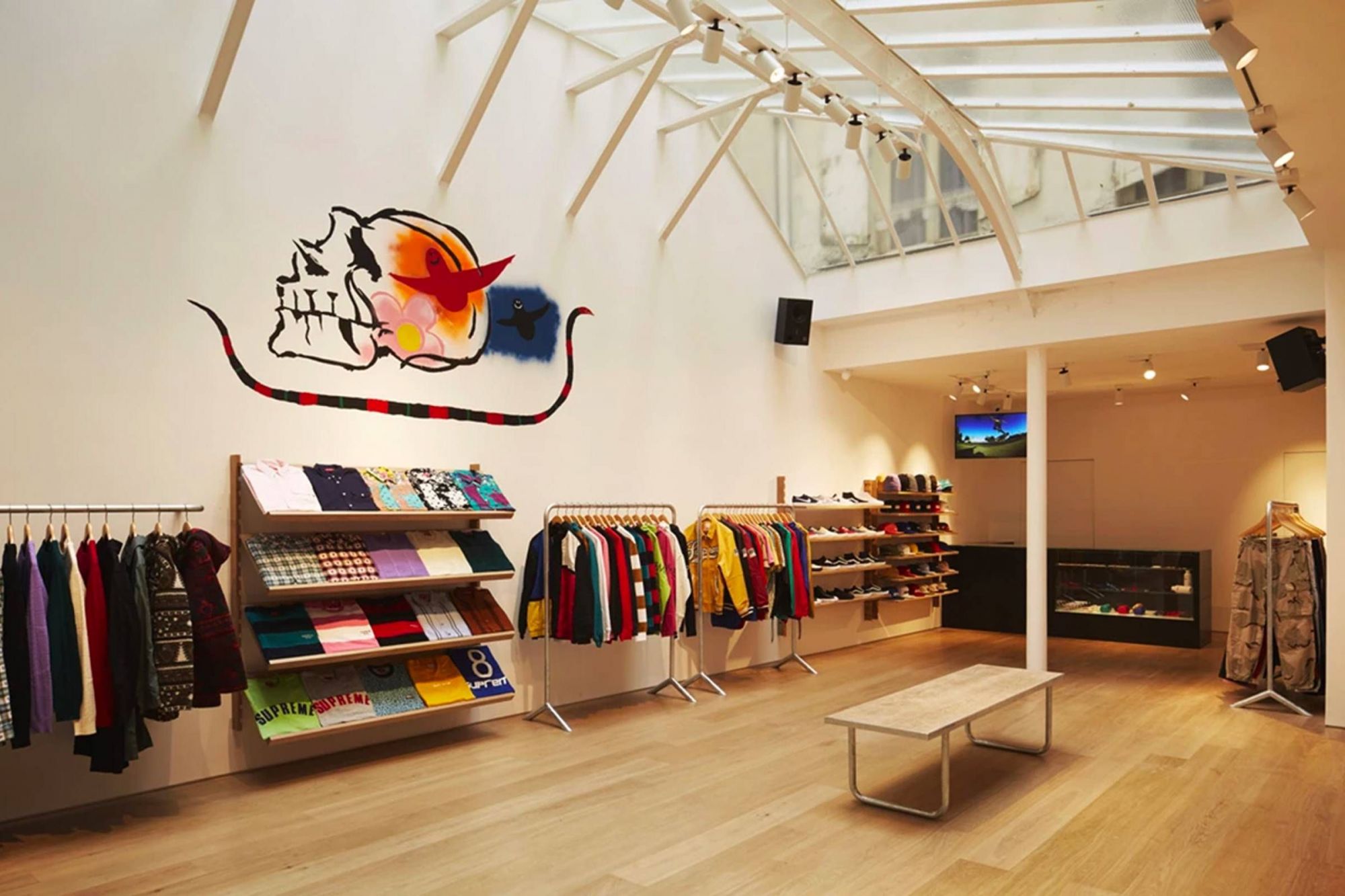
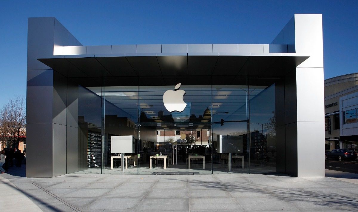
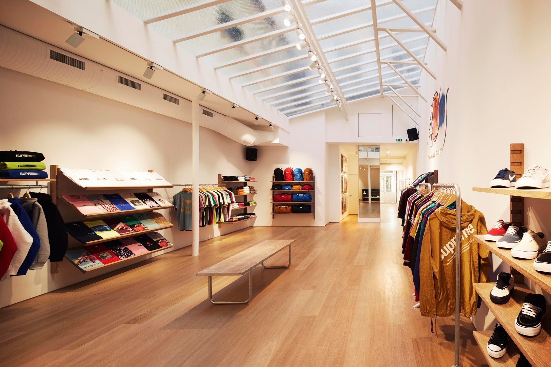
Large and tidy spaces, but above all a lot of wood. Both brands love to create a feeling of order by making their stores minimal and clean, always displaying a weighted quantity of products to create even more a feeling of exclusivity. The use of wood is another all too obvious parallelism: Apple uses it in its iconic tables on which it distributes iPhones and other devices in an almost religious way, while in the Supreme stores it's the protagonist both in the flooring and in the shelves.
3. The distribution
If Supreme has always sold directly only in its own stores, Apple has also begun to reduce the distribution of its products to external stores in recent years. Therefore, both companies aim to centralize all their charm in their flagship stores, increasing the idea of exclusivity behind their products and creating real meeting points around their points of sale.
4. The "mecca" stores
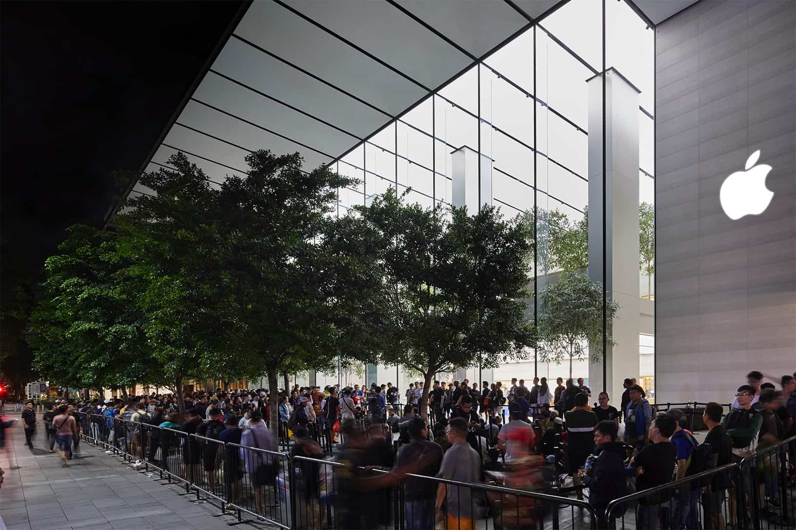
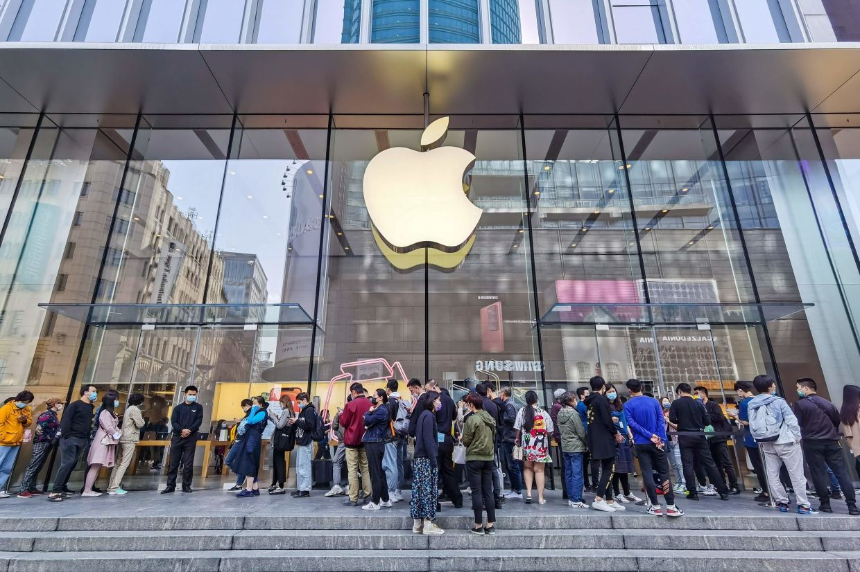
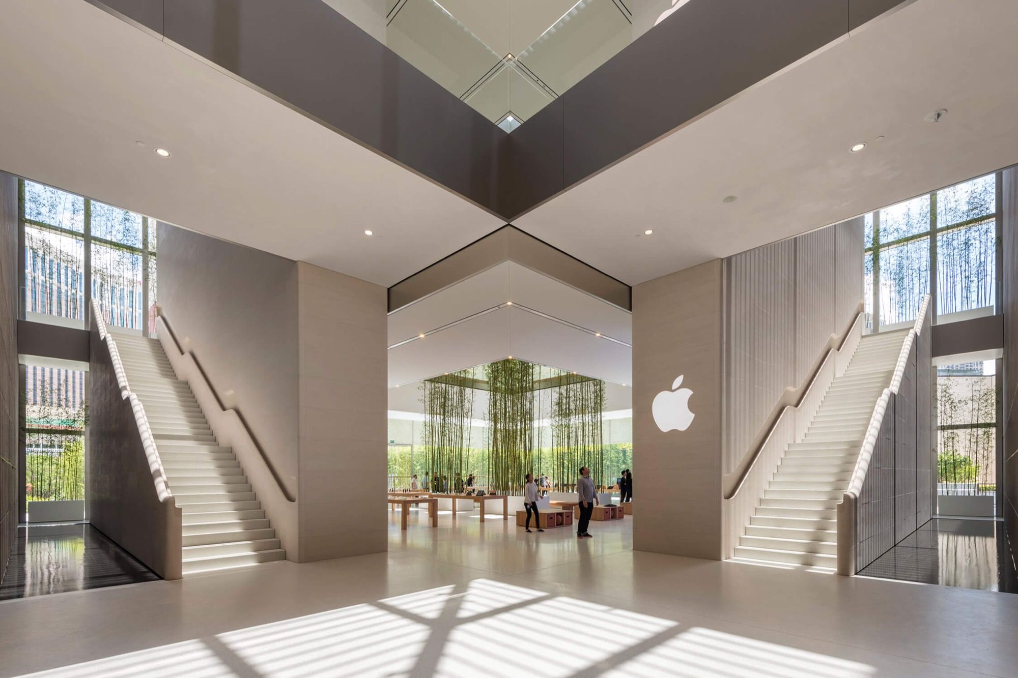
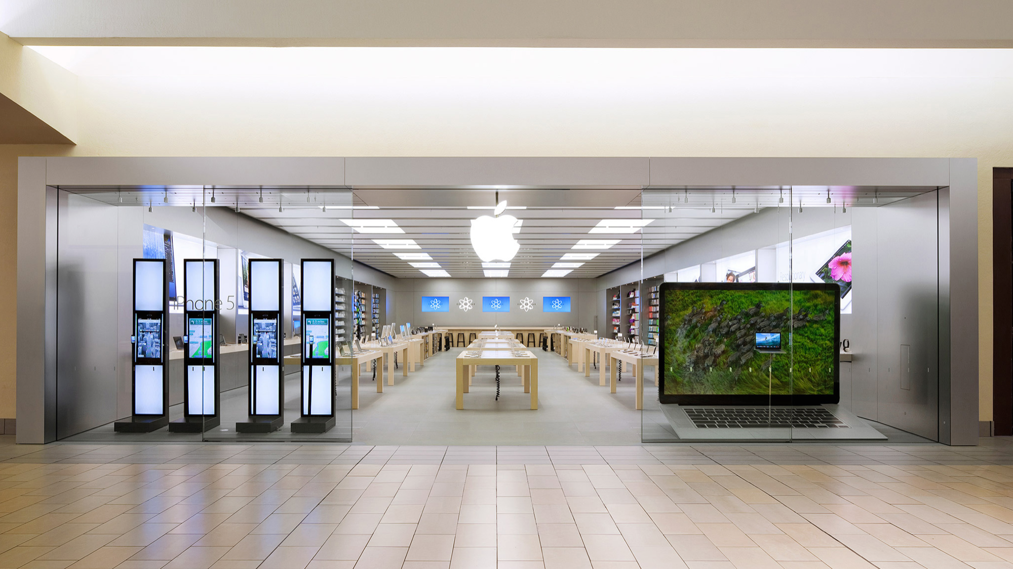
The large windows that characterize the Apple and Supreme stores seem to be huge windows towards an aspirational world. It's certainly no secret, but behind the two brands' architectural choice, there is a precise strategy designed to attract buyers by tempting them with a look inside a world designed to represent the ideal point of arrival for any customer.
5. The rows
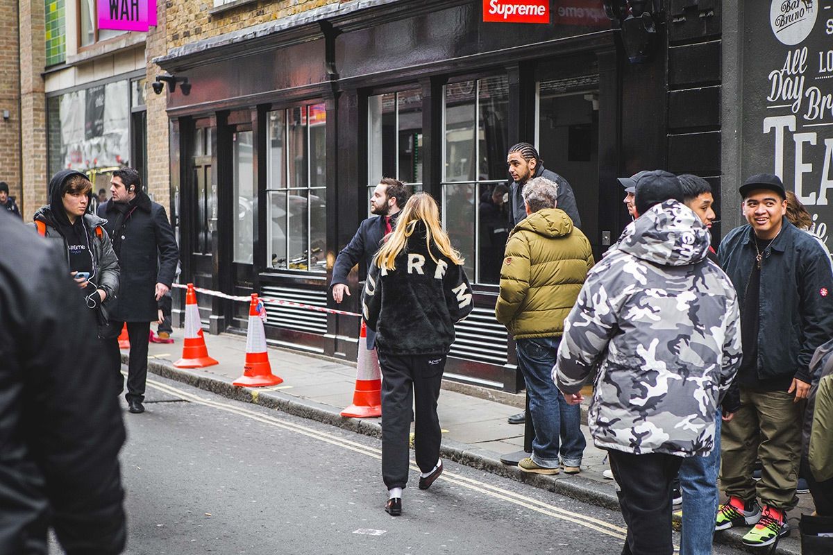
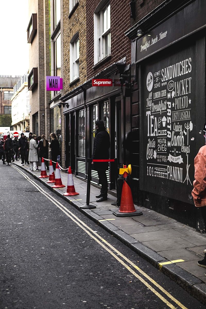
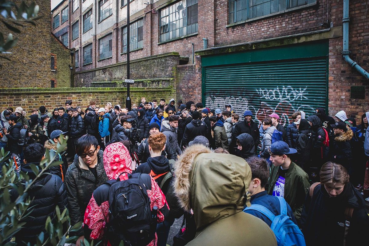
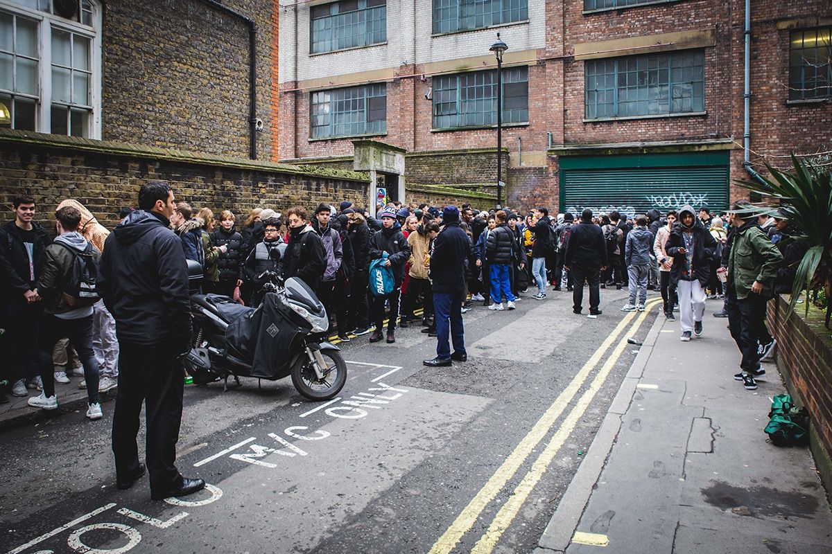
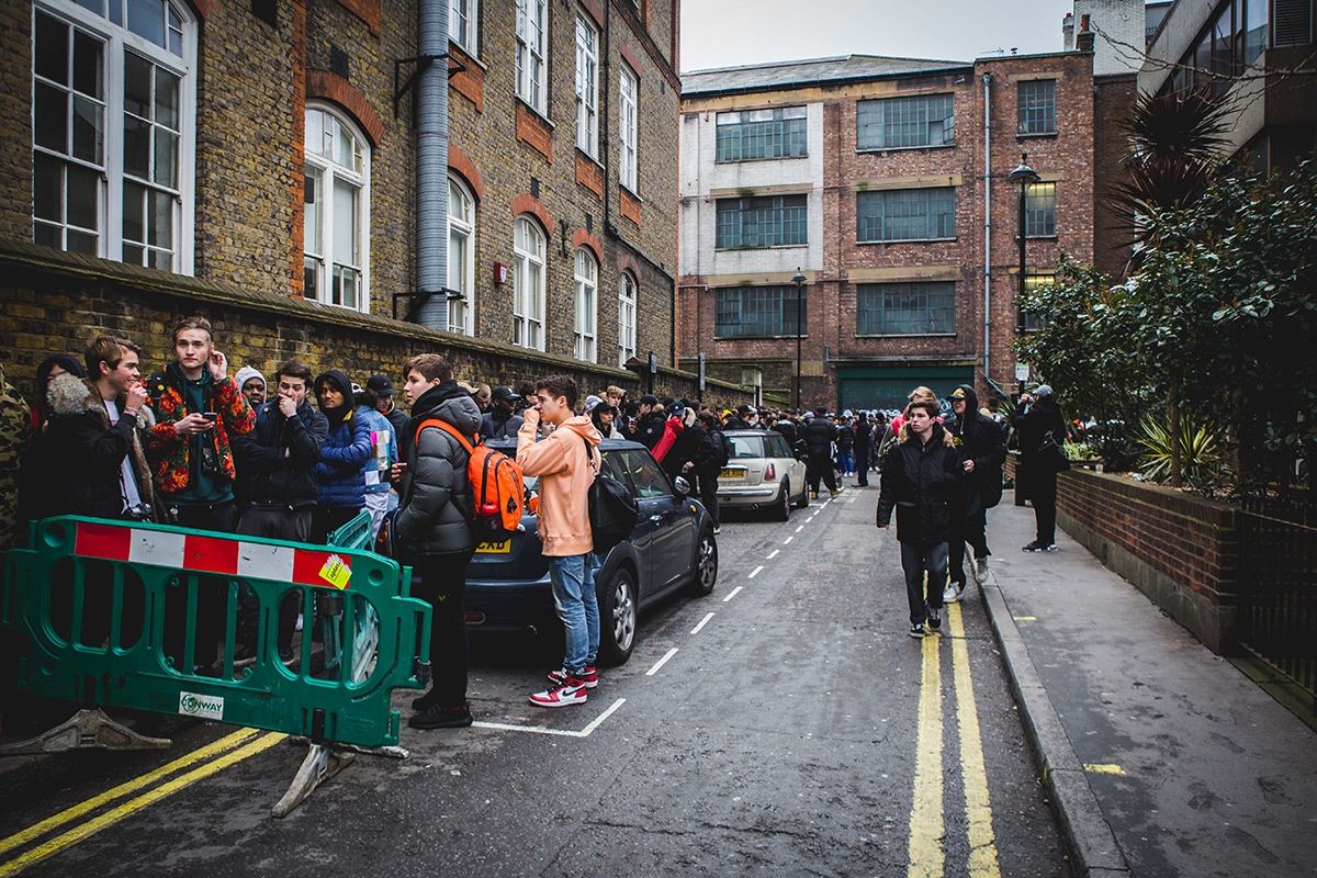
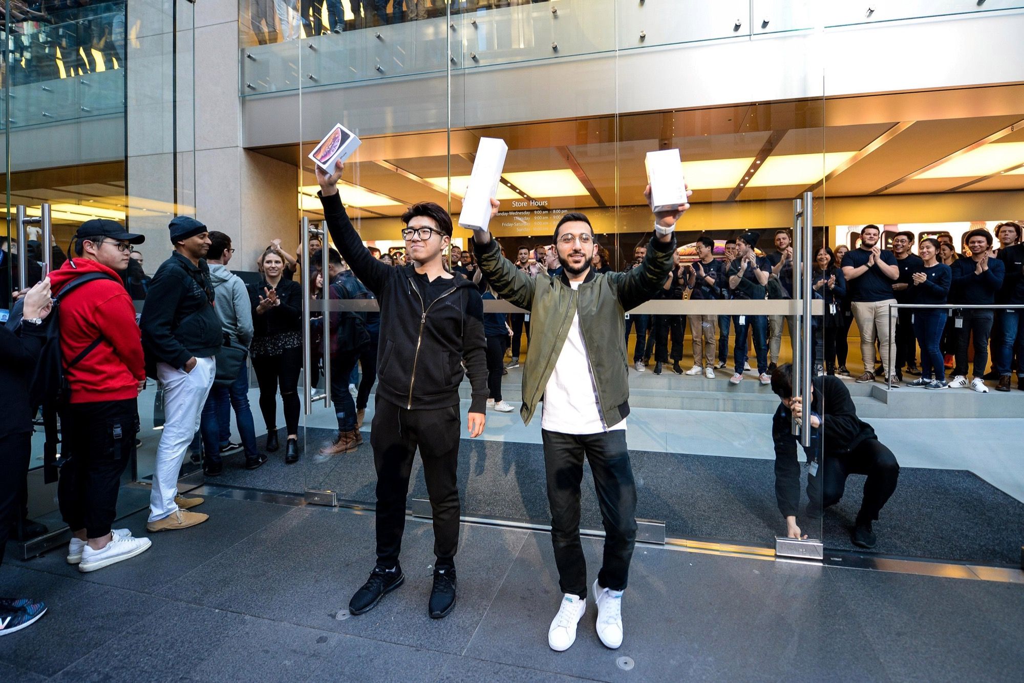
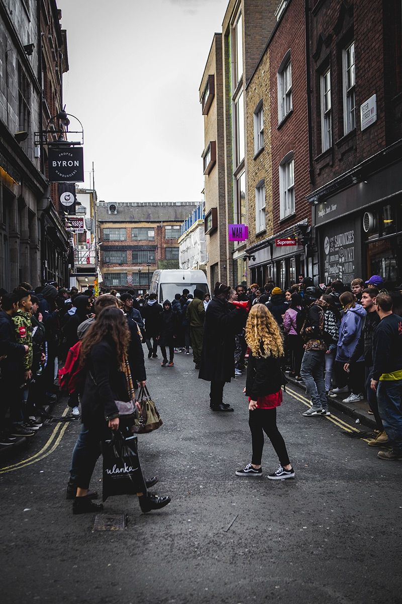
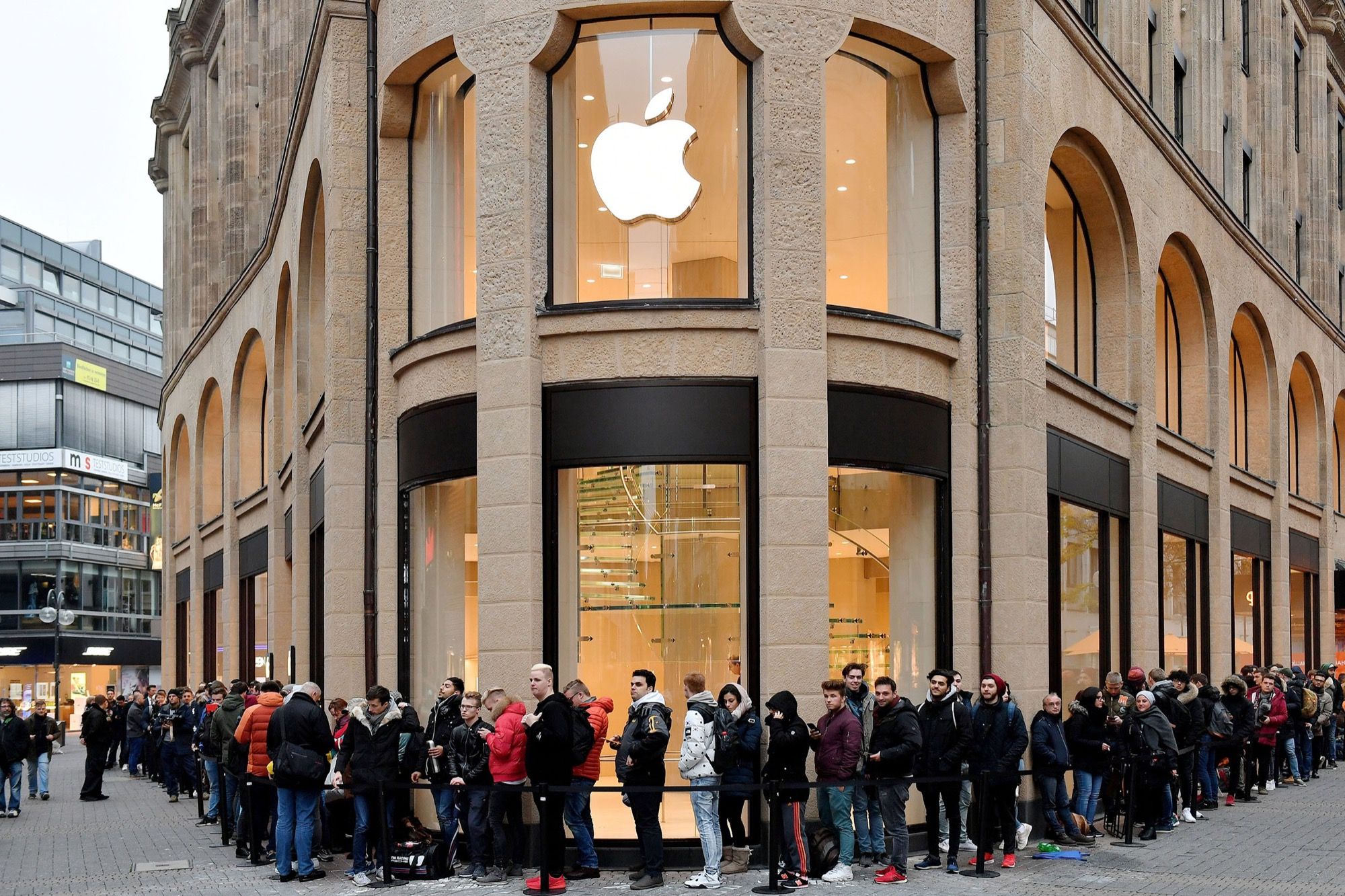
If the campout culture immediately makes us think of the sneakers and streetwear world, even the most avid Apple fans know the pains of a night spent in a camping chair in the hope of getting the latest iPhone. It's all part of the hype, an ideal arrival point of a path made up of very precise strategic choices that bring us back to the reality of the facts, making us crave always new products.


