The worst NBA jerseys of all the time
Do the right thing
October 4th, 2013
Last week we showed you what for us are the most beautiful jersey in NBA history. Here, as with anything, there is always the other side of the coin, represented in this case by the ten most embarrassing to uniforms (to use the term ugly is not cute, come on).
10. Denver Nuggets 1984
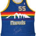
Assuming that this might even like it, you should have some eleven or going to the disk in the 80s, but maybe you belong to one of two categories and then this cute tank top with a rainbow drawn pleases you, and yet so much.
9. La Clippers Alternate 2013/2014
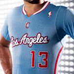
New, all-new alternating Clippers that call into question for two reasons. First: you can not enter into this type of ranking the deductible most unlucky ( and losing ) the history of the american sport. Second: call us jurassic , but the short-sleeved jersey in the NBA are not welcome.
8. All Star Game 1996 – San Antonio
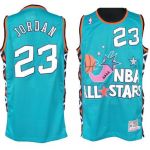
Usually the jersey of the All Star Game are beautiful . Here, you are definitely stylist NBA forgotten the second ( and crucial adjective) . It ' true that the chili is a Texan's ngredient, but here, we have very exaggerated with the rustic.
7. Chicago Bulls St. Patrick Day

The Americans are the most diverse people in the world, and we know that. The NBA celebrates some of the major ethnic groups in the region through special evenings. Here they materialize then the "Noche Latina" and special uniforms for St. Patrick's Day . These uniforms are basically all ugly, we choose the Bulls a bit, cause of the bulls in green are a punch in the eye, a little because that is the ugliest of all, however, that the Knicks will meet later in this special classification (Two placed on 10 seemed too much ) .
6. OKC Blue Alternate
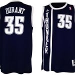
Not that it's particularly hideous, but is chosen essentially because it is quite difficult to understand. What does it represent? It's not a tribute to the past, because otherwise they would opt for something that resembled the uniform of the Sonics, and I do not think this is the case. A stylish jersey because it looks like no damn acetate to suits that our mothers they put on as children. Ergo is that ?
5. Dalla Mavericks Alternate 2003

I can handle simple as: ugly? No really, there are stories from the details on this, but ugly is ugly .
4. Cleveland Cavs Alternate 2008-2009

Bad attempt to replicate the jersey of the Cavs early '70s, dull yellow logo indefinitely and a terrible combination of shades of yellow and red. Imagine the worn Lebron does not alleviate the pain, while Zydrunas Ilgauskas see it on the sharpens considerably (poor Zi).
3. Golden State Warriors 2012/2013
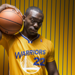
First experiment of split -sleeved, absolutely not to be repeated. And do not, persevere for what is evil, what is usual today and here is where does the currency in at number 9. This, however, is considerably worse , will be the orange shorts will be absurd , but this jersey is quite embarrassing to wear.
2. New York Knicks Christmas Day
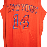
If I had announced the Knicks , although this time the fault is not entirely theirs . For Christamas Day all the teams have played with one color t-shirts ( including logos and numbers). They only had the worst , wearing a orange thing that is best comparable to a popsicle orange than anything else. For the series: beyond the damage (of PLAY lo at Christmas ) or insult .
1. Toronto Raptors Camouflage

What can I say ? And to think that in Italy we complained the new currency of Naples. What should Canadians say that most of this jersey that looks like a camouflage Art Attack of dry leaves ? Worst NBA Jersey Ever


