The NBA City Edition jerseys power ranking
What are, in our opinion, the best and the worst?
November 18th, 2024
Every year in the weeks leading up to the start of the NBA season, it's time for the “Power Rankings", in which analysts and trade magazines rank the teams in the two conferences according to their respective chances in the battle for the title. The starting lineups they create are usually divided into groups: “contenders” (the favourites to win the title), “pretenders” (more or less legitimate contenders), “playoff/play-in teams” (the middle tier) and “tank teams” (the least competitive); these labels, which have evolved over time into stand-alone definitions of franchise status, are also used outside of projections and rankings. Following the same pattern, we've created an aesthetic ranking of the best and worst "special" jerseys of the current NBA season in Basketball Nights of the Stars' discovery of the new Nike City Edition 2024/25 jerseys.
Launched at the start of the Nike-NBA partnership in 2017, the City Editions are exceptional variants of the game jerseys released annually by each of the thirty organisations (along with the NBA Cup jerseys from 2023) and are increasingly anticipated and appreciated by the public. These jerseys celebrate the link between the franchises and their respective cities, communities and cultures: a concept that is pursued with great creative freedom and sometimes even departs more or less significantly from the colours, style and visual identity of the reference brand. All of this is done with the participation of artists from diverse backgrounds, collaborating with designers from the streetwear universe, tapping into the current trends and bringing to life one of the many (too many?) occasions where NBA teams challenge each other off the court - and do it in style. so with the “power ranking” in hand, we're sitting here on the panel ready to get started on who made the cover.
Contenders
As in any decent Power Ranking, we start with the obligatory favourites for this year's Best City Edition award and then three nominees that are somewhat surprising. They are the Toronto Raptors, the Utah Jazz and the San Antonio Spurs, in that order.
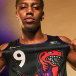
The Canadians, on the occasion of their 30th anniversary, are relying on a time-honoured trust: the public's appreciation - from the very loyal to the casual - of the old Jurassic Park-style logo, i.e. the stylised red and purple dinosaur used at the turn of the millennium and made iconic forever by the Raptors' most iconic player: Vince Carter. The silhouette of the reptile passing the ball under his legs, inspired by the immortal “Air Canada” dunk in the 2000 Slam Dunk Contest, is a tribute to his recent induction into the Hall of Fame and the retirement of jersey number 15 at Scotiabank Arena. The background of the jersey is a plain black with subtle vertical ligatures and the words “We The North” at the bottom in gold tones like the swoosh on the chest. So beautiful that one would be inclined to say, in the words of Carter himself in this All-Star Game, that's it: “It's over” We, on the other hand, are just getting started, with 29 other contenders in the queue hot on our heels.
Starting with the Utah Jazz, who for their part are going for a great classic and putting aside the yellow and red of years past for good (deo gratias). So here we have that identity-defining look again that never seems to get old, mixing the Jazz flavour with the mountains of Salt Lake City. The classic font, blueand white detailing and “refreshed purple mountain" design” of this edition give the jersey a new spin that takes us back to the “Stockton-to-Malone” years: the golden age of the franchise, on and off the court. The San Antonio Spurs, on the other hand, drew on a characteristic element of the city - in the tank top and even more so in the shorts: the architecture of the Hemisfair neighbourhood and the Spanish influence that characterises it. The product is packaged in a promotional video that taps into the Latin American soul of the fan community and in which the hombre del pueblo Manu Ginobili passes on the lightning bolt of Texan hearts to the enfant prodige Victor Wembanyama.
Pretenders
Competing with Toronto, Utah and San Antonio may be a tough task for anyone. In the second tier, however, there's no shortage of City Editions trying to do it with imagination and vigour. A good example? The Minnesota Timberwolves jersey, which is not only “cold” in name, but actually complements last year's model with a dedication to the “Land of Ten Thousand Lakes” and its wintry atmosphere.
Or the Atlanta Hawks, who have dusted off an old motif - the wings of an eagle - which in a way is reminiscent of the jersey worn by “Spud” Webb at the 1987 All-Star Game. The colours, however, are brand new: white and Aviation Blue (that's “A-Town”) with black and ochre details that represent an interesting mix of the brand's origins and development.
The Charlotte Hornets have also updated their City Edition series, drawing inspiration from the city's past. The North Carolina capital was home to the first US Mint at the historic Mint Street location - and here's a jersey (penned by Jumpman Jordan, as always) in the colour of the Mint, with gold designs like the minted coins. There's little to say about the look, but you might get the feeling you've seen something before (and you wouldn't be wrong).
Other examples of the fusion of old and new include the Orlando Magic (with classic vertical stripes reinterpreted as armour, and colours and fonts reinterpreted in a Gothic key), the Cleveland Cavaliers (inspired, as in the elegant matching parquet, from the legacy of the Cleveland Museum of Art), the Philadelphia 76ers (a mix of classic 1960s and modern flavour) and the Phoenix Suns (a reissue of the 1995 All-Star Game jersey that defies the red and blue aesthetic prescribed by the NBA up to that point).
The New York Knicks wear a style “heavily influenced by the late 1990sand early 2000s", as the organisation itself says. The New York Knicks confirmed the collaboration with Kith, reversing last season's colours in a design that aims to “bridge the gap between past and present” The Houston Rockets, who lean even more on the '90s style, have instead dusted off the aesthetic of the Hakeem Olajuwon days and are celebrating the “repeat” (for the 30th anniversary) in a jersey that's a City Re-Edition, and we like that too.
The Detroit Pistons, Memphis Grizzlies and Oklahoma City Thunder bring up the rear in this category. The former with a bone-coloured jersey, again explicitly inspired by their own Golden Age and thus the tenacity of the “Bad Boys” (with a patch dedicated to the back-to-back from 1989-1990); the Pistons, on the other hand, with a 1970s-style uniform to celebrate the 50th anniversary since the founding of the Memphis Sounds (ABA); the Thunder with the familiar Electric Rush and going against the grain by removing “City” from the lettering.
Play-in and tanking
The final two groupings: the one where there might normally be strong teams, but for one reason or another they don't reach the level of the best; and the one made up of “rebuilding” teams slumming it in the league's slums. In the case of the current roster, it's a deferral for twelve months and then onto the next City edition, in the (questionable) belief that they can do better in 2024.
In the battery of “play-in jerseys" we find the Denver Nuggets, who have paid homage to the tradition of jerseys featuring Colorado's mountains (on the theme of 5,280 feet above sea level) and the rainbow, albeit what looks like a faded copy of so many fine vests of recent years; the Golden State Warriors, who lean toward the modern, innovative and somewhat cold style of San Francisco rather than the energy of years past (similar discourse for the "icy” Indiana Pacers).
And once again: the Los Angeles Clippers elegantly bear the signature of Jonas Wood (artist and designer), but lack identity (though not as much as the Milwaukee Bucks); the New Orleans Pelicans' colours - mixed with last year's to create a particular purple-gold-fluorescent green - aren't bad, but the combination with the patterning and bony lettering doesn't convince us as much; and the Los Angeles Lakers have simply released a nice jersey, but perhaps lacking in interesting elements, at least in the context of a city edition and the cultural and historical context of the genre.
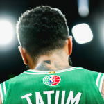
At the end of our preferences are a handful of teams that, as I said, will make it to next year. The Boston Celtics practically snubbed even Joe Mazzulla, just as the initial reaction to the KAWS collaboration was pretty cold for the Brooklyn Nets. The Chicago Bulls, Miami Heat and Dallas Mavericks have opted for a clean but uninspiring design, while the Sacramento Kings have adopted the colours of the Cincinnati Royals (no, not the Philadelphia 76ers). Finally, there's the Portland Trail Blazers with a mix of many styles, perhaps too many, and the Washington Wizards, whose colours don't exactly help an already rather banal design.


