The best fonts of the Serie B
The secondary series, unlike the Series A, does not have a unique font, thus allowing more freedom for the teams
August 31st, 2024
Unlike what happens in Serie A, in Serie B there is no rule that obligates teams to conform in terms of font usage. There is no single solution approved by the League, which means that clubs and their technical sponsors have freedom of choice. They can play with shapes and lines, experiment, and propose alternative solutions. It is a further step in the creative process that leads to the creation of a game jersey. A challenge that in some cases has led to excellent results.
Cesena - Erreà
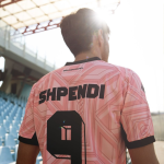
The collaboration between Erreà and Cesena has resulted in a retrofuturistic font. The design is geometric, characterized by small lines that follow the main figure of the number both inside and outside, creating a three-dimensional effect. An aesthetic inherited from the 1980s and used only for numbers, as a more linear font was chosen for the players' names.
Pisa - adidas
For the eighth consecutive season, adidas is the technical sponsor of Pisa. The new chapter of this collaboration has led to the proposal of a font for numbers characterized by predominantly curved lines. To enhance this proposal, there is a curious stylistic choice, namely the creation of a sort of second border by inserting a thin line of the same color as the number but slightly spaced from the main body, creating a void that is filled with the color of the jersey.
Sampdoria - Macron
Linear and elegant, yet voluminous, characterized by soft lines that do not intertwine, but seem to rest on their own background and create a sense of continuity with the letters. The font used by Sampdoria for their numbers represents the combination of two opposite fantasies that manage to coexist despite the limited space they have to share. All of this is, of course, embellished by Baciccia, the symbol of Sampdoria, at the bottom.
Cittadella - Erreà
On the other hand, Erreà has adopted a completely different philosophy with Cittadella. No soft lines, but a geometric pattern, brutal in the way the lines change direction to create angles and cut through space. An interlocking of straight lines that are rotated to meet the needs of each number.
Modena - New Balance
Stylized features, but not poor, slim shapes that do not convey a sense of harshness, gentle curves that respect the geometric order drawn by each horizontal or vertical line. The font Brans DemiBold appears on the Modena jerseys as a result of New Balance's choice to propose a minimal but elegant look for both names and numbers, just as they have redesigned the club's visual identity in the last two seasons.


