The strangest typefaces of the pre-season
Yes, on the Manchester City one, there is the WWE logo
Sports
August 9th, 2024
August 9th, 2024
In a few days, all the top European leagues will begin: Serie A, LaLiga, Premier League, Bundesliga, and Ligue1. To aim for peak performance on the field, clubs have been engaged for weeks in pre-season tours, which have now become a key strategy for expanding their branding overseas. Borussia Dortmund played in Japan, while Bayern Munich debuted at the Audi Summer Tour in South Korea. Manchester City under Pep Guardiola opted for the United States.
What unites all three clubs is the opportunity to take the field with a special font for the names and numbers on their jerseys. However, not all clubs that have played (and are still playing) pre-season friendlies have introduced limited edition or custom-made fonts, nor are those shown by the aforementioned Manchester City, Borussia Dortmund, and Bayern Munich the best we will see this year: just think of the elegant font of Real Madrid that will look even more incredible on the backs of new signings Mbappé and Bellingham.
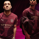
Manchester City
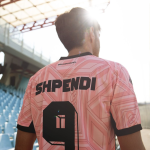
At the end of June, Manchester City announced a partnership with WWE which involved reworking some of the franchise's athletes' historic claims: it was just a taste of the font that we saw worn by Haaland & co. in the pre-season friendly lost 4-3 against Celtic. The special font, in addition to displaying the WWE logo, contained the claim "Never give up" repeated within the number, a tribute to wrestler John Cena, who announced his departure from WWE just a few months ago.
Bayern Munich
For the first time in its history, Bayern Munich flew to South Korea for a pre-season tour to play in the Audi Summer Tour 2024. The Bavarians are set to face Tottenham, and for the Korean trip, they chose to create a new, exclusive font in collaboration with the Seoul-based brand and creative studio Over The Pitch, for both the Home and Away jerseys for the 2024/25 season. The font for the away jersey is inspired by traditional Korean architecture, particularly the "Chuma". The numbers are adorned with Dancheong motifs, a traditional Korean decoration typically found, in color, on wooden buildings. The font for the Home jersey, on the other hand, is inspired by the Bauhaus style: it is characterized by minimal geometric shapes, and the numbering incorporates the Taeguk motif, reflecting part of the Korean tradition.
Borussia Dortmund
Just like their Bayern Munich rivals, Borussia Dortmund also let the charm of Asia and the aesthetics of the continent take over. The schwarzgelben missed Asia after visiting Malaysia and Singapore two years ago, so for this season, they chose to go big. In addition to showing up with a customized bus featuring a One Piece graphic, they designed a Japanese font. However, the font was met with criticism, especially from the Japanese themselves, who condemned the club for choosing Kanji characters that are not used in Japan, considering it a stereotypical typeface with which Westerners view the Asian country, the kind that in Germany makes up the writing on noodle boxes and convenience store signs, accusing the German club of not doing any research in creating the kit.
Real Madrid
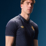
Even during their tour in the United States, Real Madrid couldn't resist taking the field with a special typeface, used in their match against Enzo Maresca's Chelsea. It's called "Bear Champ," and its design is inspired by the famous character of the same name created by artist JC Rivera. The kit has been put on sale, and all proceeds will go to the Real Madrid Foundation.