Discover the Napoli Calcio rebranding
A new logo, a proprietary font and a fresh start for De Laurentiis' club
July 5th, 2024
After some experimentation in recent months, Napoli Calcio's rebranding has now officially gone live. At the start of a crucial summer and a season that has seen two years of ups and downs, Aurelio De Laurentiis' club has indeed begun the process of renewing its image: a 360-degree process that begins on the pitch - where the arrival of Antonio Conte on the bench and the football market session that has just begun promise to have a major impact - but also off the pitch. The main news of the last few hours concerns the branding of the Campania club and in particular its historic logo, which has been redesigned after years and for the first time has no trace of the blue that has characterised it for almost a century.
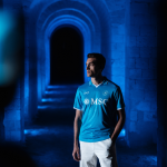
The gradual redesign was foreshadowed a few months ago by the fourth jersey, which was worn without the "Keep Racism Out" patch after the Acerbi-Juan Jesus case, but also by the special editions "Halloween" and "Everywhere". In addition to the tricolour, the new Azzurri crest, which has been on display since yesterday, could be seen on the chest of these jerseys. Along with the first images of the kits for the 2024/25 matches, the team's visual identity has entered a new historical phase, the fulfilment of a silent revolution, without the bombastic announcements seen in similar cases such as Juventus, Inter, Roma and Fiorentina. Many Neapolitan fans learnt of the change vicariously, on the occasion of yesterday's event for the draw of the calendar for the next championship, through the graphics published by the Lega Serie A, which were picked up by all the main national media. In the hours that followed, the logo was also replaced on the club's official website and relevant social profiles, where a video released yesterday afternoon and a statement today finalised the change.
So here is the new Napoleonic "N", which from now on will be the banner of the fourth most supported club in Italy and a globally recognised brand. The first innovation lies in the (proprietary) font "BE NAPOLI"," which the club introduces as follows: "Naples is a melting pot in constant motion. A multifaceted city where contrasts merge and create an unrivalled eclecticism. We wanted to capitalise on this heritage to create a unique and dynamic typeface inspired by the cultural richness of Naples. A city, a team and a typography linked by a unique weave. A connection expressed in letters with outliers and diagonals like visions of the city, letters as thick and compact as a united and determined team, sharp and dynamic angles that symbolise grit and speed. The genetics of a people that lives on passion, history and chapters yet to be written."
As expected, the traditional light blue background has been abandoned in favour of transparency, making the logo more streamlined and versatile. In addition to the midnight blue with which it was presented to the public, the other colour declinations (light blue, white, grey, black, red) actually guarantee a cross-cutting use on the entire range of uniforms and merchandising products and generally in all the areas for which it is intended. The two concentric circles around the "N"," of which the outer one is slightly thicker, complete the minimalist design of a monochrome logo without lettering, following a widespread trend in the European football landscape. In short, another redesign that seems to meet the needs of the market, partially sacrificing the identity-creating meaning of the logo. Similar to what has happened in recent years with the introduction of Juventus' "J"," the "simplification" of Inter's crest or Roma's redesign, which many fans disapproved of. The phenomenon is part of the broader context of the transformation of clubs into brands, a process that touches on a variety of areas and that has led to a bit of a discrepancy between the views and tastes of fans and the decisions of clubs everywhere. In Naples as elsewhere.
In fact, the blue background is a constant in the club's history: the decision was made to use a rampant horse (symbol of the Kingdom of Naples) on a blue background when the club was founded in 1926, then two years later it was decided to switch to a gold "N" on a blue background, which was retained until the 1980s; later, through various evolutions (including one forced by bankruptcy in 2004), they switched to blue-azure-white, which led to the drastic change presented yesterday. In the classic blue home kit, the break with the past is less obvious, but when Osimhen and his team-mates take to the pitch in the second and third shirts, it will immediately catch the eye. Welcome to the new era of Napoli Calcio.


