The visual evolution of the Champions League over the last 25 years
How the aesthetics of the most anticipated match of the season has changed
Sports
June 4th, 2024
June 4th, 2024
It is 26 May 1999 and the Champions League final between Manchester United and Bayern Munich is about to be played at the Camp Nou in Barcelona. The referee appointed by UEFA was Pierluigi Collina, the first time without an Italian after eight consecutive editions; and it was a match that would go down in history as one of the most beautiful finals of all time, with a brilliant comeback by the Red Devils in extremis, signed by Sheringham and Solskjaer. During the opening ceremony, Catalan soprano Montserrat Caballé sang a version of "Barcelona", a song she had written and sung twelve years earlier with Freddie Mercury, which then became the anthem of the 1992 Olympics. in '91, Queen's voice had disappeared‘, so Caballé duetted on both occasions with a recording of her projected onto the big screen. A series of choreographies came to life on the green rectangle, referencing Barcelona's buildings and symbols and aesthetically fitting in with the innovative identity of the event, which will be a forerunner for all the finals of the new millennium. For the design of the ‘99 final, UEFA opted for a visual line strongly inspired by the city to represent the city's culture and create the event within the event that the finals would become in the following decades, also thanks to the European Football Association's brand strategy.


On the poster, tickets and all promotional content for Barcelona ‘99, the design pays homage to Joan Miró, another icon of the Catalan art scene. Like Caballé, the famous painter and sculptor has also been a testimonial for a major sporting event in the country: the 1982 Mundial, for which he designed the official poster, one of his last works. UEFA's inspiration to create a unique visual identity for each final seems to have its roots in the major events organised by the Olympic Committee and FIFA, which traditionally seek to capture cultural and urban heritage in visual content. The result was an energetic, vibrant poster with a design in the classic style (surrealism) of Miró, warm colours and strong contrasts. After creating an ad hoc logo and anthem in the early 1990s, UEFA obviously paid more attention to the artistic component of these events. And after the experiment in Barcelona, the course was set, as the following stages confirm: For Paris (2000 and then again in 2006 for the 50th edition), the colours of the French flag were chosen, with a design in the centre reminiscent of the Eiffel Tower (rather defilade in the second case); for Milan (2001), the focus is on an elegant design and a theatre curtain alluding to La Scala, for a final themed "The Opera of Football"; in Athens (2007), the choice of colours also refers to the flag and the design presents a fantasy in the classic Hellenic style.
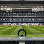
At the final in Moscow (2008), another element will be used on several occasions, this time the architectural inspiration: the (stylised) skyline of the city, in which the Kremlin stands out clearly; on the same wavelength is the communicative result of the following year in Rome (2009), where the Champions League trophy is placed on a corner of the Colosseum; finally, for Madrid (2010), the focus is on a design featuring the stylised silhouette of the Estadio Santiago Bernabeu, framed in sinuous patterns decorated with the classic Champions League star. Subsequently, Wembley hosted the final twice in three editions: in 2011, a simple, minimalist design was presented with the English lions holding the trophy, with white figures on a bluish background and red lettering. In 2013 - the edition celebrating the 150th anniversary of the founding of the English association - a less striking illustration was chosen instead, namely a series of rays of light illuminating the silhouette of the trophy and creating a scenery of flat, abstract and not very dynamic geometries that do not stand out at all against the blue background. In the final at the centre, the match in Munich in 2012 where Chelsea became champions for the first time, the complexity of the overlays, shading and flashes of light that form an authentic mosaic of irregular shapes with blue-green hues, from which a leaping goalkeeper and a figure about to shoot stand out, is remarkable.


Since the 2014 final in Lisbon, UEFA has delegated the task of illustrating the finals to the London-based creative agency Designwerk. Over the following four years, the graphic design of the event became more consistent and coherent, both in terms of iconography and colour scheme: Champions blue became the predominant colour in all designs. The first work pays homage to the Portuguese naval tradition: a giant moving spinning top surrounds the trophy, which rests in the centre of a luminous compass rose depicted in small size in the trophy's belly. For Berlin 2015, the basic idea is much more sober: in a huge monochrome background, the trophy rises above the Olympic Stadium in the distance, while the shadows of the pillars of the Brandenburg Gate form the word "FINAL". The following year in Milan, the Galleria Vittorio Emanuele II is the setting for the visual identity, while in Cardiff the Welsh dragon is the protagonist, proudly clutching the trophy. The dress for the final in Kyiv, on the other hand, is reminiscent of the colours of the Ukrainian flag and the hypnotic "hole" motif on the roof of the Olympic Stadium.
After ending its partnership with Designwerk, Nyon handed the ball over to local graphic designers who they felt could better interpret the soul of their city. The decision proved to be the right one: the identity of the 2019 final in Madrid is a stunning collage of figures, animals, nature and traditional elements, painted in the intense blue-orange colours of the candilazo, Madrid's characteristic sunset. The beauty of his own city at sunset was also an inspiration for the Turkish artist Tolga Tarhan to depict his Istanbul. He is the creator of a charming blueand pink colour gradient that envelops the most famous monuments of old Constantinople. A design that, as we recall, had to wait a good three years to be used: the pandemic led to the 2020 and 2021 finals being moved to Portugal - and with it the lack of a visual identity ad hoc - while the 2022 finals in St Petersburg, adorned with an abstract explosion of geometries and colours reminiscent of the Suprematism of Kandinsky and Malevich, had to be moved to Paris due to the Russian invasion of Ukraine.


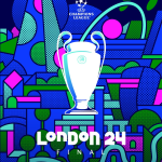
In contrast to Lisbon and Porto, the final in Paris was given its own identity, but its sparse, monochromatic design suggests an internal UEFA production rather than an external commission. To conclude this colourful review, we mention the final that will conclude the 2023/24 European football season tonight: The final in London also relies on an intricate geometric composition with intense colours, a multi-faceted graffiti that "reflects the energy and constant movement of the city with shapes that allude to iconic buildings and the vastness of the city while contrasting with green spaces".