How a ball revolutionised the adidas aesthetic
History of Teamgeist, the template that defined early 00
May 24th, 2023
Is it possible for a ball to change drastically football’s aesthetic? Yes, it happened frequently and most of the time it had something to do with adidas and their design’s intuitions for the World Cup’s balls. Starting from Telestar, the ball used in 1970 and 1974 that introduced for the very first-time black pentagons on football’s balls. Then along came Tango, the ball used between 1978 and 1998 with always different colors and patterns applied to the immortal curved triangles printed on each of the 32 hexagonal panels.
And then there was Teamgeist, the ball designed for the 2006 World Cup played in Germany that managed to affect the entire adidas’ collection from 2006 to 2007. In the words of Jürgen Rank, adidas’ Senior Design Director Football: “Teamgeist is the result of enormous effort, ideas, and inspiration. We’ve abandoned the hexagonal structure of 32 panels and developed a new design with 14 panels. In this way, not only we’ve created a contemporary, eye-catching, and sophisticated look but we’ve also made the ball way smoother, improving players’ ball control and making the game more dynamic”.
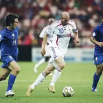
Aesthetically, Teamgeist’s most important details are the golden boarded ellipsis flattened in the middle used to separate each of the 14 panels. This curvilinear style was later rebranded as “8shape” and it was so much appreciated inside adidas that it was then introduced in all their football kits, starting from the jerseys realized for the 2006 World Cup. All the shirts created by adidas featured a bell on the chest, a bit flattened on the flanks before spreading in the final part. Among the adidas equipped teams at that World Cup, only Trinidad and Tobago did not wear a jersey inspired by Teamgeist. All the other teams used an “8shape” version created ad hoc based on the colors of the flag or the traditions of the country.
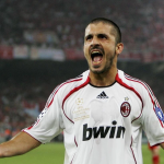
The success of these jerseys was so big that adidas decided to use the same pattern for their biggest teams at the time. For Real Madrid’s home jersey, they picked a black spinning with grey nuances. A more discreet approach for Chelsea, namely a thin white line for the home jersey and a blue one for the away. The pinnacle was reached during the Champions League’s final played in Athens in 2007 between two clubs, Liverpool and Milan, both sponsored by adidas and both with a customized version of the Teamgeist that evening: Liverpool played with their traditional red home jersey that featured a fine white edging, Milan with a white away jersey on which a black spinning overlapped red details.
“We realized that the beating heart of football, what connects players and fans, is represented at his best by one element, the most important: the ball. No ball, no football. That’s why we decided to add all the Teamgeist’s elements to all our new kits”, Rank said to explain what led adidas to turn a ball into their most beloved collection. So much so that in February 2022 adidas launched a new revisited version of Teamgeist, the only football kits’ collection entirely inspired by a ball.


