What it means to have a universal font like in the Premier League
A choice that goes far beyond ensuring that names and numbers are visible
March 30th, 2023
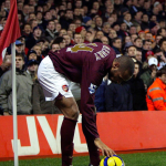
Premier League launched their latest league-wide kit font last week, but this strategy is about much more than making sure the names and numbers are clearly visible.Just as football shirts themselves have evolved over the years, so too has the use of numbers and namesets. Introduced to the sport in order to make the players distinguishable from one another, 1928 was the first time a team wore numbers on their shirts, when Arsenal numbered their jerseys from one to eleven depending on each player’s position on the pitch. The 1950 World Cup was the first FIFA tournament in which players had a number on their back, which could differ from one game to the next, but the 1954 edition brought in designated numbers assigned to each man for the duration of the tournament. It wasn’t until the 90s that club football began to adopt the rule of such fixed squad numbers, and it was in the same decade that the addition of the names above or below the number became the norm.
From the stitched on cotton numbers that were a hallmark of Ennerre’s craftsmanship in the 1980s, to the flock applications and sublimation of the 90s and 2000s, various techniques of applying these numeric identifiers have come and gone. The size and font of the letters and numbers often give a small glimpse into the general aesthetic of the time in which they were applied, with some prevalent trends now clearly visible when looking back through the archives. If you were to look through the back catalogue of Premier League seasons however, you would not see a lot of variety.
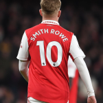
Last week, they revealed their new league-wide font to be used by all teams from next season onwards. It is the fourth different iteration since the first uniform Premier League typeface was introduced in 1997. The new look is not radically different from the last. Slightly larger digits, the namesets abandon the curved positioning that they held for the last 26 years and a tonal lighting bolt pattern is now visible within the numbers, and of course the PL logo incorporated into them has been enlarged. All of this supposedly with the aim of increasing legibility. Upon the reveal, many commenters online lamented the “one for all” approach as it leaves no room for individuality. The league-wide font is certainly practical in that it assures clear visibility for referees, spectators in the stands and tv viewers, but there is no denying that it’s not very expressive.
For the Premier League of course, it’s about more than just ensuring that everyone can clearly see what’s written on the back of the kits. The self-proclaimed “best league in the world” has significantly more financial might than its European counterparts and that is down to how well it has marketed itself over the past couple of decades. Their extremely lucrative tv broadcasting deals - that bring in so much revenue and allow PL clubs to pay over the odds for players and offer them salaries that they won’t receive elsewhere - give the league a wide global reach, with matches beamed around the world and viewed by millions. The Premier League’s official Instagram account has 65 million followers, more than any of the clubs who compete to become its champions. They have grown their brand incredibly well, and their league-branded signature fonts have surely played some small part in that.
Since 1997, every time a shot of a player’s back has appeared on a tv screen, been printed in a magazine or newspaper, or shared on social media, the brand has been visible. Each font used since then has had either a six or ten year cycle, plenty of time for them to become instantly recognisable and synonymous with the Premier League thanks to repeated viewing. Then there’s all of the player printed replica shirts that fans have bought in that time, making the font even more ubiquitous. The concept of visual identity is regularly mentioned these days, especially in relation to clubs redesigning their crest, and the Premier League recognised its significance well before the rest.
The English top flight was the first league to impose this specific stylistic restriction on all competing clubs, but most have since followed suit. Ligue 1 introduced their first league-wide typeface in 2014 and updated it in 2021, the same year that Serie A and La Liga began forcing all of their clubs to use a streamlined design. The Premier League have set the benchmark for the others to aspire to in terms of generating revenue, so implementing some of the same techniques should logically help bring about some similar results. But what about the loss of character and personality that comes with this specific rule?
Although none of them were exactly extravagant, the newest Premier League font is arguably the blandest yet. The names are perfectly horizontal, the letters have long since said goodbye to the gentle curvature and non-uniform thickness of the first edition, the slightly arched numbers are now also a thing of the past and any sharp corners have all been neatly squared off. The Serie A typeface is certainly more curvy in comparison, but again it's the uniformity across the board that makes it generic. A club’s jersey and colours represent their identity. Having the option of choosing or creating the typeface on the back provides a further outlet, albeit a small one, to convey that identity, or at least to complement the overall design and aesthetic of the kit. Conversely, the unified approach serves only to reinforce the brand image of the league rather than anything directly related to the club.
Arsenal used a gothic style font for their non-PL games in the 20-21 season that referenced their previous club crest. In the 18-19 season, Lazio’s famous 80s throwback shirt was matched by a blocky typeface that helped further recreate the look of that era. These kinds of details let the club fully stamp their mark on their kits, something usually aided by the placement of their crest at the base of the numbers. Serie A allows this practice but when playing league games in England, in place of the club badge is a lion’s head, a constant reminder that you’re not just watching Arsenal or Manchester United, you’re watching the Premier League.


