Are we going too far with the special jerseys?
In the ever-expanding landscape of football shirts, one particular type is exploited more than others
January 31st, 2023
The insatiable desire for profits has long since usurped the initial purpose of third kits (to provide an extra option in case of a colour clash, if you were wondering) and it has also led to the increasingly frequent launch of special edition kits, sometimes labelled as fourth shirts. These can arrive at any point of the season, are usually commemorative in nature and generally make just one appearance on the pitch. A centenary would be a classic example of something considered worthy of a limited edition release, marking a major milestone for the club. Fair enough, it's a big moment and a beautifully round number, so why not give the fans a wearable piece of club history while celebrating it at the same time?
Unfortunately for marketing departments, centenaries only come around once in a lifetime, so in order to peddle more merchandise, other noteworthy occasions must be dreamt up. There have been plenty of good looking special edition shirts, but aesthetic quality alone does not justify their existence. With their raison d'être in mind, here are some of the most dubious offerings we’ve seen.
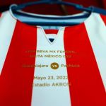
Least Deserving Anniversary: Chivas Guadalajara 2022
Mexican club Chivas de Guadalajara released their first ever special edition shirt in 2006 to mark their centenary, a perfectly reasonable and acceptable cause for festivity. They developed a taste for it after their first one, going on to release several more special kits in the following years that were seemingly just retro-inspired designs with no particular motive. They had no designated third kit in those years, so the special shirts brought their total each season up to a reasonable three. 110 and 115 year anniversary editions followed, creeping further into unnecessary territory, but they saved the most tenuous reason for 2022. Chivas were feeling the itch for another anniversary shirt, so the “20 years of ownership by the Vergara family” kit was born. A nice looking jersey, but very self indulgent on the part of the Vergaras.
Most Exploitative: Atlético Madrid 2021-22
On the topic of anniversaries, it goes without saying that the only ones worth making a big deal of are those in multiples of 25. The 75 printed on the centre of this Atlético shirt from last season is not a reference to the club’s foundation, but the number of years since they changed their name from Club Atlético-Aviación to Club Atlético de Madrid. Not the most convincing cause for celebration, and the design here leaves a lot to be desired too. It was essentially a plain red shirt, yet it sold out in no time. The explanation for the supporter’s haste in snapping up the uninspiring jersey was simple; it featured the much-loved previous version of the club crest. Atlético updated their badge in 2017 without consulting the fans and the tensions created by the change still linger almost six years later. Many Atléti fans reportedly refuse to buy new club merchandise as a way of boycotting the new crest, so this special edition gave them the chance to refresh their matchday wardrobe without compromising their position.
Guiltiest Party: Napoli
The 13 point gap between Napoli and the rest of Serie A shows how good they are this season. It also mirrors how far ahead of everyone else they are when it comes to releasing unnecessary shirts. Since EA7 entered the fray, they’ve been churning out jersey after jersey with zero regard for what constitutes cause for celebration. The relationship between the club, the city of Naples and Diego Maradona transcends sport and could probably have excused the multiple Maradona tribute jerseys last season, were it not for all of the other offences. Their most flagrant cash grabs have come in the form of holiday releases: two Halloween shirts, the recent lipstick-marked Valentine’s day jersey, and of course the shameless Christmas kit, apparently designed by combining the first few results of a Google image search.
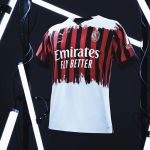
Worst Received: AC Milan 2021-22
This one came as a surprise to everyone, both because there were no announcements or rumours in advance of its launch, and also because of how it looked. PUMA collaborated with Italian brand Nemen for this whitewash design that attracted a lot of attention. Part of Nemen’s manifesto is “Re-directing styles from their typical manifestations towards new aesthetics and applications,” and it's hard to argue that they didn’t do that with this Milan kit. It could be described as revolutionary as its visual design was completely different from anything else out there, but the positive connotations of that word don’t exactly fit the level of the aesthetic appeal here. “Experimental” is a more neutral term so may be more appropriate, although experimentation doesn’t quite cut the mustard as far as motives go.
Most Controversial: Boca Juniors 2005
For their centenary in 2005, Nike created a set of special shirts for Boca Juniors based on specific seasons throughout the club’s first 100 years in existence. There was a nice 80s style jersey similar to what Maradona wore in his pomp, as well as a much more retro callback complete with drawstring collar. One jersey in particular raised more than a few eyebrows however, thanks to its yellow sash. The sash is of course most strongly associated with their eternal rivals, River Plate, but Boca actually sported the look first in their early years before settling on their trademark chest band in 1913. This led to confusion amongst the uninitiated when Boca took to the pitch in what was interpreted by many as a copycat version of River’s shirt. Even those who knew their history were unhappy about their team wearing a shirt that resembled the strip of their enemy. The historical significance was there, but this particular aesthetic was definitely more symbolic of River Plate on first sight.


