8 jerseys from this season very similar to previous one's
Some of this season's kits closely resemble others from past years
November 2nd, 2022
The current season has been, for many game jersey designers, one of a strong return to tradition with various templates related to the history of the various clubs. However, ideas and originality do not always support the kits creation, and in the now out-of-control number even creativity often has to lean on homages, references and quotations that can make templates for different teams look very similar to one another. In past years it has happened on more than one occasion that a sports brand designed uniforms that closely resembled others from the past, and even this year in some respects there has been no shortage of duplication.
Such is the case with Bayern Munich, with adidas designing a total white Away jersey that cannot but bring to mind the classic and iconic Real Madrid uniform and especially the one from the 2019-2020 season, which as well as the Bavarians' current one features gold inserts. Also creating some controversy was Fiorentina's new away jersey by Kappa, which is white with a large purple V positioned below the club and sponsor logos. In Brescia, someone have cried plagiarism for the kit that closely resembles the classic Rondinelle's inverted stagger, brought back just this season in vogue by Kappa, but also the Velez Sarsfield one in Argentina.
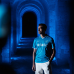
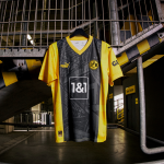
The psychedelic tone of Liverpool's Away jersey, on the other hand, harks back to the world of video games; in particular, to the special jersey that was designed for Juventus for a online event on FIFA 19. In this case, the laminated randomization of the Nike's jersey takes on a cold, digital tone, combining English rave culture with the LEDs of gamers' screens. Haaland's move from Borussia Dortmund to Manchester City appears not to be the only link between the two clubs. In fact, this year's yellow home shirt with black vertical stripes closely resembles the Citizens' away shirt in the '98-'99 with the only difference being a more fluorescent yellow and some light blue inserts for the latter. While in Serie A it is the just presented Inter third kit, yellow with light blue and black sleeve and collar borders, that brings to mind that of Napoli in the 2011-2012 season, although in this case the uniform seems to be more successful than its original.
Also falling to the temptation of plagiarism is a national team. In fact, for Germany, ahead of the World Cup in Qatar now just around the corner, adidas presented a jersey that in design, but not in color, is very reminiscent of Ajax's home; white on the sides and with a large colored band in the middle, red for the Dutch and black in this case for the German selection. Umbro for West Ham's third kit also seems to take inspiration from a concept seen recently: the orange flames on a white background recall those of Atletico Madrid's away uniform in the 2021-2022 season. Finally, two similar jerseys from each other but both from this 2022, starring Bayern Munich again with the special edition dedicated to Oktoberfest in dark red. What other uniform does it resemble? Norwich's 2022 away one, in the same hue and with gold inserts. Then again, after a while, templates, colors and designers' imagination sometimes run out.


