The 10 best jerseys from the rest of the world
Some of those you probably missed
September 8th, 2022
After ranking the best jerseys of the season in the Premier League and Serie A, today we are going to discover all those passed over in silence. Jerseys from clubs that are not emblazoned, not used to writing their name every year in the roll of honor of the biggest competitions but that still manage to stand out among the others for their aesthetic choices. From Malaga via Brondby to Stuttgart, all those teams that cannot count on pharaonic sponsorships or the full attention of brands, but nevertheless have been able to make the most of one of their most important assets: the football jersey.
Stuttgart Away - Jako
Stuttgart's second jersey is a time machine that takes the German Rossoneri back to the 1997/98 and 1998/99 seasons, when Krassimir Balakov, Fredi Bobic and Frank Verlaat played in the team's ranks. Identifiable from that period are the white jersey collar with black and red details and the narrow horizontal stripes in the same colors broken up by a central one in white overlaid with the sponsor's logo.
Brondby Away - Hummel
The Danish team opted for an attractive second jersey, creating a complex design that covers the entire jersey by superimposing various graffiti dedicated to the club. But the added touch to an already highly sought-after jersey are the game names and numbers, for which a font inspired from tags on walls was used.
Coventry City Third - Hummel
Danish brand Hummel has also produced kits for Coventry City, which plays in the Premiership, including a stunning third jersey dedicated to the city's most famous monument, the Cathedral. In fact, the jersey features a design on the front that echoes the stained glass window behind the baptistery with its hundreds of colored tiles from red to green to yellow.
Celtic Home - adidas
The Glasgow Catholic team's jersey always remains one of the most iconic in European football with its green and white horizontal stripes. For this season adidas did not distort the original design of course, but added a tone-on-tone lozenge movement in the green bands and used the metallic gray three stripes on the shoulders.
As Monaco Third - Kappa
For the Monaco club Kappa has proposed a color never seen before in the Principality, a lavender purple that characterizes the third kit and where the classic cross band here is replaced by a black grid that divides the jersey in two. A novelty that will surely find its admirers and detractors but refreshes a traditional pattern.
St. Mirren Away - Joma
Less well known is perhaps St. Mirren, the Paisley-based team that plays in Scotland's top division. And it is the name of the city, which has historically been associated with the famous ornamental pattern of Persian origin, that inspired the pattern of the new jersey, which precisely uses the Paisley in white on a black background in a manner mirroring what Manchester City did in the 2020/21 season.
Pau FC Away - PUMA
A year of big changes for the team from the small town in the French Pyrenees, which as of this season has a new technical sponsor, PUMA, and a new corporate logo, thus revolutionizing its visual identity. To crown it all come the jerseys for next season, which in the two home-and-away versions reverse the blue&yellow colors that divide the front in three large horizontal blocks, almost an homage to the iconic Boca Juniors jersey.
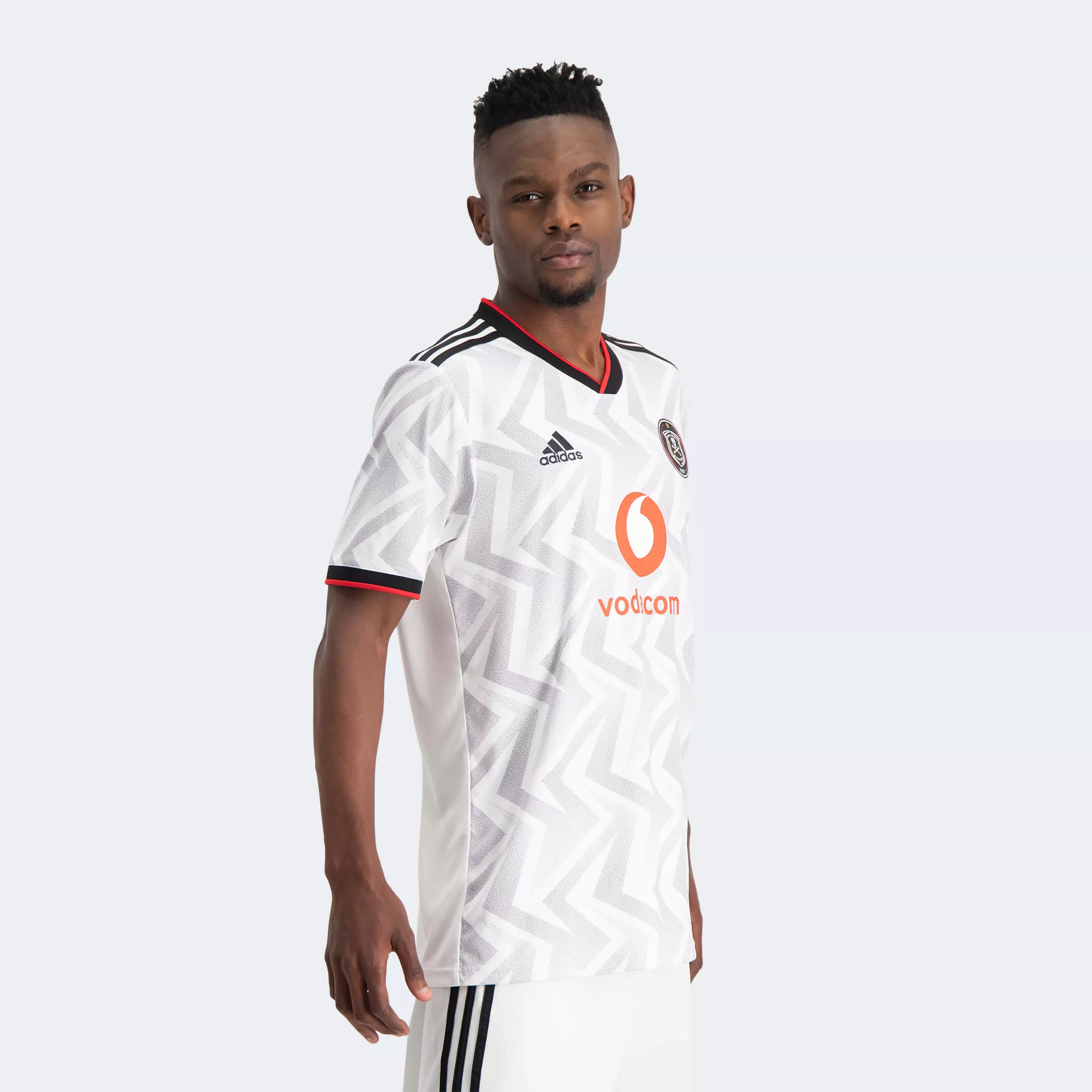
Orlando Pirates Away - adidas
The Johannesburg team has a now nearly 30-year relationship with adidas, which over the years has produced highly successful jerseys igniting the rivalry with the South African capital's other team, the Kaizer Chiefs instead sponsored by Nike. For the current season adidas has designed a gray and white away jersey with a pattern similar to that also used for Benfica, but with details in red and black, the social colors of the capital club.
Malaga Fc Away - Hummel
More than eighty years ago a rose garden was planted next to Malaga's stadium, so much so that the new facility was named La Rosaleda. Now that that nursery is long gone, Hummel has decided to revive those flowers now settled in the club's history on this season's away jersey, which features precisely a rose garden in dark red with an effect that hints at the horizontal stripes that characterize the first jersey.
Lorient Home - Umbro
For its first season on Lorient's jerseys, Umbro decided not to leave anything for granted by making some very fascinating concepts for the French club. While the second jersey is inspired by sea waves and the third by sandy beaches, the first one is a tribute to the team's history when it won the French Cup 20 years ago.


