The return of the historic Ajax logo
Revealed with the new adidas jersey for the 2021-22 season
July 14th, 2021
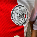
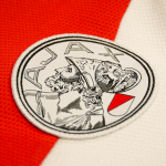
After launching the away kit or 2021-22 in the last days of last season, Ajax and adidas presented the Dutch team's first kit. No particular aesthetic revolution in the design of the shirt, with the exception of the return to the club logo introduced in 1928 and replaced at the beginning of the 1992 season. The tradition and elegance of Ajax's home kit - never significantly changed compared to to the very first versions - keeps the central band in "collegiate red", but it is the details that give new life to the kit. The logo is the element that most of all attracts attention, creating a decidedly suggestive contrast between ancient and modern. The symbol represents the head of Ajax Telamon, drawn with eleven strokes in the version used since 1992 to represent the eleven players on the pitch. The stylized style of the last 28 years has been replaced by the logo made in woodcut which creates a very different effect.
Also particular is the adidas crest which, in the red part of the central band, maintains a white border. Another detail that does not go unnoticed by the fans of the Lancers of Amsterdam is the width of the iconic band, smaller than the latest versions with the edges that coincide with the width of the collar. Ajax's new jersey also indirectly revealed the special badge the Eredivisie created for its 65th anniversary - in addition to the new logo that has already been made official.
Legends of the club such as Marco Van Basten, Sjaak Swart and Frank Rijkaard were involved in the launch campaign of the shirt, representing points of connection between Ajax's glorious past (three have won four Champions League championships with the Dutch) and the future personified. by three children with somatic features similar to those of the three champions.


