Marseille presented their shirt away with a ''wrong'' color
When photo filters make the difference
June 17th, 2020
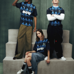
Last week Olympique de Marseille presented its new Puma shirts for the 2020/2021 season, with images of its most representative player, Dimitri Payet, who have traveled around the world thanks to a respectable shooting and of a shirt - the away one - as impactful as it is creative: in fact there is no standard design or pattern but, scattered throughout the jersey, there is the ''comic'' style design of the Phocean City which is inspired by the unmistakable neighborhoods and multicultural cultures of Marseille.
So far nothing strange, except that when the German brand published the official photos of the French shirt on its e-commerce, it seemed that there were two ''away'' versions.
This is because Puma used very heavy photographic filters in post production to make the Marseille shirt more ''clearer'' than it is in reality: in fact if in the photos of the shooting we see a blue shirt in water, in still life photos the jacket becomes almost navy blue, with the contrasts between the logos, the collar and the fabric much less evident than in the first version seen.
The difference between the two shirts is so clear that some kit experts like Phil Delves have been led to think that the one published on the Puma website was even the third kit.
Photo editing is important.
I love the new Marseille away shirt, but when comparing the shoot and retail pictures I might as well be looking at an away and third kit.
Nevertheless, the jerseys that have already appeared in the physical stores are faithful to the darker version, which is why we should not expect further changes to the kit by Marseille.


