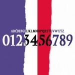
The 10 ugliest fonts in the A series in the 10s
How to ruin a jersey in a few moves
May 15th, 2020
The importance that soccer jerseys have assumed in recent years - both for reasons of collecting, and as regards the combination of football / fashion - is now clear and it is also for these reasons that the technical sponsors are trying to make each shirt recognizable produced for clubs. One of the ways to make each jersey ''unique'', as well as a reason for debate among football-nerds, is the use of a precise and studied font, used both for the characters that make up the name of the player and for the numbers of the shirt number.
From next year also in Italy - as well as in Premier, Liga and MLS - the teams of our championship will apply a standardized font on their shirts, a solution that will not allow technical sponsors to dare - or at least not at all, since the our teams will still be able to use custom fonts for European competitions - but which will give a visual sense of greater presence on the part of the League. Furthermore, this choice will avoid the danger of reviewing some of the most questionable fonts seen in recent years, difficult to digest due to the poor readability, the style of the font, the color choice, the heterogeneity they showed compared to the style of the shirt or the combination of these factors. These are fonts that can risk complicating the sale of what is the main scope of a club's merchandising.
Palermo '12/'13
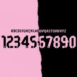
The rosanero moved in 2012 from Legea to Puma signing an important agreement that would ennoble the image of the provincials of Italian football, back from a couple of negative seasons. The font used for this two-year period - which was also chosen for important clubs such as Borussia Dortmund - tries to appear modern, however, proving to be only angular.
Napoli '13/'14
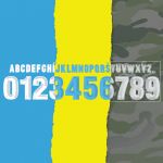
The Neapolitans in recent years have accustomed us to original choices for the style of the shirts and fonts used in them. In 2013/2014 the chosen font is very square, Sans Serif, and is characterized by the presence of some darker bands inside, aimed at providing a sense of three-dimensionality to the writings. A style that does not go well with the design of the various jerseys of that season, especially with the then much discussed camouflage jersey.
Chievo Verona '15/'16
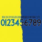
The font chosen by Givova for this edition of the Gialloblù shirt is an excessively graceful Gothic, which makes it even more difficult to read the names. A style that should recall that used to write ChievoVerona in the coat of arms of the clivense shirt which is only excessively complicated.
Sampdoria '16/'17
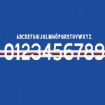
The choice of a very regular Sans Serif font is not necessarily to be evaluated negatively. In a celebratory shirt like the one for the club's 70th year sported by the Sampdoria '16 / '17, it is consistent with the design and style of the jersey. In this case it is the absence of the edges that creates problems: the entirely white numbers intersect with the horizontal lines of the shirt thus becoming difficult to read. Sometimes even those who design uniforms for the "most beautiful club jersey in the world" can be wrong.
Milan '17/'18
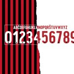
After 3 seasons where the ''Milan'' font had been used at the behest of Barbara Berlusconi - the one with which Casa Milan is branded to be clear -, the Rossoneri opt for a revolutionary but not as convincing restyling: the names and numbers return to be borderless taking inspiration from the characters of the late 80s, a pity that there is no homogeneity of size between the names (too small) and the numbers (too large).
Inter '16/'17
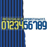
It is probably the concentric circles of the shirt that do not honor the font: since the beginning of the collaboration with Nike, Inter had always accustomed us to classic looks, and then presented at the beginning of the '16 / '17 season a kit with so much yellow tending to fluo, that it would not even have bothered so much if it hadn't been repeated everywhere on the back; that year, in fact, the back of the Nerazzurri jersey had a name, a (huge) number and the sponsor Driver. Exaggerated.
Lazio '08/'10
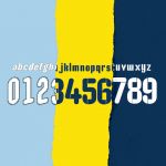
In this two-year period Lazio has used a very rounded character on its shirts which will however become difficult to read and tacky if mixed with the shirt numbers. In addition, on the first shirt the names become almost illegible because the black outline is too thin.
Udinese '12/'13
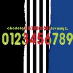
A set of wrong choices: the lettering in Debussy Regular is not particularly readable on a striped shirt, plus you put a juxtaposition of colors to what is questionable; on the - ugly - wave of the Juventus 2007/2008 shirt, the color of the font used on the black white lines is red, while on the second and third jerseys a dull fluorescent yellow is chosen. Avoidable.
Fiorentina '12/'13
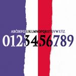
The font chosen this time is an Old Letterpress Type Regular, which would also look good if the proportion between the numbers and the lettering were more consistent. Instead, huge numbers come out and a little too ''squashed'' compared to the rather classic letters that - in the away version in red and white - do not even have a beautiful effect. Joma has distinguished itself over time for a series of minimal but elegant fonts, taking a few missteps in the design of the jerseys of the provincial teams.
Novara '15/'16
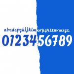
The character chosen for the '15/'16 season is a lowercase gothic look that becomes unrecognizable on the shirts, not a very intelligent choice for a group of players who grew up in the lower series and not known by the general public. This font has shown once again how difficult it is to find the right font to use in lowercase.


