.jpg)
UC Sampdoria: rebranding operation
The nss graphic project that renews the Italian teams, start from Genoa and its symbols
February 19th, 2019
Disclaimer: this project was not carried out in collaboration with the Unione Calcio Sampdoria club but is exclusively the result of the imagination of nss sports.
The graphic identity of many Serie A teams describes the common un-progressive attitude. What is needed is a decisive rebranding action, to rejuvenate and bring clubs to new chapters of their own history.
nss sports has thus decided to entrust to different graphic designers the task of giving a new image to Italian teams. It is not easy to explain to fans that the crest of their team leaves a lot to be desired in terms of beauty and style, but we tried, despite the task was not easy. It is legitimate, even for the most faithful fan, to think that we can do more, without upsetting the story or disrespecting anyone. The first club to undergo the beauty treatment is UC Sampdoria, and the creative studio that has been entrusted with the project is Heygraphic, specialized in illustrations, like those of the sneaker zoo we told you about.
Rebranding is a strategy of renewing one's own external image, a way to relaunch the brand in the market and reach a new slice of the public. In Italy, the latest in order of time to focus on rebranding was FC Juventus, which, since the 2017/2018 season, has transformed the oval crest into an essential and very effective logotype.

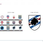
We agree that UC Sampdoria's jersey is among the most beautiful and characteristic in football, but we can not say the same thing for the crest, a classic shield and not original in the inner elements.
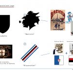
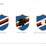
The project starts from that confused shape placed at the center of the shield, as incomprehensible as it is able to summarize the history of the city in its essence. It is the Baciccia, typical Genoese fisherman, stylized with hat, pipe, beard and hair in the wind, also diminutive of John the Baptist, the patron saint of the city. The new Samp could only start from the port and its symbolism, for centuries a true element that makes the Ligurian capital a unique city in the world.
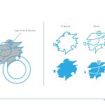
Heygraphic has thus decided to isolate that subject, inserted in the crest of the "blucerchiati" since 1971, making it more understandable thanks to the addition of only two lines: that of the hat and that of the beard. The general outline has been geometrized, while the only addition is the crossed crest placed on the hat, symbol of the city and also present in the center of the jersey. The direction in which the project is moving is modernity and the possibility of adopting a more versatile form also to merchandising. In this direction goes the proposal of the Baciccia with the tattoo on the neck, dynamic and modern as the logos of the American sports franchises, but faithful to the history of UC Sampdoria.
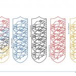
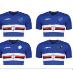
The supporters can see all the symbols of the club respected, highlighted or enhanced by a new study of the color palette. Do not abandon the red, blue, black and white, combined with gold, which surrounds the elements as a sign of prestige of the club. The attention to colors does not take second place, for this reason they were made by Heygraphic 3 versions in which the "new" Baciccia is superimposed on the blucerchiata band, a unique symbol of the union of Sampierdarenese (red and black) and Andrea Doria (white and blue), which took place in 1946.
Disclaimer: this project was not carried out in collaboration with the Unione Calcio Sampdoria club but is exclusively the result of the imagination of nss sports.


.png)


.jpg)


