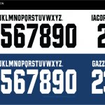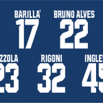
Parma Calcio font 2018-19
Designed by Erreà
September 25th, 2018
Parma is one of those Italian teams hard to hate: maybe it's cause of the coolness of the shirt, the baggy nostalgia or just how pleasant it is to make a trip to Tardini. In few words - removed the rival teams and supporters - it's very difficult to deeply hate Parma.
This season is also the year of the great return in Serie A with a dignified team that aims for a safe salvation and a jersey that has been appreciated all over Europe. A gem of the new shirt designed by Erreà is the custom font for I Crociati. The characters are bold with aggressive cuts inside the numbers, the color is black on the home shirt, white on the away one and on the third kit. The Parma font is one of the most interesting in Serie A along with those of Lazio, Inter and Juventus.


