Pantone's fake feminist move with 'Period Red' A shade that is supposed to break the stigma around women's period
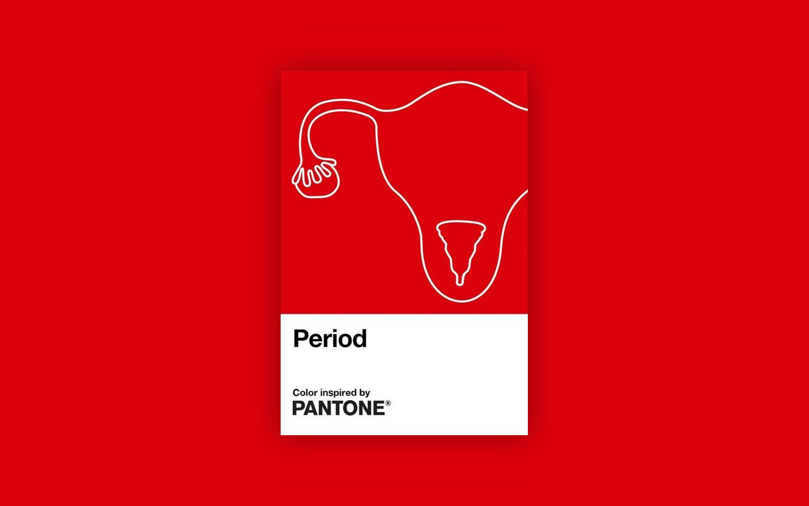
A couple of days ago Pantone, the colour registry company, released a new shade with an unmistakable name: Period Red. It is precisely the red shade that should represent the menstrual cycle, a creation created in partnership with Intimina, a Swedish brand of feminine products, as part of the Seen+Heard campaign. Pantone immediately underlined its good intentions, defining the operation as a way to raise public awareness - without distinction of gender - on a topic still considered taboo in many countries. Laurie Pressman, vice president of the Pantone Color Institute, said that the collaboration was born with the aim of encouraging everyone, men and women, to feel comfortable speaking freely and openly about this body function, so pure and natural.
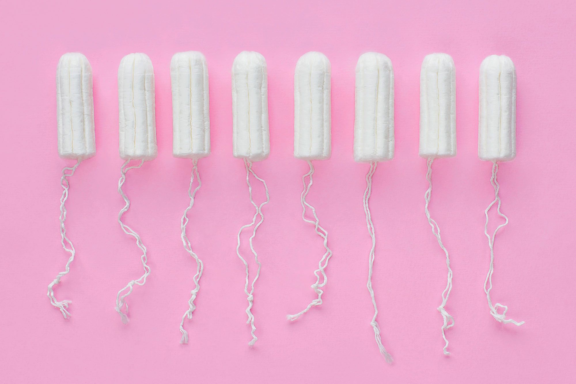
There is certainly legitimacy in this project, if only because the period affects a woman on average for 2,535 days of her life, and it still remains a topic rarely discussed in public debate. To be discussed, to be fair, there wouldn't be much, it would be enough to acknowledge the period's existence, the discomfort that comes with it, the symptoms - without turning them into excuses behind which to hide, or worse, misogynistic expressions to address the phenomenon - and above all the enormous taxation which, for example in Italy, is applied to products such as pads and tampons, real luxury goods.
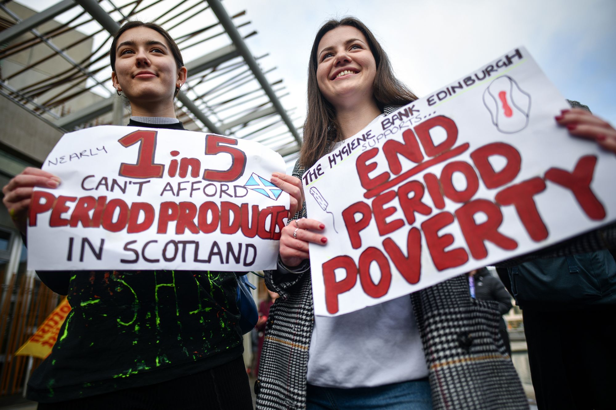
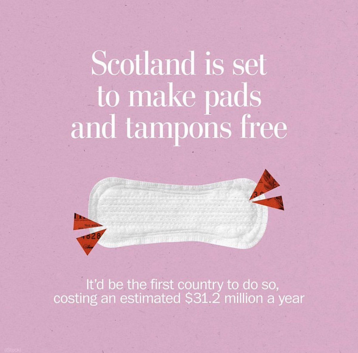
It is still very high the number of countries where not only girls have to suffer discrimination in their period days or are forced to skip school, removed from the family home because considered impure, or that still do not have the economic means to be able to afford sanitary pads. Nevertheless, steps in the right direction have been taken. Scotland, for example, was the first country to provide free sanitary pads in schools, colleges and universities in 2018, followed a couple of years later by the UK.
As always when it comes to this type of topics, the reactions to this campaign have been mixed, between those who see it as a revolution and those who accuse Pantone of not having the courage to openly address women, in times when gender fluidity is manna for business. Pantone's gimmick, however, has nothing revolutionary. First of all, because that nuance is yet another sweetened and stylized representation of the period - more than a step forward is yet another mystification of the phenomenon, rarely framed in its real features. And also, how should this image encourage debate on the issue, or helping to break the barriers that generate bias and prejudices? The project, born with the sole objective of becoming viral, is rather part of a form of feminism, if it can still be called that, which lives a lot (and only) on social media, living off pre-packaged claims and battles of questionable relevance. Feminism that thrives on momentary indignation and volatile claims, which has recognized the new Pantone colour as a great achievement, and not as the final proof that no progress has been made, quite the opposite. Smoke and mirrors that Pantone, a marketing genius, has created specifically for those social people. But who exactly does this battle belong to, who is it talking to, who should fight it? This is not clear.


