The new Netflix's animated graphic And the message behind the multicolor effect
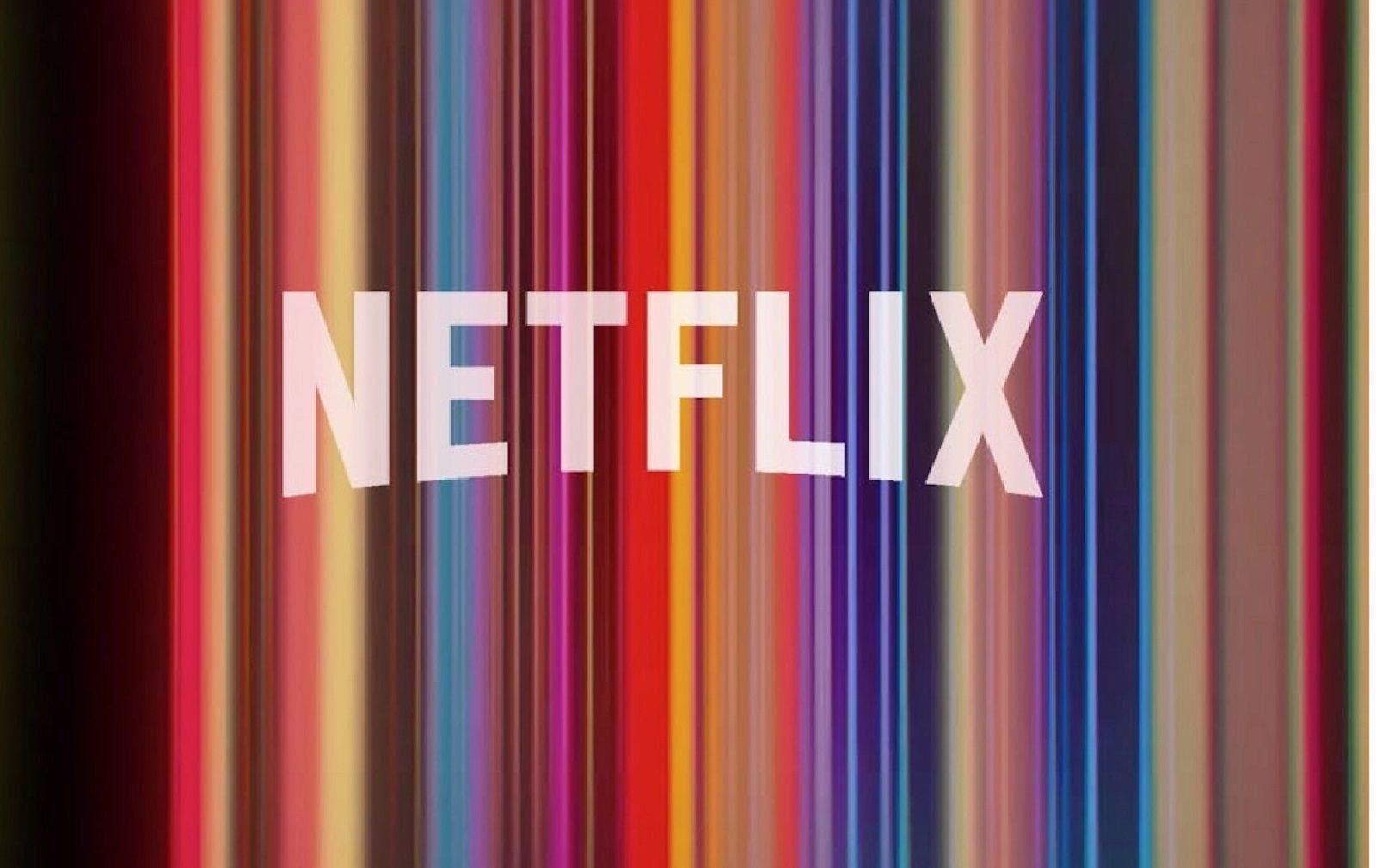
If you've used the famous streaming service these days, you've probably already noticed it: the animation that accompanies the beginning of Netflix original productions has changed. From Friday 1 February, before seeing a film or a series produced by Reed Hastings platform will appear a new animated graphics instead of the one with the characteristic red N. The background sound remains the same, but now an increasingly invasive zoom shows us the logo dissolving in a series of vertical multicolored lines that, to a closer look, we discover to be actually the frame of a movie or TV series produced by Netflix.
A symbolic choice as the company explains via Twitter:
"SOME PERSONAL NEWS: starting from today there is a new animation of the logo before our original content: the new design has been designed to show the spectrum of diversity that distinguishes the stories, languages, fans and creators that make it so beautiful and unique Netflix."
It seems that to realize this last graphic project created in collaboration between the internal design team and an independent agency took 2 years. This is the third time that the streaming giant changes logo: in 2014 it had eliminated the shading from the white writing with an arched effect, while in 2016 it had opted for the only letter "N", narrower to better fit the smartphone screens and tablet. Who knows if it has this graphic renewal will also correspond to some other new, interesting project.


