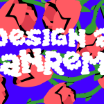
Sanremo's visual identity analysed by Caffè Design
The creative trio collabs with nss to review Festival's artistic choices

February 10th, 2023
Sanremo is not only about music, it is also about fashion and entertainment. While the nss editorial staff analyses the best looks of each evening, also exhuming those of past editions - which we might want to forget - the Caffé Design team reviews from their 'little bar in the Internet' the visual aspect of this festival, from the graphics to the choice of stage. In a collaboration conceived ad HOC for design enthusiasts, Caffè Design will post a video summary of each Sanremo evening on Instagram and TikTok every day until next Sunday, analysing everything that works - or doesn't go - about the Festival through the trio's expert eye.
The first subject analysed by the trio was the stage, in astrolabe style with a curtain, which for the team is consistent with the Festival's visual identity. Designed by Gaetano Castelli, the historical set designer of Sanremo stages, this year's was designed according to the specific requests of Amadeus. The dome is new, a clear reference to the Pantheon that floats above the stage to illuminate the most interesting moments with optical effects. However, the very rich and impressive set design is not well framed by digital visuals, considered by the trio to be too similar to those of an amusement arcade. According to Caffè Design's advice, inspired by foreign stages such as those at the last Oscars, the graphics should move away from the futuristic 1980s look, in favour of more natural lines and materials.
Also criticised were the 'circles' presenting the singles in the competition, which for the umpteenth year were also reintroduced by the Sanremo team in the graphics of the temporary classification, and that for the trio have an essence a bit too generic. After the second evening, the main theme of Caffè Design's analysis shifted from the stage to the Festival logo. In the video, it is explained that although there is good potential, the overall visual identity has some shortcomings, starting with the title. The logotype, Garbata by Zetafonts, is highly appreciated by the team, but its retro soul does not fit in well with the futuristic 'key visuals', such as the 'waves', an element that has been repeated for several years in the latest editions of the Festival, and the gradient shades of purple. These two concepts, being at antitheses, are disconnected, even though together they form one of the boldest looks of the last kermesses.Caffè Design's last analysis looked at commercials, this year more original than usual, and the album covers of the competing artists, a category judged on the trio also on Youtube that according to the team of graphic designers was won hands down by the Cugini di Campagna, who chose a witty caricature designed by Riccardo Mazzoli. Café Design's favourite adverts included Spotify's simple and 'relatable' one, Netflix's subtlety that closes with 'Coming soon, but not this week', and BMW's contemporary concept. The trio were also taken aback by the Regione Molise ad, which with orchestral music and powerful vocals highlighted very striking images. They were not equally taken aback by the one dedicated to Regione Liguria, which although it was built on a nice idea, for the team it was hardly understandable.


.webp)


.jpg)


