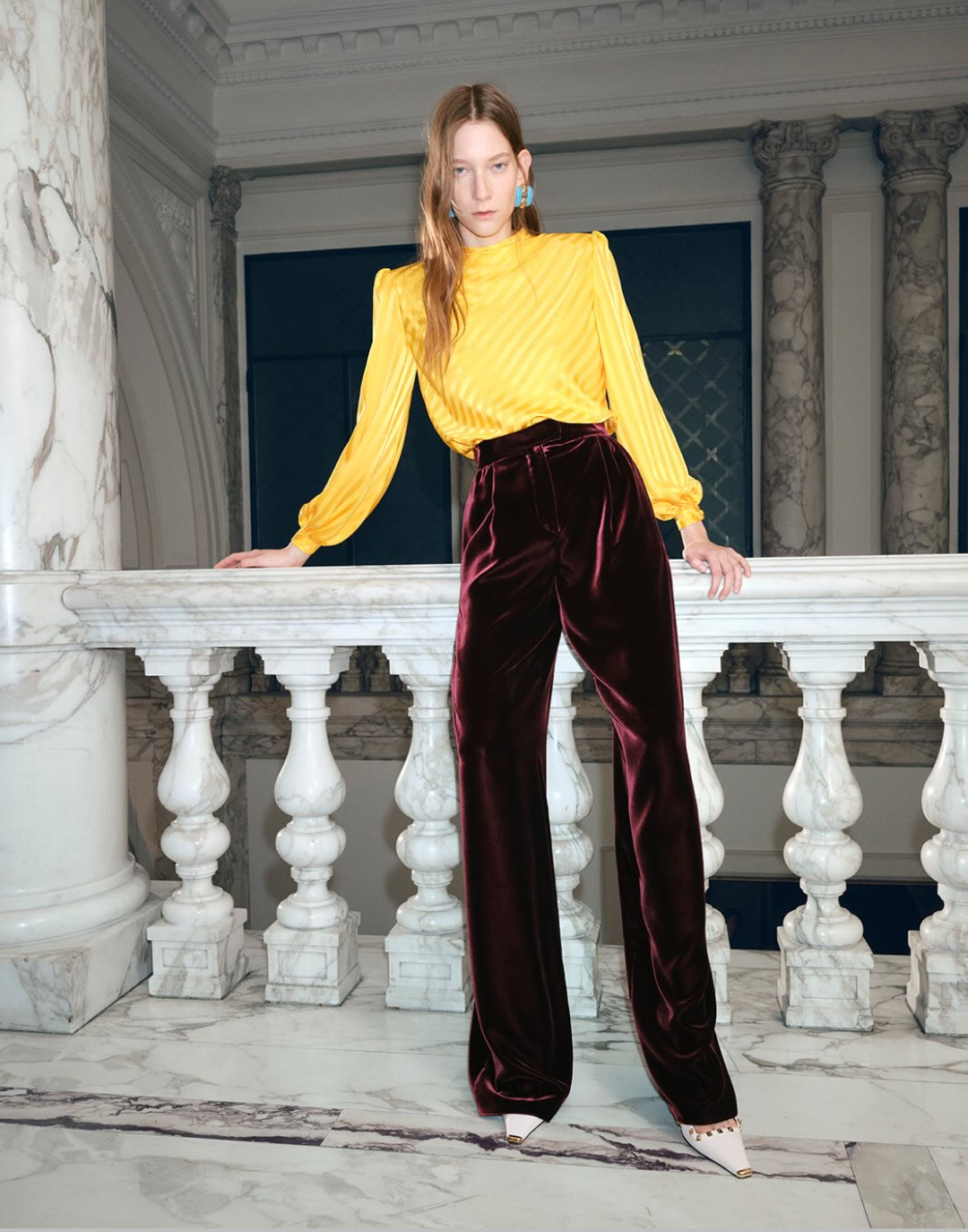


The history of iconic fashion logos When graphic design, visual art and fashion mix and mingle
Logos first appeared in 1440, with the beginnings of printing, initially serving to differentiate and recognize various authors and printers of the time. The very first logo created for advertising, however, came much later in 1886, by Coca Cola. Their purpose took a turn in 1914, not only promoting a brand but also identifying a group of people and activities, as Pierre de Coubertin created the first Olympic pictograms. But what interests us isn't soda or sports, but fashion. In 1815, it was Louis Vuitton (or rather his descendants) who brought this small emblem to the spotlight within the luxury and fashion sphere.
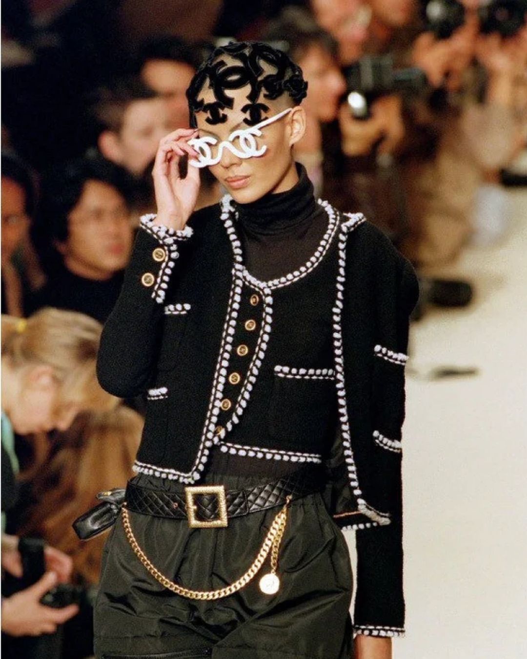
Whether on bags, jackets, belts, even AirPods cases, backpacks, or yoga mats, the Louis Vuitton Monogram is now ubiquitous, displayed in all shapes and colors. Yet, this wasn’t always the case. Initially, the French house was recognized by the checkerboard canvas created in 1896, always in chocolate tones, which was unfortunately easy to replicate. To prevent this widespread piracy, Georges Vuitton, son of Louis Vuitton, created a geometric canvas covered with his father's initials, thus pioneering Vuitton's branding. This idea was quickly adopted by the Chanel House with its double C logo. While it's easy to guess that it represents Coco Chanel’s initials (the nickname of the brand’s founder, Gabrielle Bonheur Chanel), an important historical detail should be mentioned: the interlocking Cs design actually comes from Queen Catherine de Medici, or rather her castle and its stones engraved with her intertwined initials. Today, these two logos are said to be the most copied in the world.
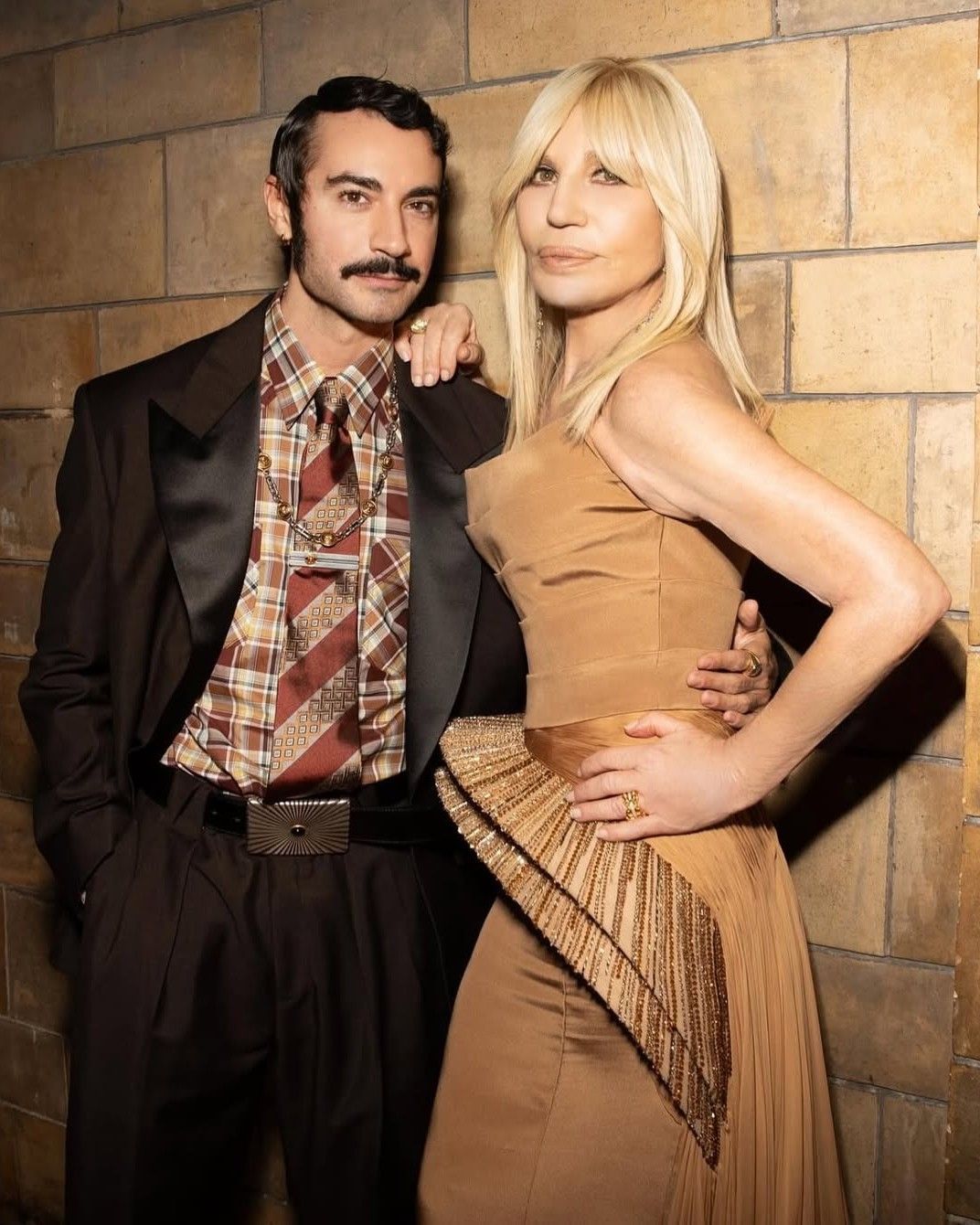
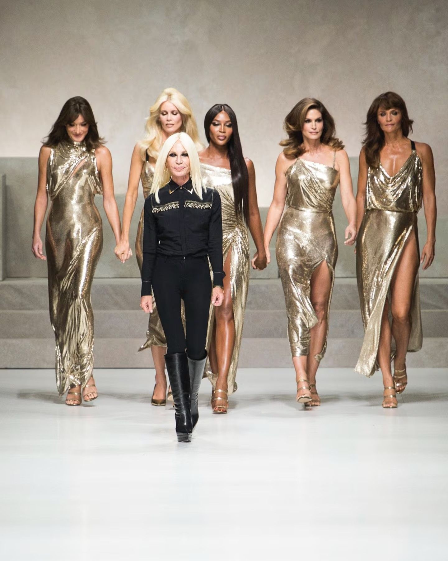
As for Saint Laurent, he asked for the help of the Franco-Ukrainian painter A. M. Cassandre who designed its logo in 1961, where the three letters composing its name intertwine in a simple yet effective design. But let’s leave France for a moment and head to Italy, which is far from being outdone when it comes to logo design. If the first logo by Versace in 1978 simply bore the name of its creator, Gianni Versace - tragically murdered in front of his Miami villa in 1997, leaving the brand to his sister Donatella who still leads it - it underwent later on a total makeover. Introduced in 1993, a drawing of the Medusa goddess now represents the brand, reflecting Gianni Versace’s passion for mythology and a desire to convey authority and charm through his creations. As for Fendi, we owe its logo to Karl Lagerfeld, who supposedly sketched the iconic double F on a napkin when he joined the brand as artistic director in the 1960s. The logo’s real impact on clients and fashion enthusiasts came in the late 90s, with the Baguette bag’s 1997 launch.
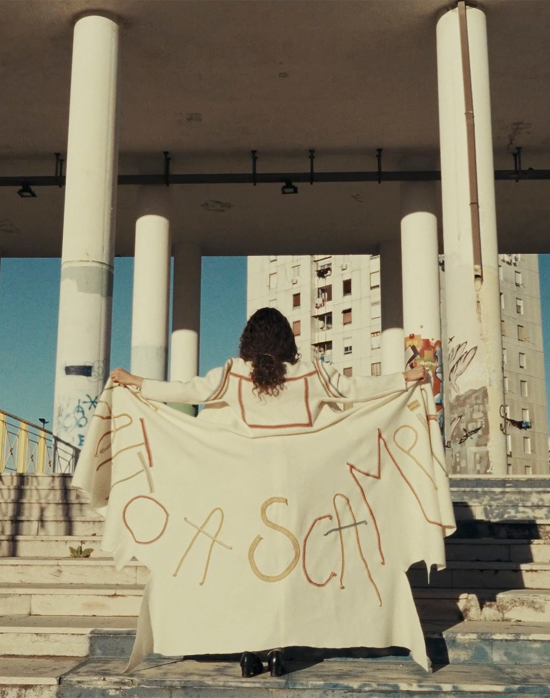
If logos were once used in a fight against counterfeiting, a cause championed by designers like Coco Chanel and Madeleine Vionnet, who in 1921 created the Association for the Defense of the Plastic and Applied Arts, their purpose today is primarily aesthetic and distinctive, forming in spite of himself an exclusive, closed community. An idea completely rejected by some fashion houses, like Maison Margiela, who rejected this interpretation of fashion by eliminating logos altogether in 1989. In a contrasting approach, other more recently famous brands like Jacquemus have made their name a logo. But what about the logos of the brands that helped define these emblems’ history?
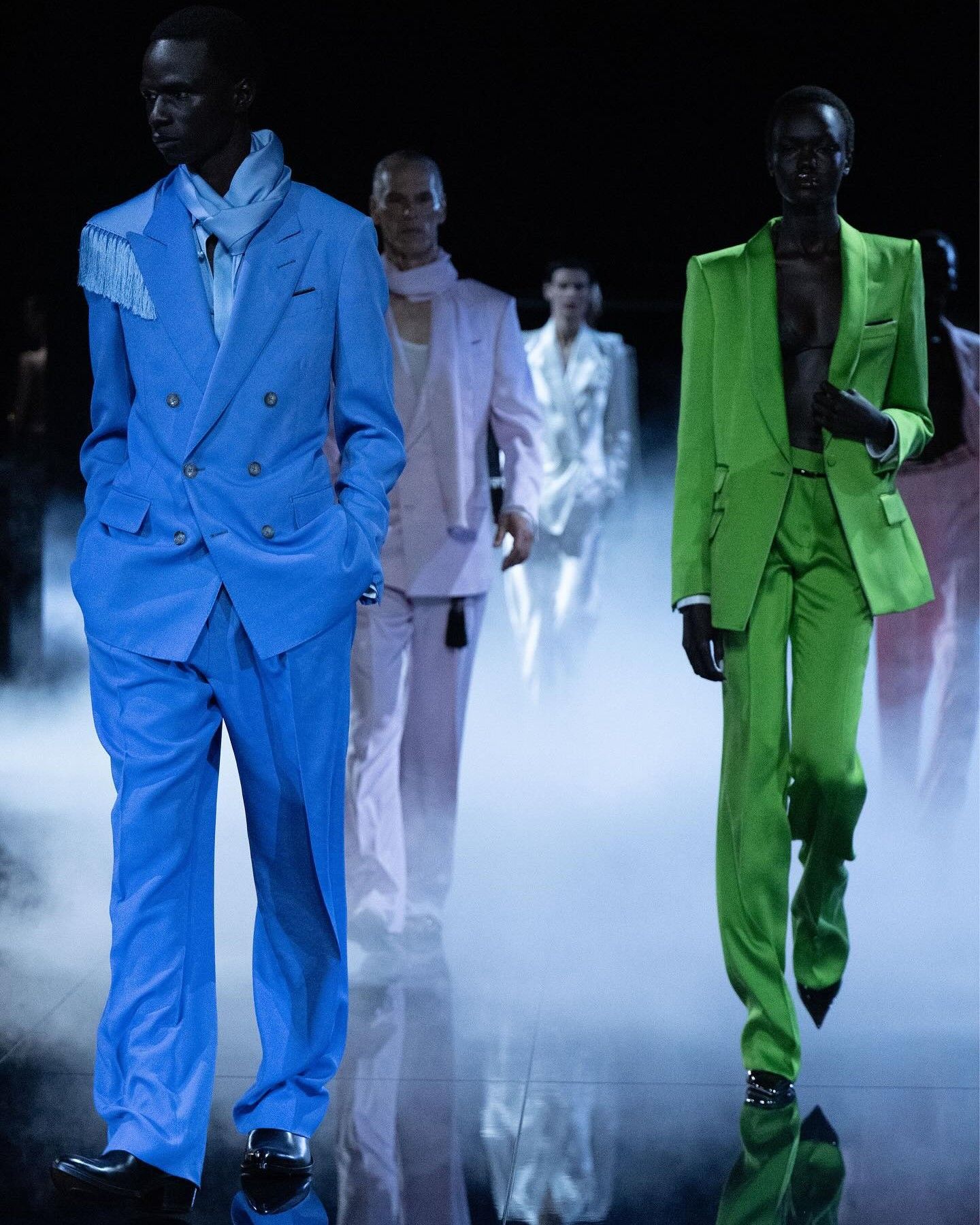
The answer is somewhat disheartening: the calligraphy and originality of yesteryear have been replaced by similar, basic, even uninspiring fonts and aesthetics. In 2012, Hedi Slimane changed Saint Laurent’s elegant YSL to a bold black “Saint Laurent Paris.” In 2017, Demna did the same for Balenciaga, followed by Olivier Rousteing at Balmain in 2018 and Daniel Lee at Burberry in 2023. In an era where Olsen sisters’ quiet luxury with The Row is the epitome of taste, and luxury shame is rising in China, could the very character logos once imparted to their brands be at risk? What remains certain is that a single design can convey a house's craftsmanship, history, and heritage in just one glance. It's important to remember that, through the power of graphics, fashion can be designed, summed up, told and, above all, sold.