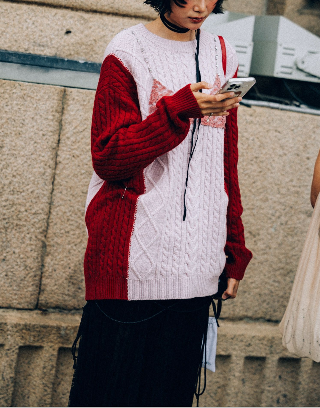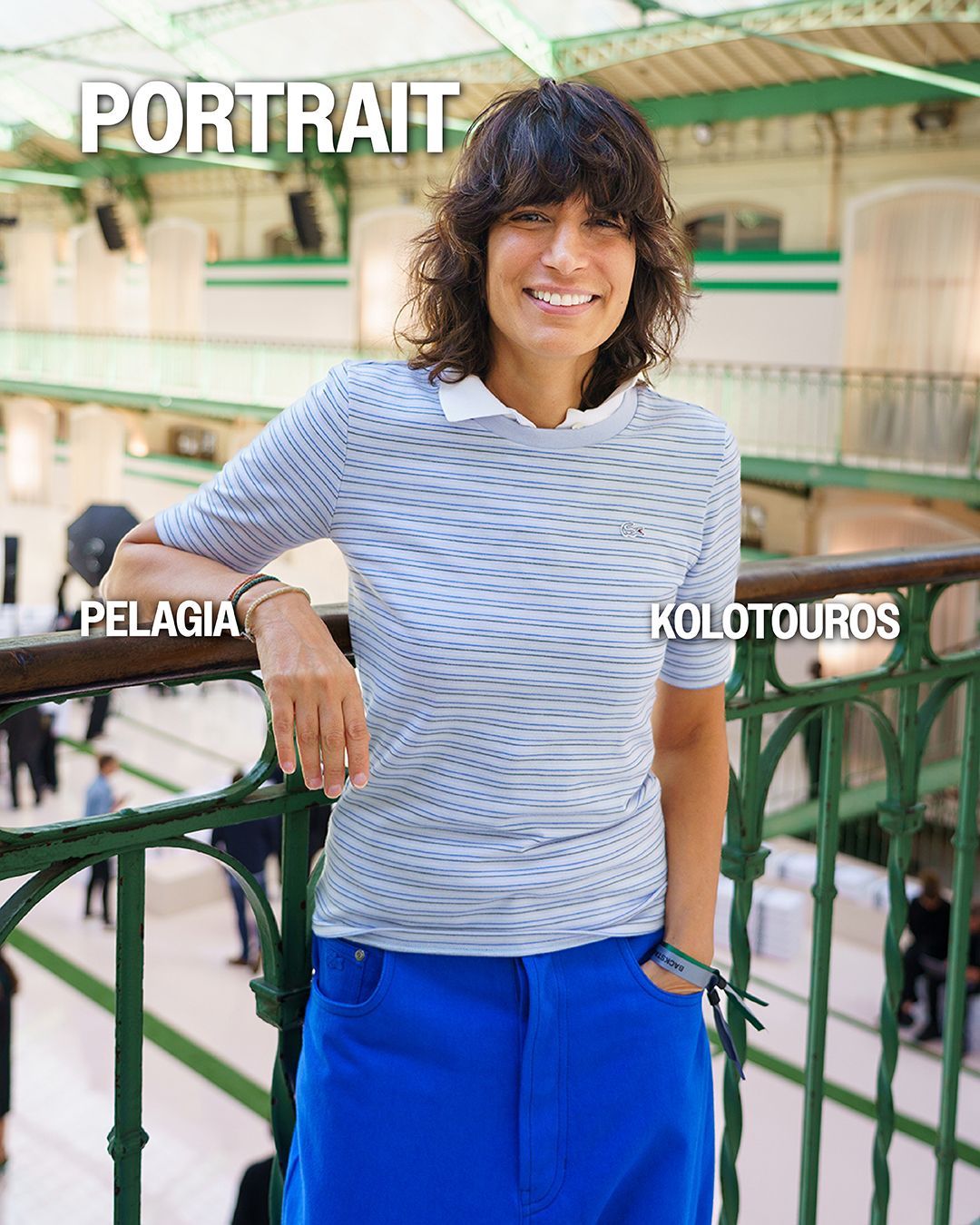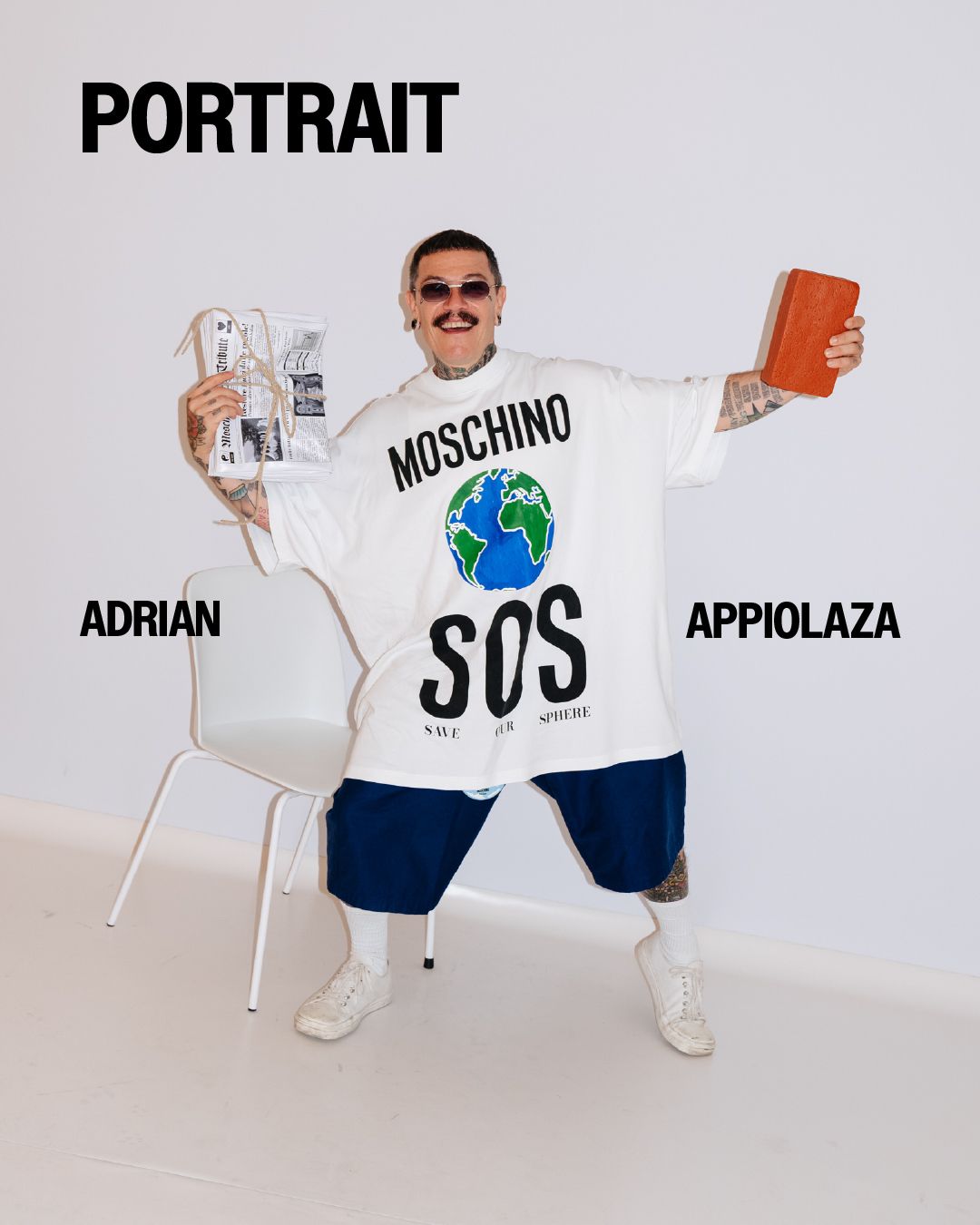
Logos where you don't expect them Logomania is not over, it has only evolved
In 2003 it was Tom Ford who complained about the aggressive branding promoted by marketing campaigns to the tune of overlapping tone-on-tone logos and monograms. Indeed, logos are a bit like an artist's signature on a work of art: they can confirm the authenticity of his or her creativity and make it instantly recognizable. But without an effectively engaging identity or narrative, the risk of getting lost in the crowd of catchy lettering and fonts is high. Without neglecting the fact that, even before the impact of a more or less bold logo, brands should focus on the goal of creating a universe so identifiable that that pile of cubital lettering seems totally insignificant.
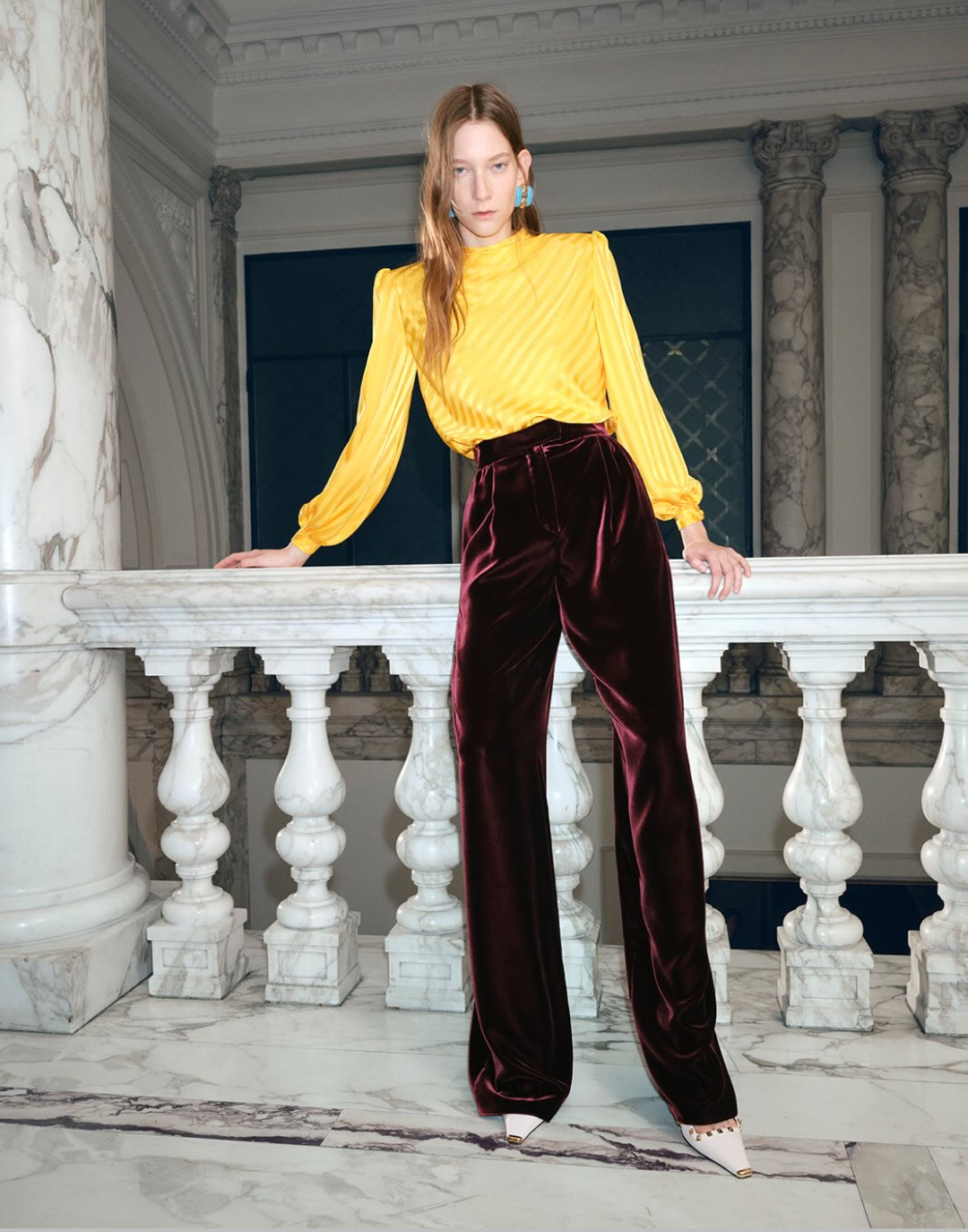
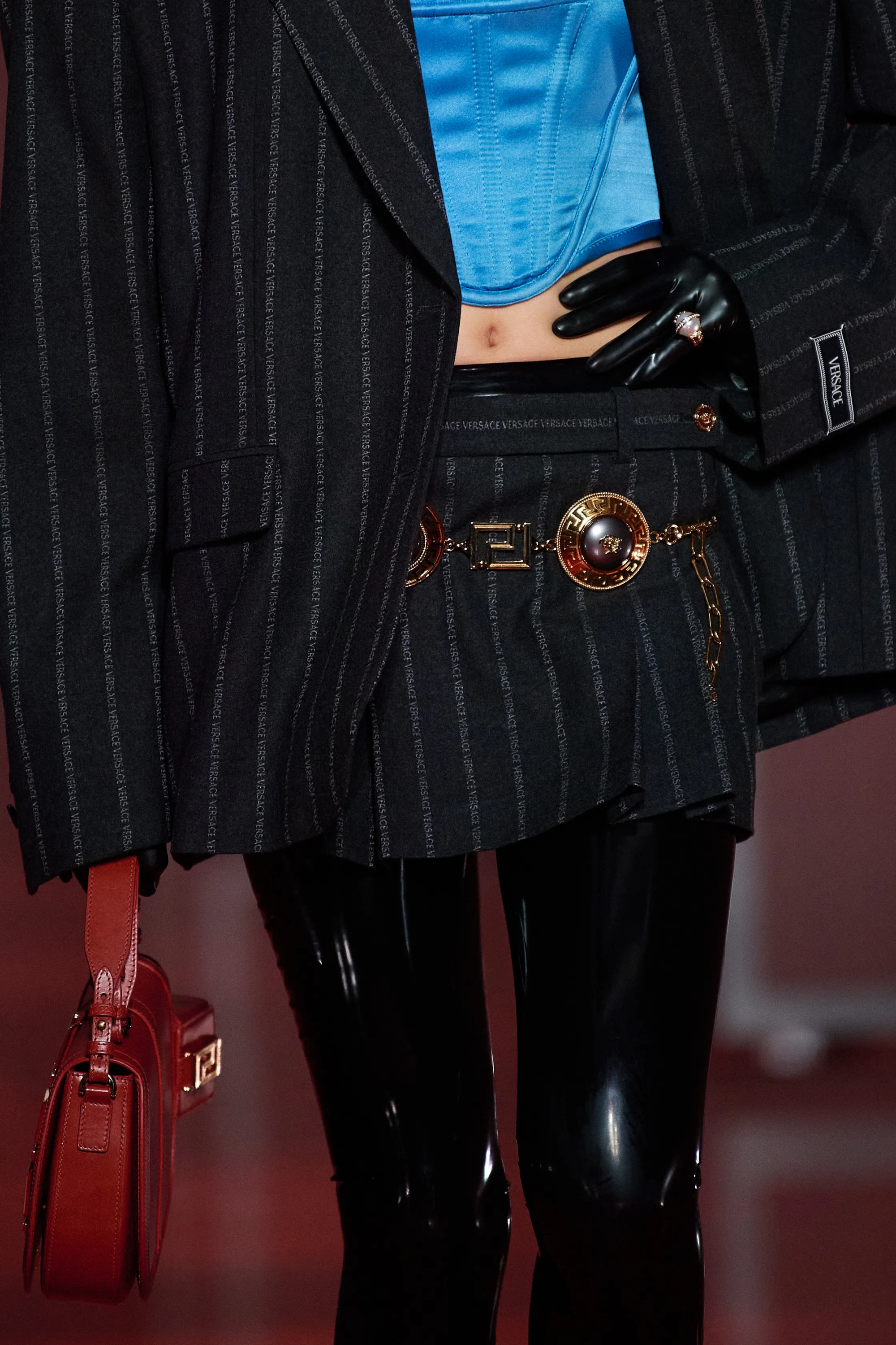
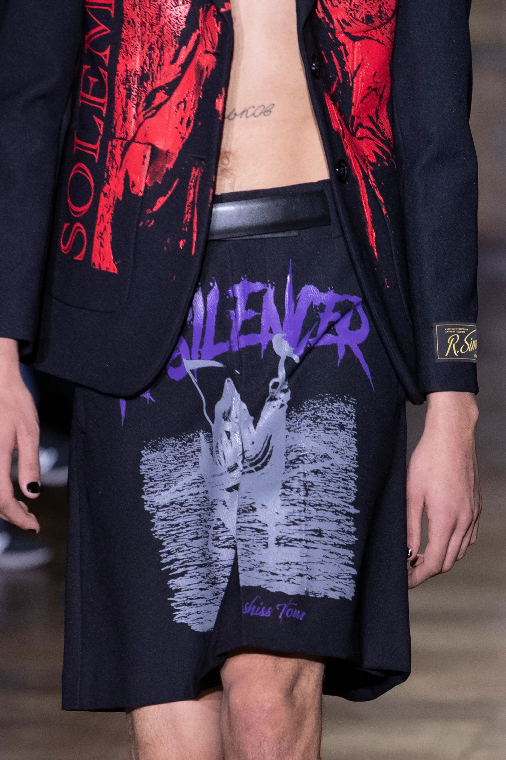
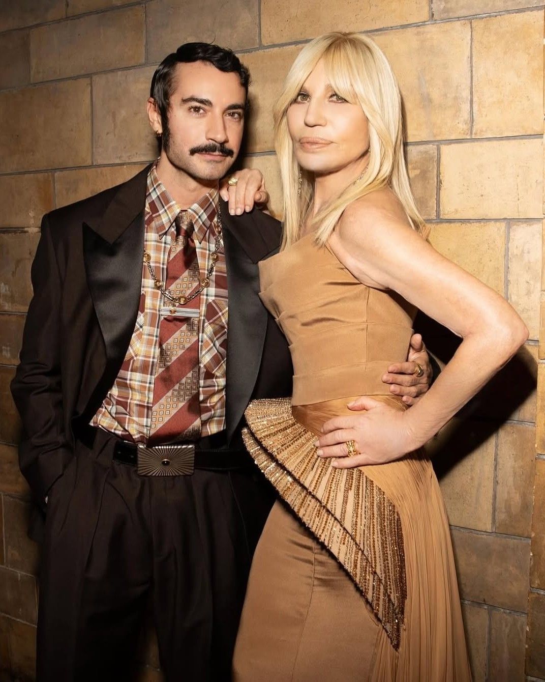
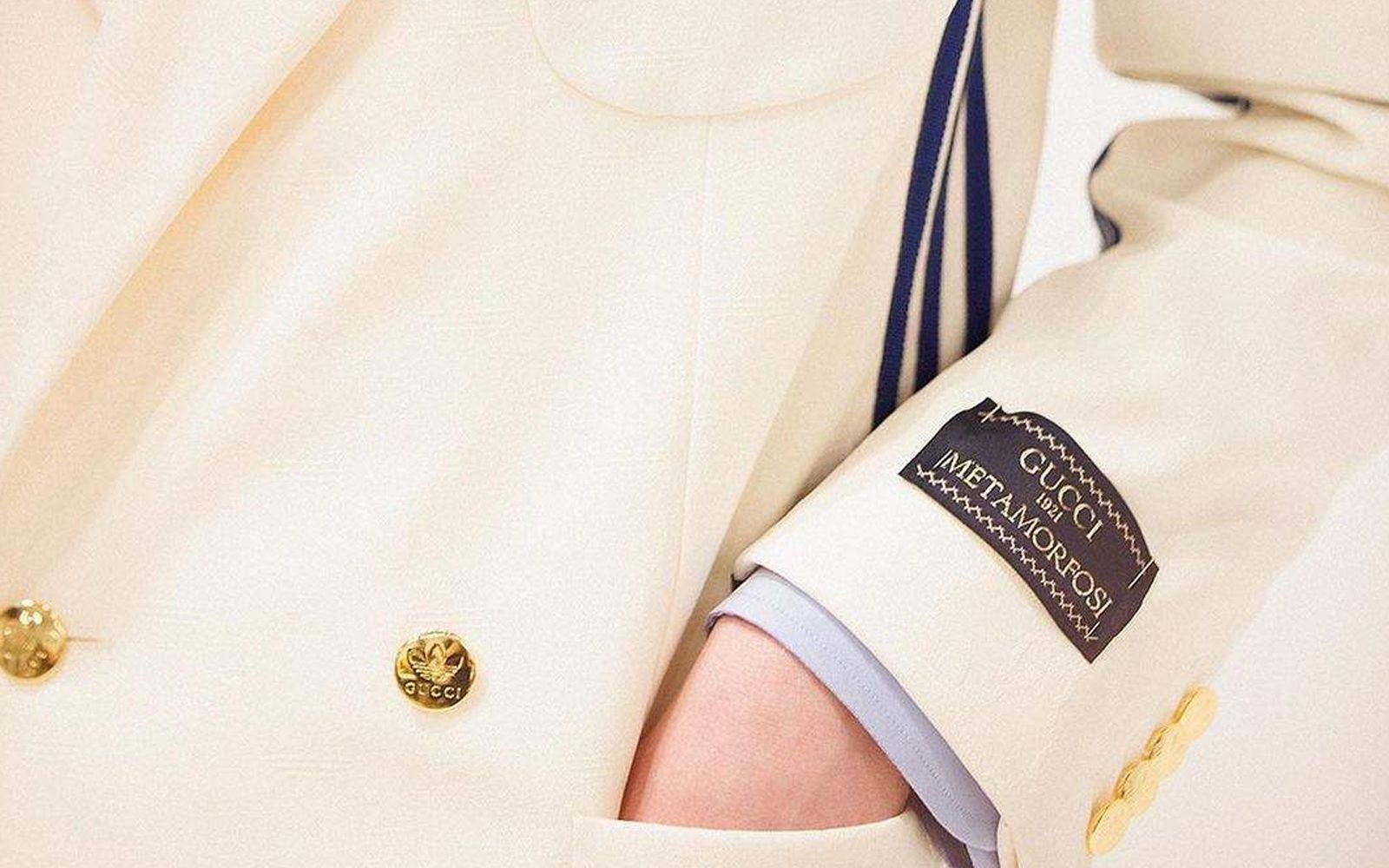
There have been brands that have actually never made use of logos, monograms, or lettering prints. Margiela, in his process of structural deconstruction of the garment, had removed his name from the label, reduced to 4 white stitches. He then resorted to inserting numbers-each corresponding to a precise product line-as the final initials of his creative manifesto. And so in the FW22 collection of the MM6 label, labels were applied along the sleeve of jackets and tailoring. A typical custom of the sartorial world, that of the label sewn on the sleeve of the jacket was taken up by more than one brand during the last edition of Milan Fashion Week. Versace, alongside bustiers and repertory dresses in line with the brand's heritage, preferred a decidedly less high tone of voice - baroque prints are entirely absent - by applying a label to jackets and dresses.
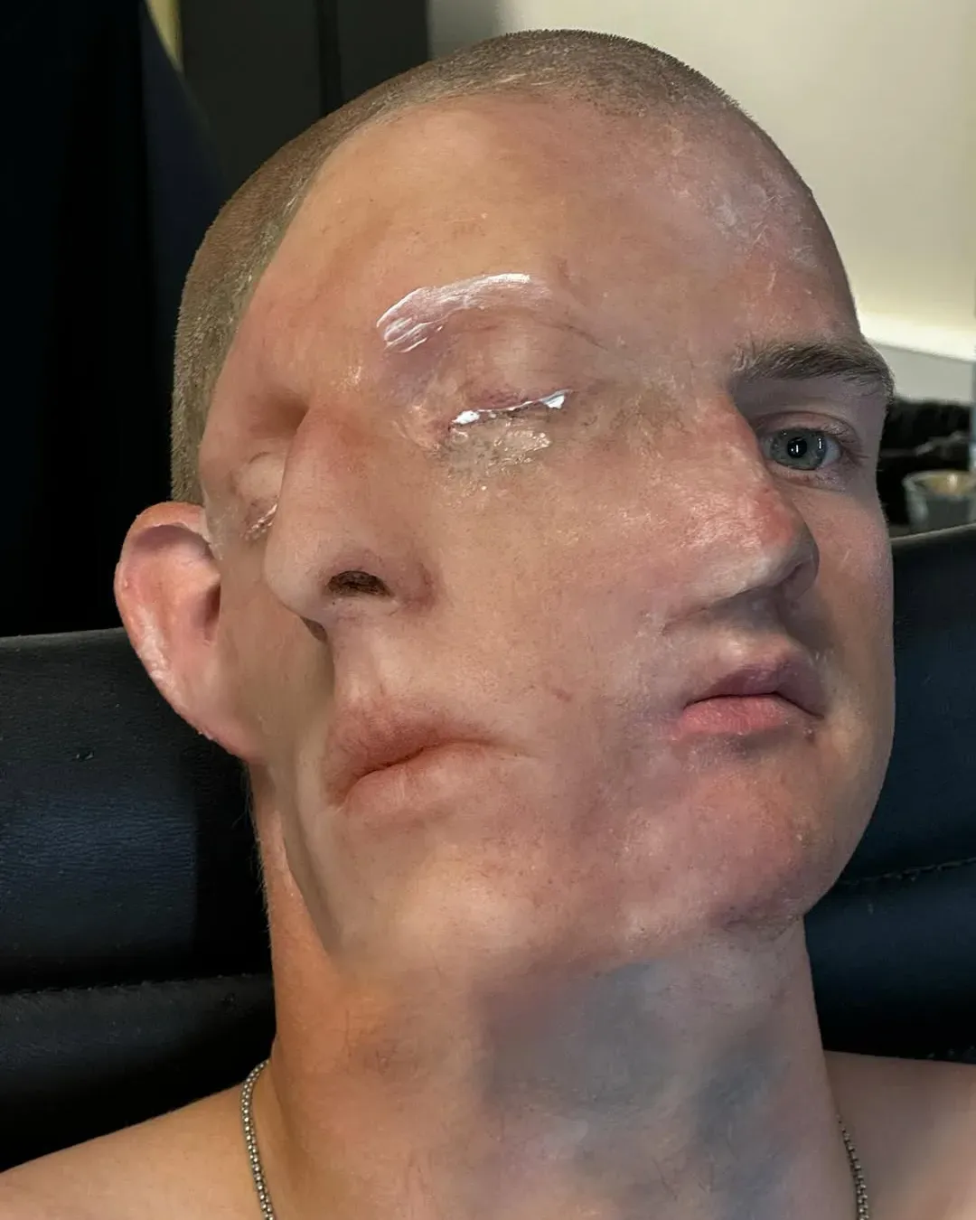
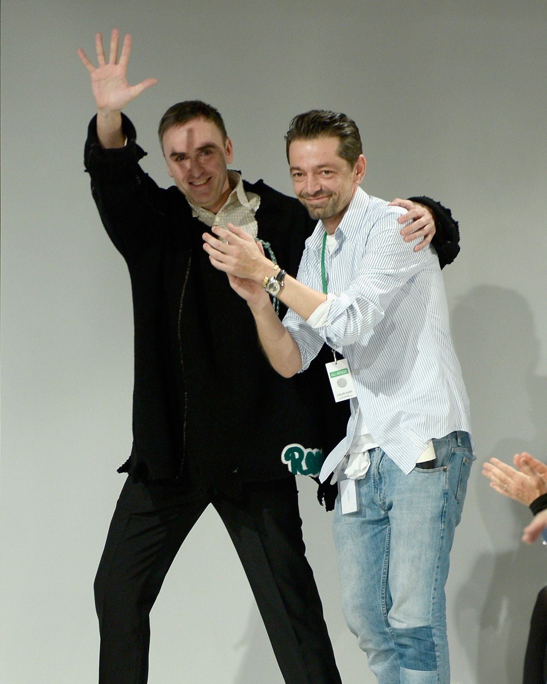
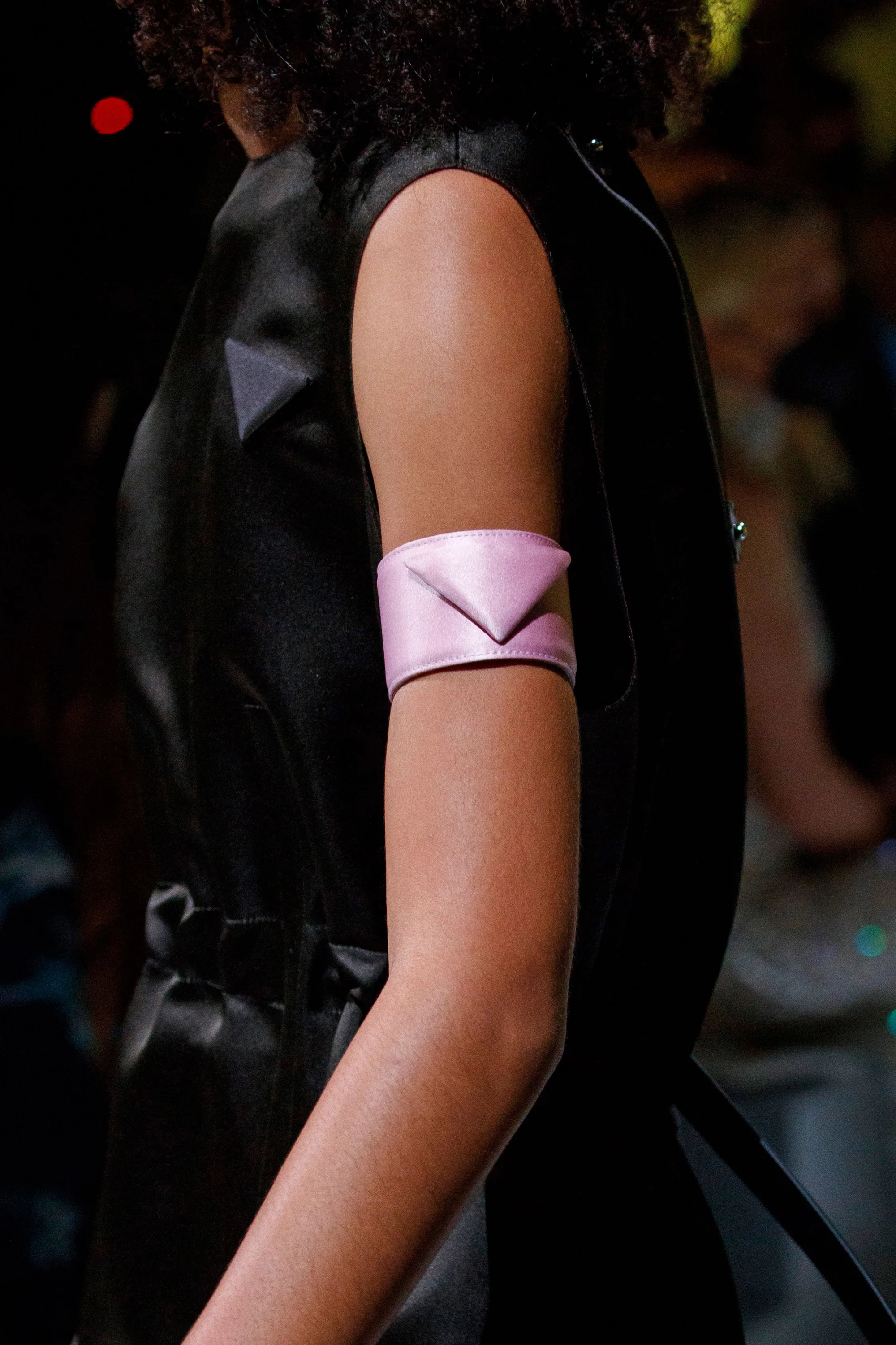
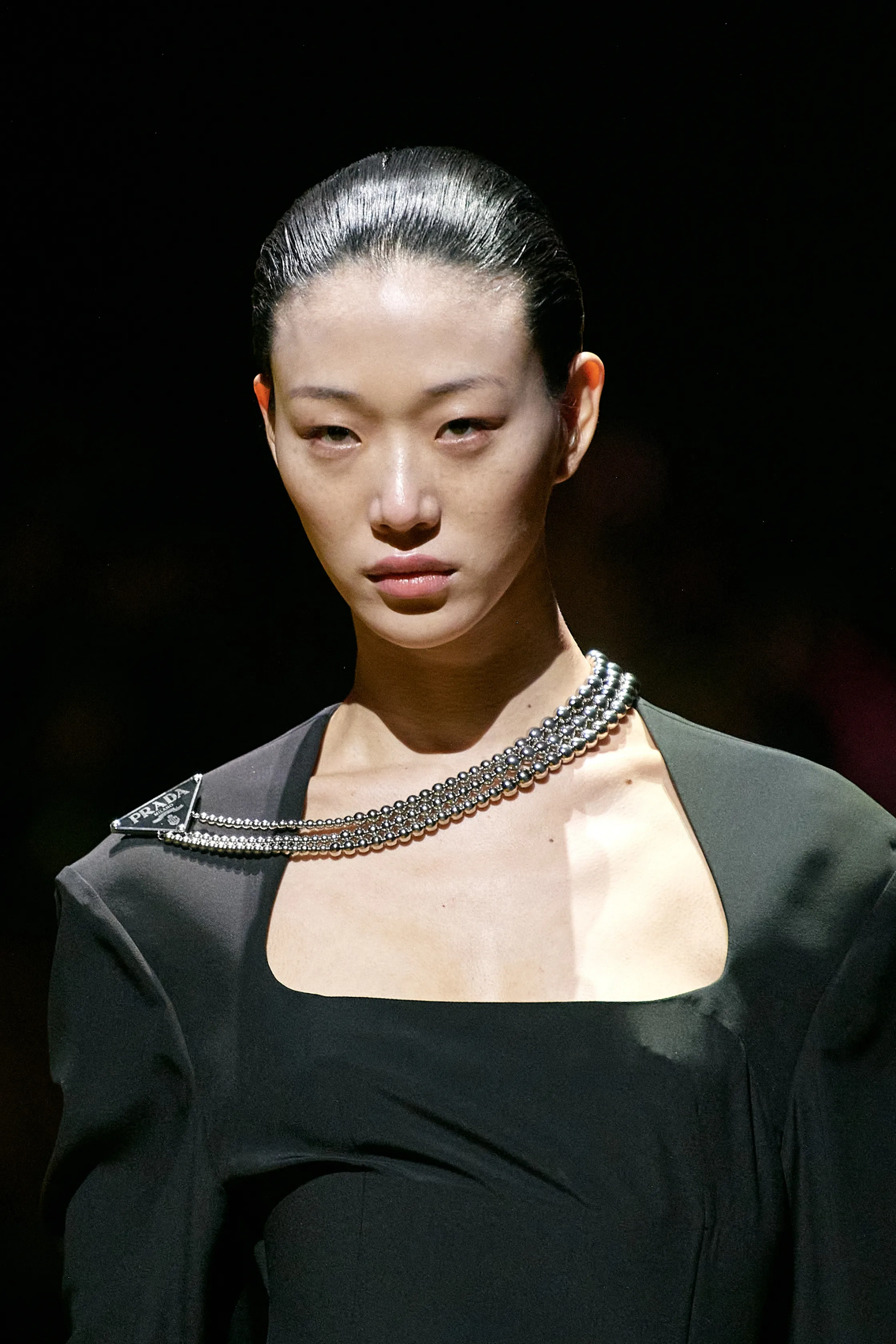
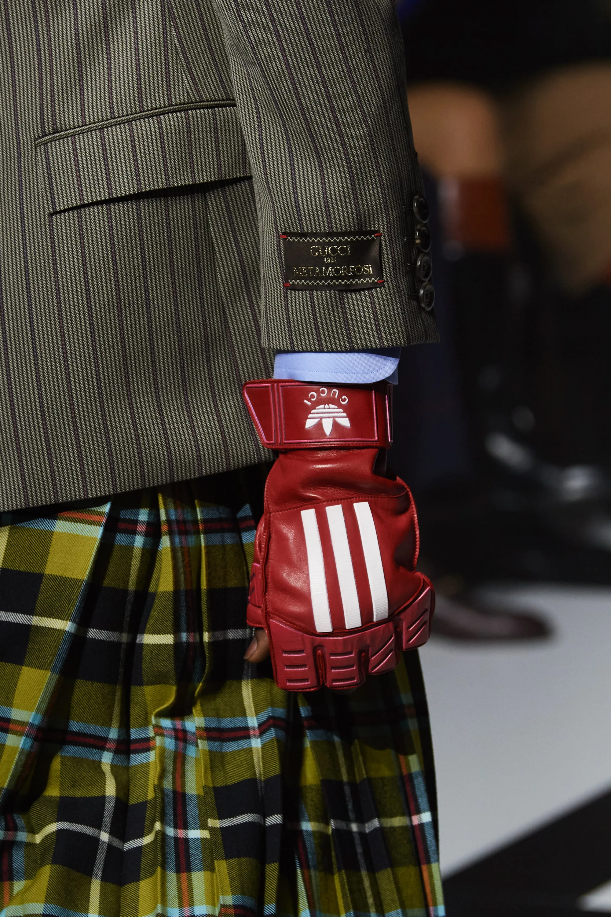
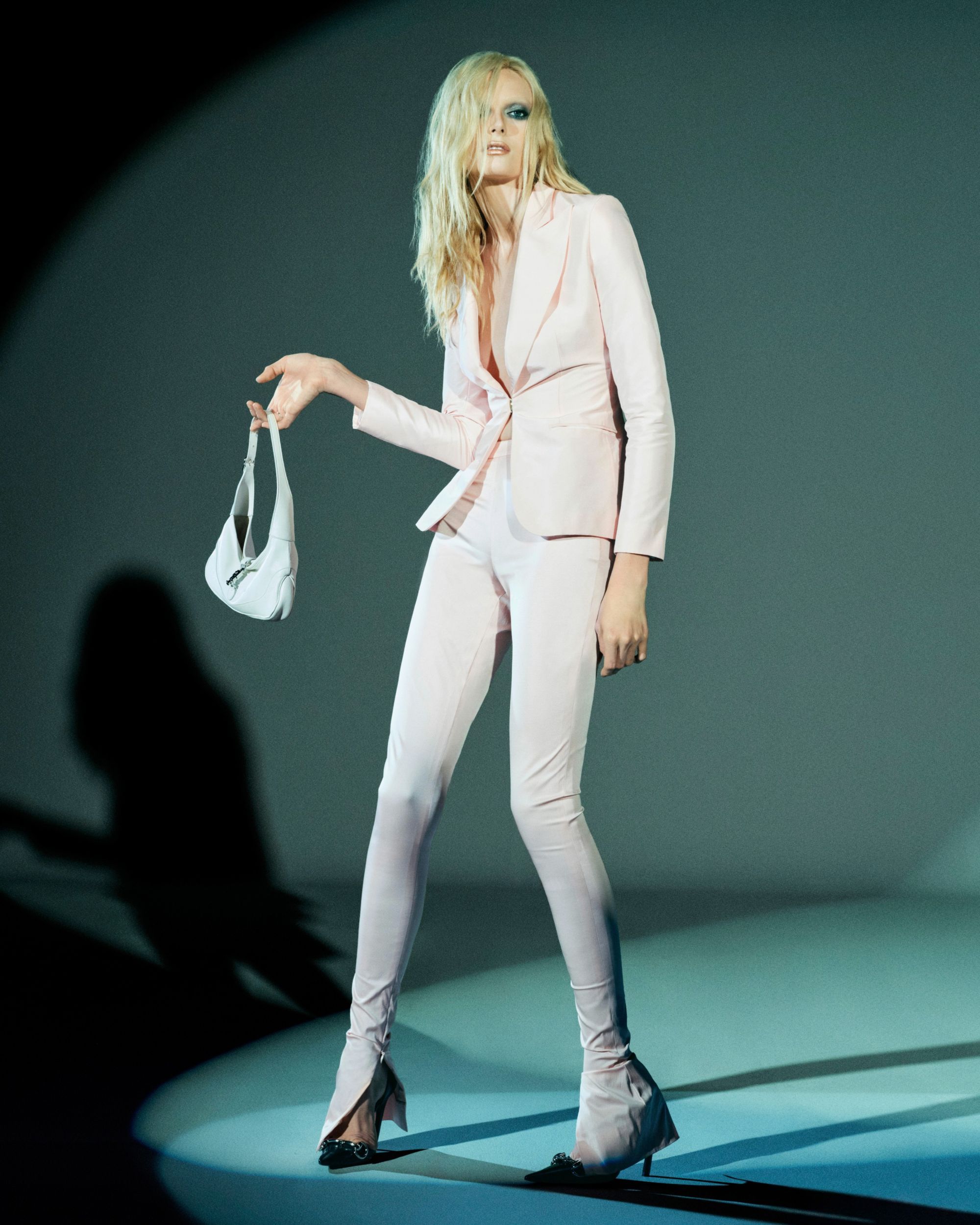
Tool also picked up by Gucci, which, with FW22, made tailoring the narrative device to announce the long-awaited collabo with adidas. And, in coordinating two voices to be imprinted on the same fabrics, Alessandro Michele juxtaposed the adidas logo with a Gucci label applied to monochromatic or phantasmagorically printed suits. Balancing operation or the need to personally reread the phenomenon of collaborations that it may be, Gucci confirmed its intention to want to reclaim its 100-year history with the Cosmogonie collection: very few bags, very few monograms, and lots of clothes. In order to see the logo in all its majesty, it is necessary to shift your gaze to the haircuts of the models or the headgear on the runway. Or, again, Prada's contribution in the obsessive rethinking of the classic wardrobe has repeatedly experimented with repositioning the triangle logo. If in the SS22 collection it was mainly displaced on accessories and bracelets designed to be worn on the upper arm, it was with the FW22 collection that Miuccia Prada and Raf Simons reached full expressive maturity: alongside tank tops with the logo in the center or skirts layered over multiple patterns, silhouettes emerged wrapped in dark coats of exaggerated proportions with necklaces askew embellished with the Prada logo.
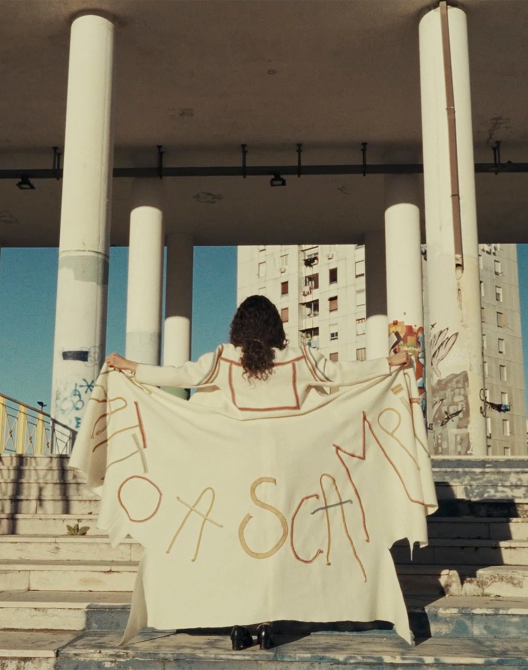
Thought of rather as a reflex gesture to the habit of dressing, this sort of strategically placed logo bijou turns out to be the only instantly recognizable element employed by Prada. A sign that brands - from the labels sewn on the sleeve of Versace or Gucci's jackets and Prada's necklace experiment, as well as Gucci Cosmogonie's buzz cut - are trying to build more recognizable attitudes, aesthetics, and styles than just a logo. Repositioning or relocating a logo means coming to terms with one's past and questioning an operation that has perhaps been held sacrosanct and untouchable for too long.


