Fashion brands have rediscovered monogram and patterns
As a symbol of a new beginning or as a tribute to the maison's archive
March 10th, 2021
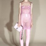
Last Friday, with the show dedicated to the FW21 collection, Versace inaugurated a new course, marking the beginning of an unprecedented path that has a new monogram as its founding element. The brand led by Donatella Versace has, in fact, decided to quit baroque prints, archive patterns, or the iconic Medusa, opting instead for a renewed pattern, renamed Greca Pattern, that has something classic to it: a design of geometric shapes reminiscent of a V, to form a clean, simple, versatile, vaguely seventies motif, proposed in a wide range of colours and on different materials and garments, a pattern that does not go unnoticed remains (perhaps also due to the similarity with Goyard's pattern). Versace, however, is not the only brand that over the last few seasons has decided to renew or reinterpret its visual codes, making them the symbol of a new beginning or a tribute to the heritage and archive of the Maison.
Balmain, for example, has brought the PB pattern back into the SS21 collection, a motif that was originally designed by Monsieur Pierre Balmain in the 1970s. The repurposed motif is composed of small all-over Greek motifs repeated in shades of white and black, a pattern that is not that different from that of Givenchy. The French Maison itself, under the creative direction of Matthew Williams, didn't give up the iconic monogram consisting of the repeated G, softening the graces of the letter and proposing it in a softer and more understated version, as in the latest collection. Williams, appointed creative director of the brand last year, started out precisely with the Givenchy monogram and logo to kick off his new creative tenure.
Anyway, Versace's move has few artistic ambitions, but rather clear strategic objectives. The CEO of the brand, part of Capri Holdings, Jonathan Akeroyd, explained to BoF that the decision comes from the desire to increase the volume of sales in the accessories segment, in which the pattern will be widely used, going from the current 35% to 50% of turnover. Brands like Louis Vuitton, for example, are estimated to get 45% operating profit from their monogrammed line of accessories. Importance shared by the same collections also at Gucci, Chanel, Hermès and Dior. The monogram sells, and although Versace wasn't particularly damaged by the pandemic, the introduction of a new pattern reveals the intention to focus on a highly profitable sector.
Both the choice to introduce a new monogram and the decision to bring back a historical pattern reveal the renewed importance that fashion brands are reserving to the visual codes of their Maison. The monogram and the pattern are the most effective elements to further cement brand awareness and brand reputation. In the luxury market, logos and patterns can still boast that ancestral importance that has undergone an aesthetic evolution aimed at simplifying, removing rather than adding, but that didn't lose its primary function: to signal one's own status quo and one's belonging to a specific social group.
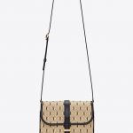
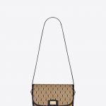
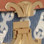
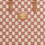
Clean and straight lines, repeated in geometric patterns lacking unnecessary embellishments and excessive details, signal a visual trend that shuns the superfluous but cannot do without shared symbols. The simplification-oriented trend had already begun in 2018, and at the time it affected brands' logos, which had ended up looking alike. Six years earlier, when Hedi Slimane had landed at Saint Laurent, one of his first decisions was to remove the name Yves from the official logo, also changing the font. Although the intricate logo that binds the three letters YSL has remained, proposed - obviously - on bags, accessories and shoes, Anthony Vaccarello has created an all-over version that sees the Cassandre logo immersed in a geometric pattern that softens its tones. Slimane himself, this time at Celine, had reintroduced in 2019 a historic pattern of the Maison, created for the first time in 1973 by the founder of the brand, inspired by the Arc de Triomphe de l'Étoile, a Paris monument, and renamed Triomphe. The design had already been proposed on several bags of the Maison, characterized by this lock closure, before being turned into a recurring motif on the canvas of accessories, be they bags, belts or caps, alone or accompanied by the writing CELINE.
The renewal of the aesthetics of brands therefore starts from the past, especially from the Seventies, to signal a change of direction or the beginning of a new course. Proving once again how powerful fashion symbols can be.


.jpg)


