How Helvetica became fashion's favourite font The typeface that homologated logos and communication of very different brands
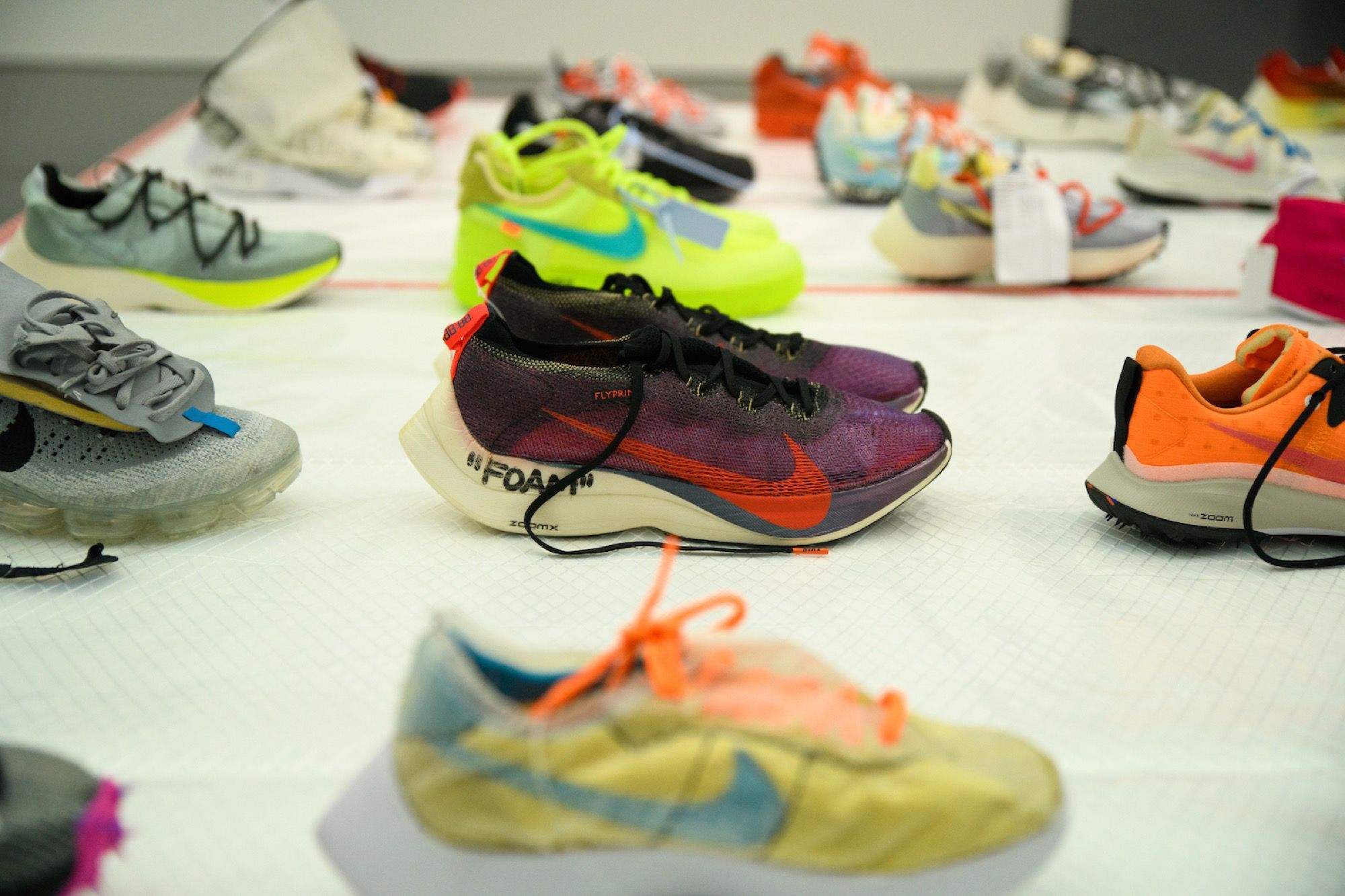
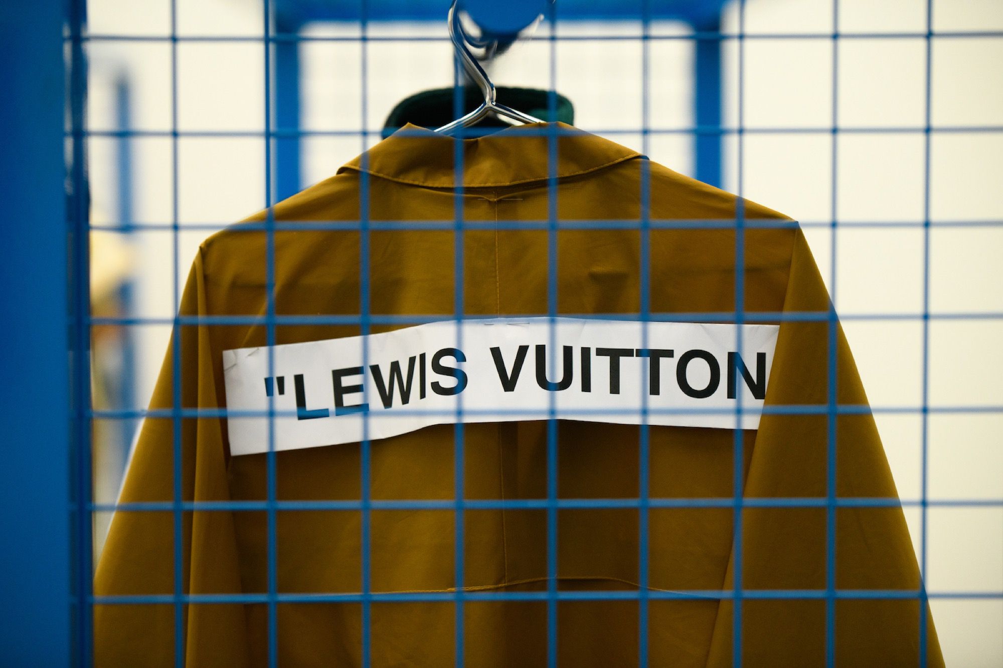
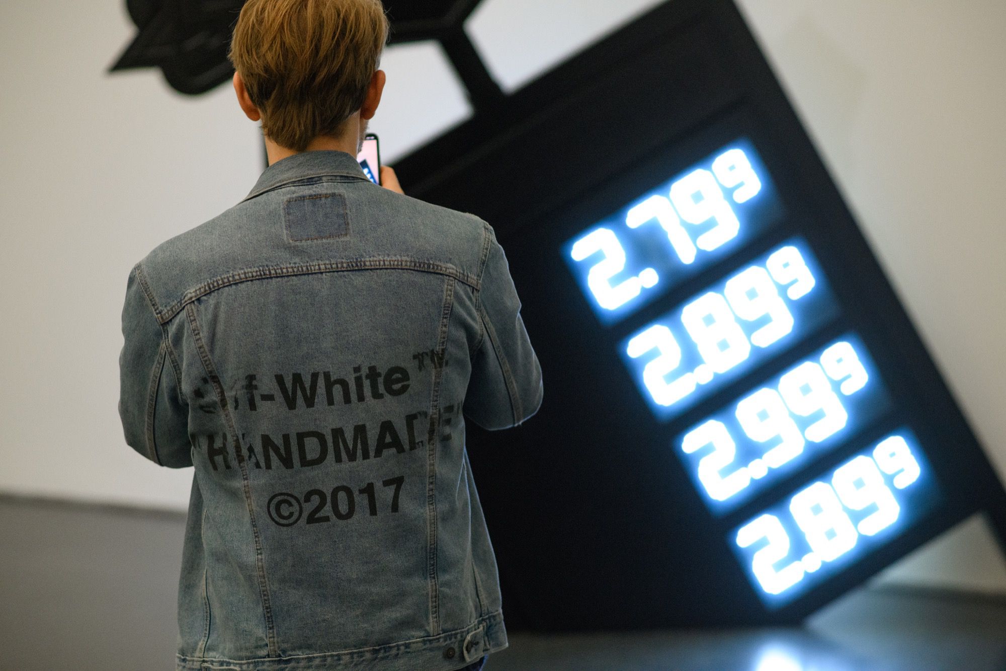
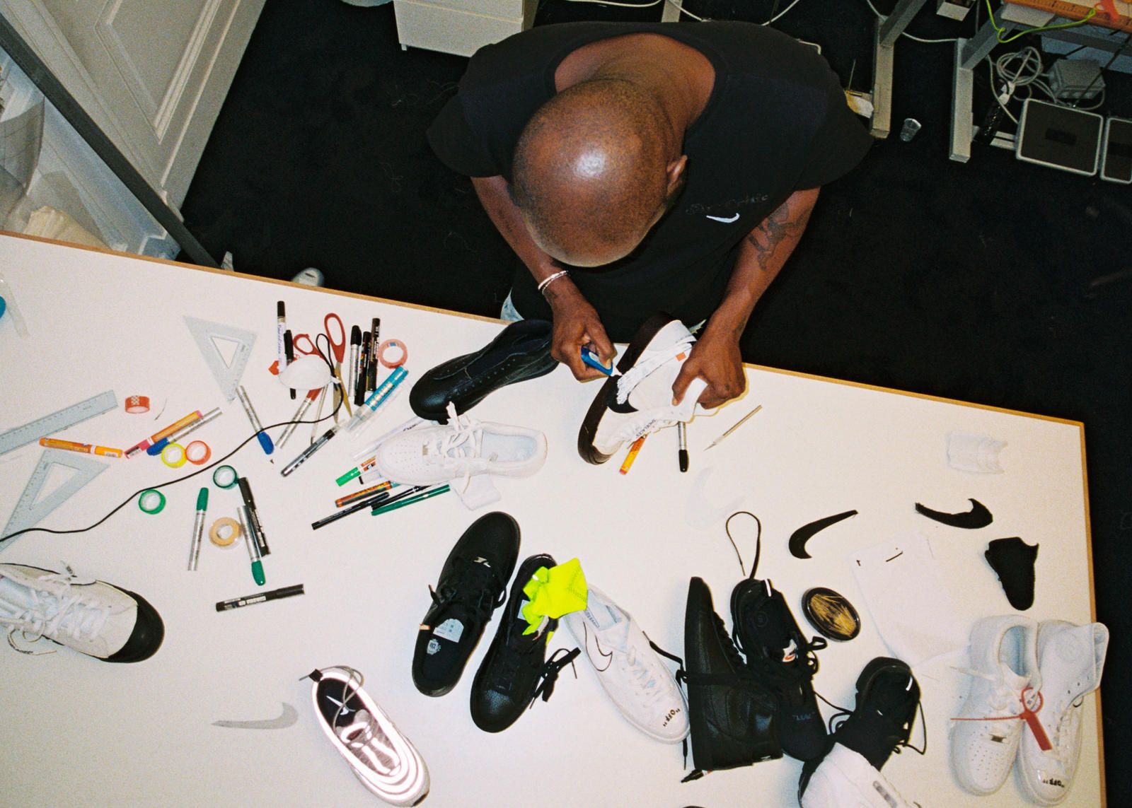
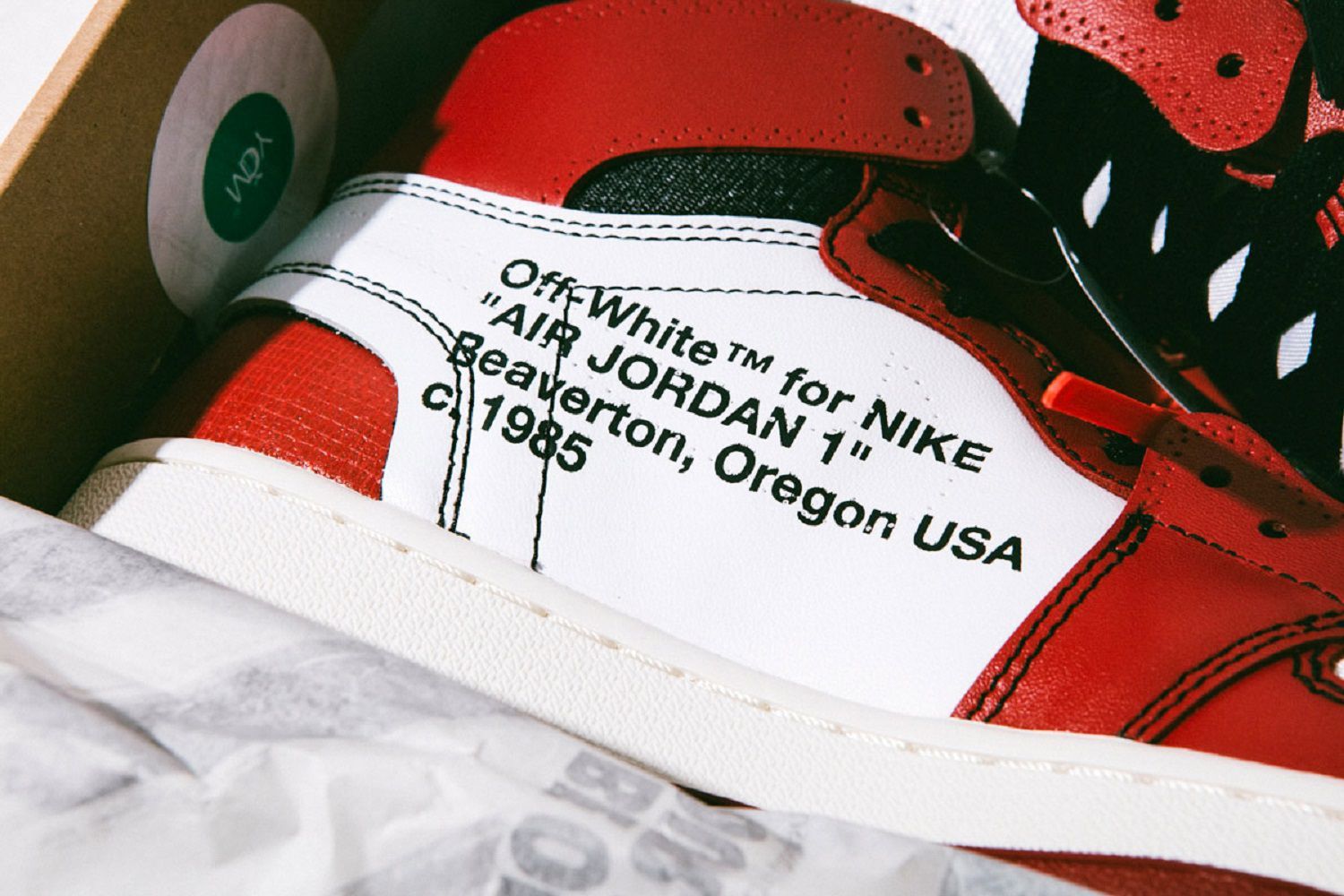
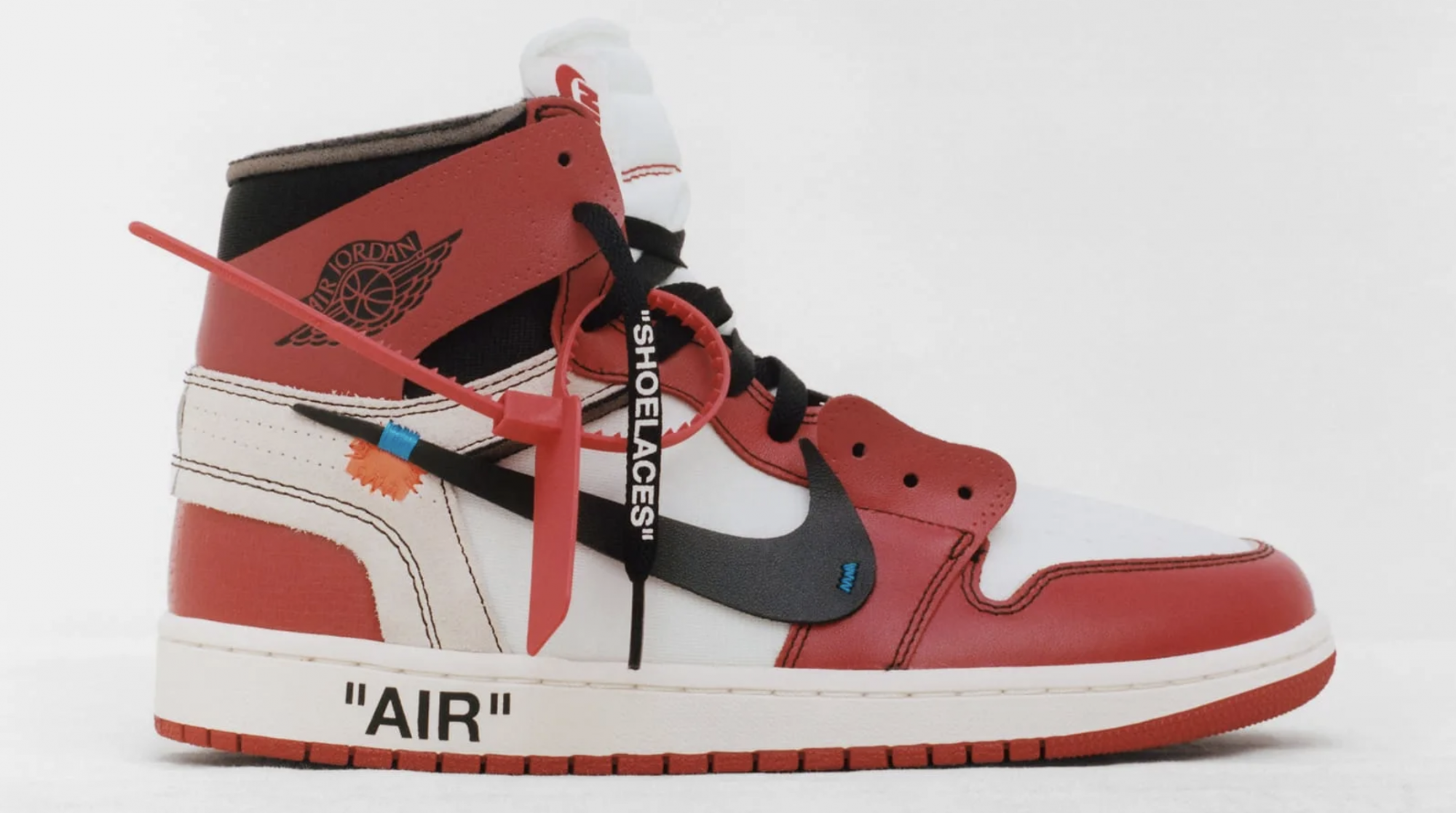
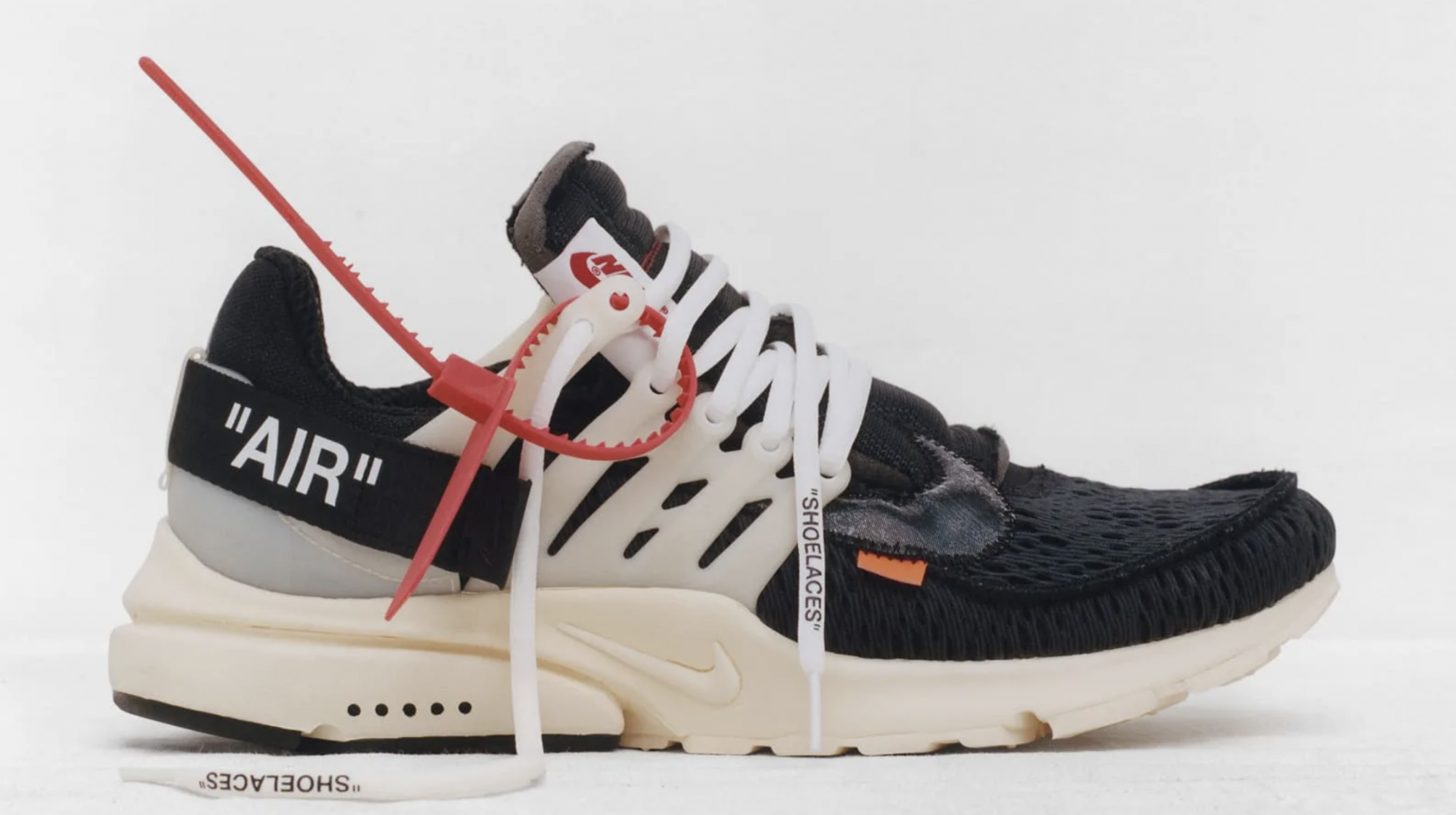
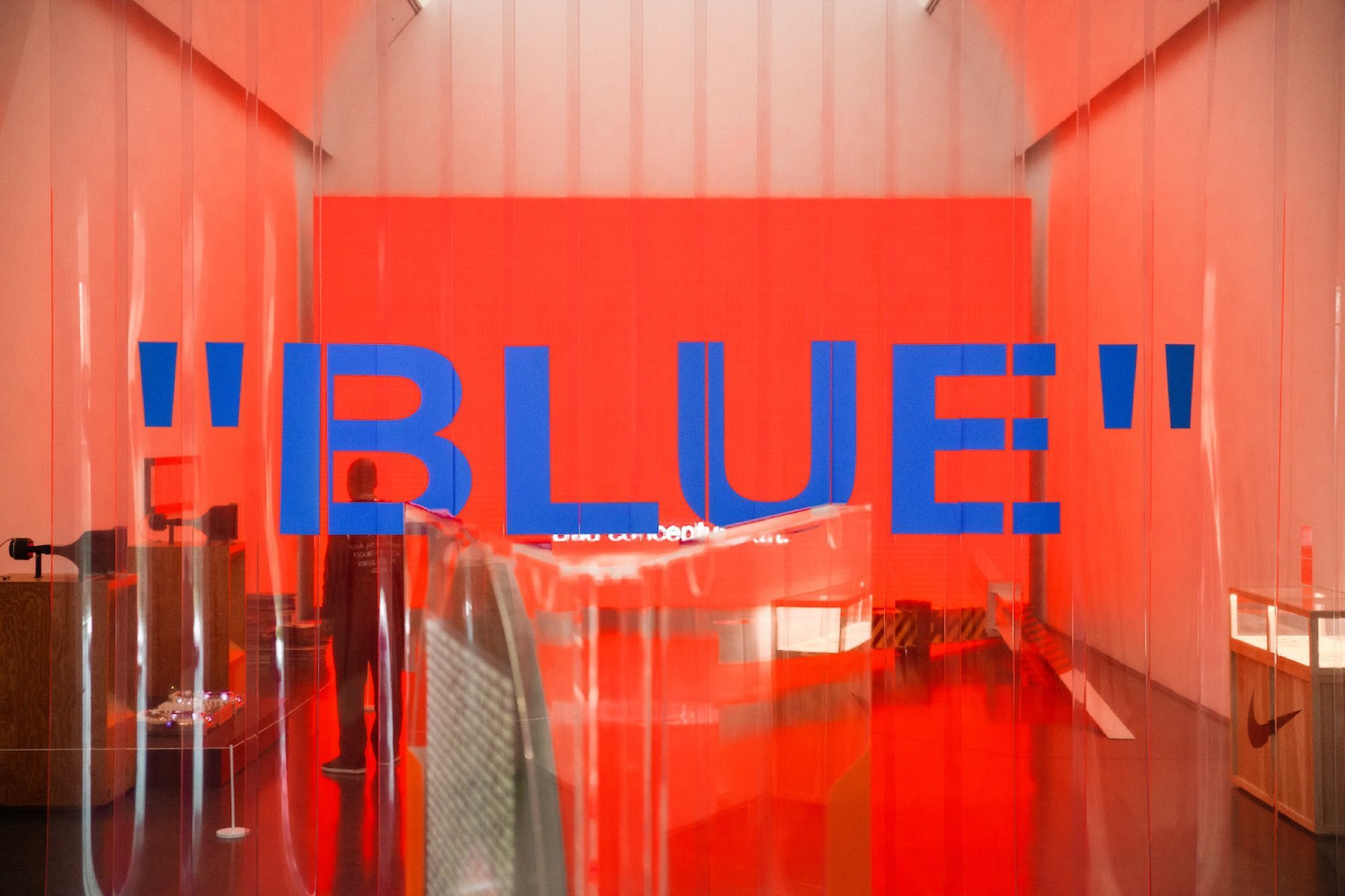
Alongside the introduction of new elements, such as the zip-tie, and more structural work on some details of the silhouettes, the major innovation brought by Virgil Abloh on the sneakers of his collaboration with Nike is undoubtedly the lettering, the constant presence of words where they had never appeared before. More than the words printed on the shoes of The Ten collection - and the following ones - it counts how the message is conveyed on a visual level, an element that has become the benchmark of Abloh's imagination. Whether it is included between the now-iconic quotes or alone, the font chosen (also) by Virgil in recent years has become the tool par excellence to communicate innovative ideas and projects for the future in a direct and objective way.
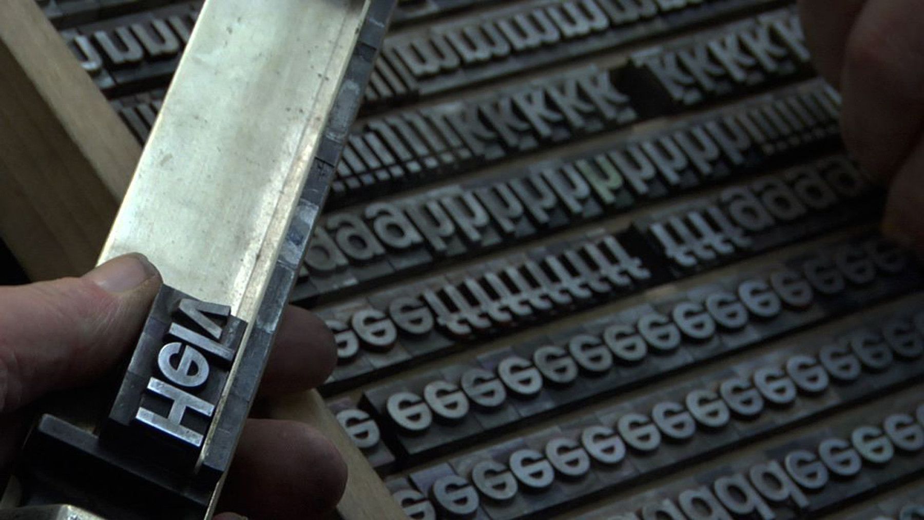
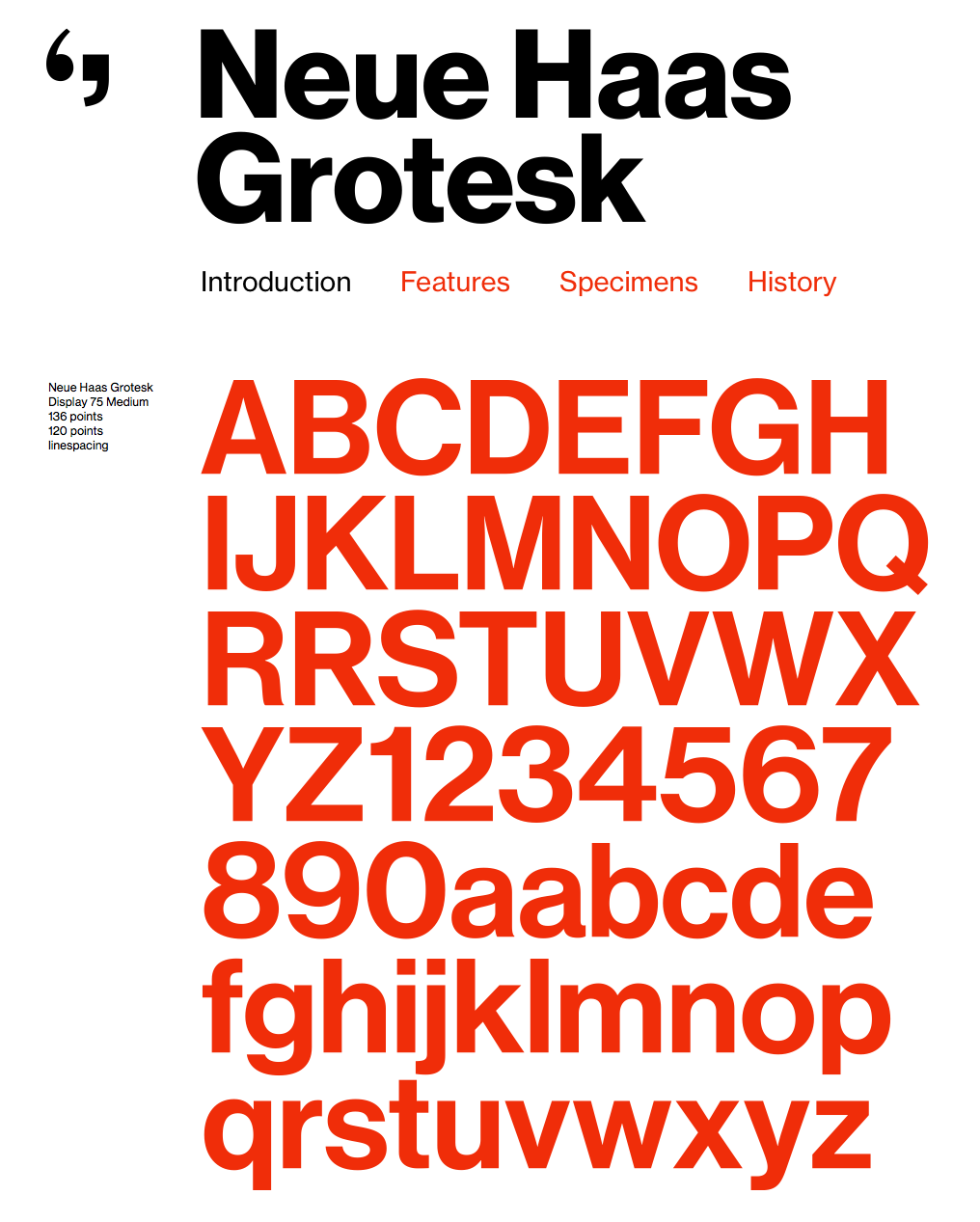
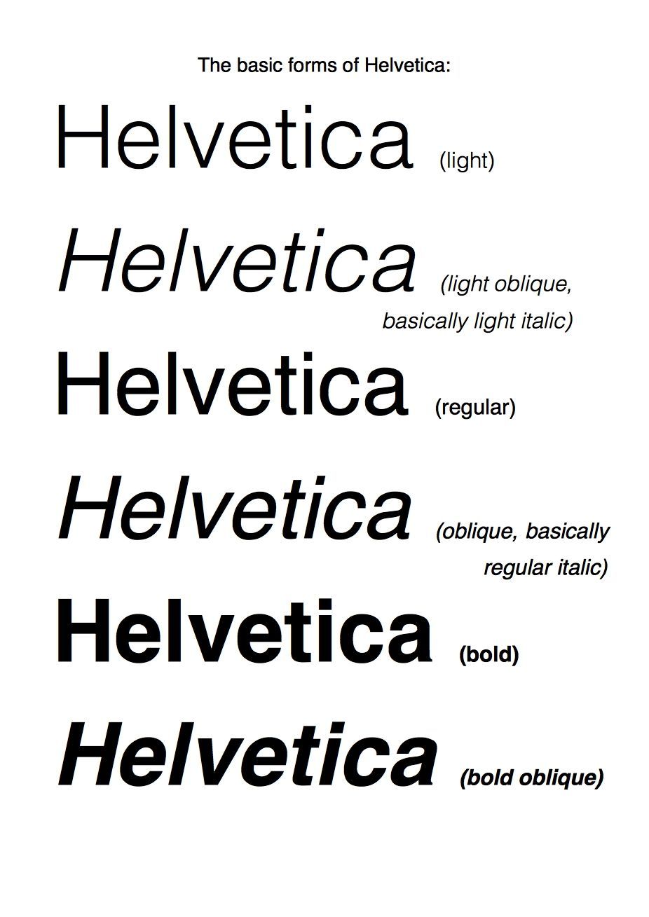
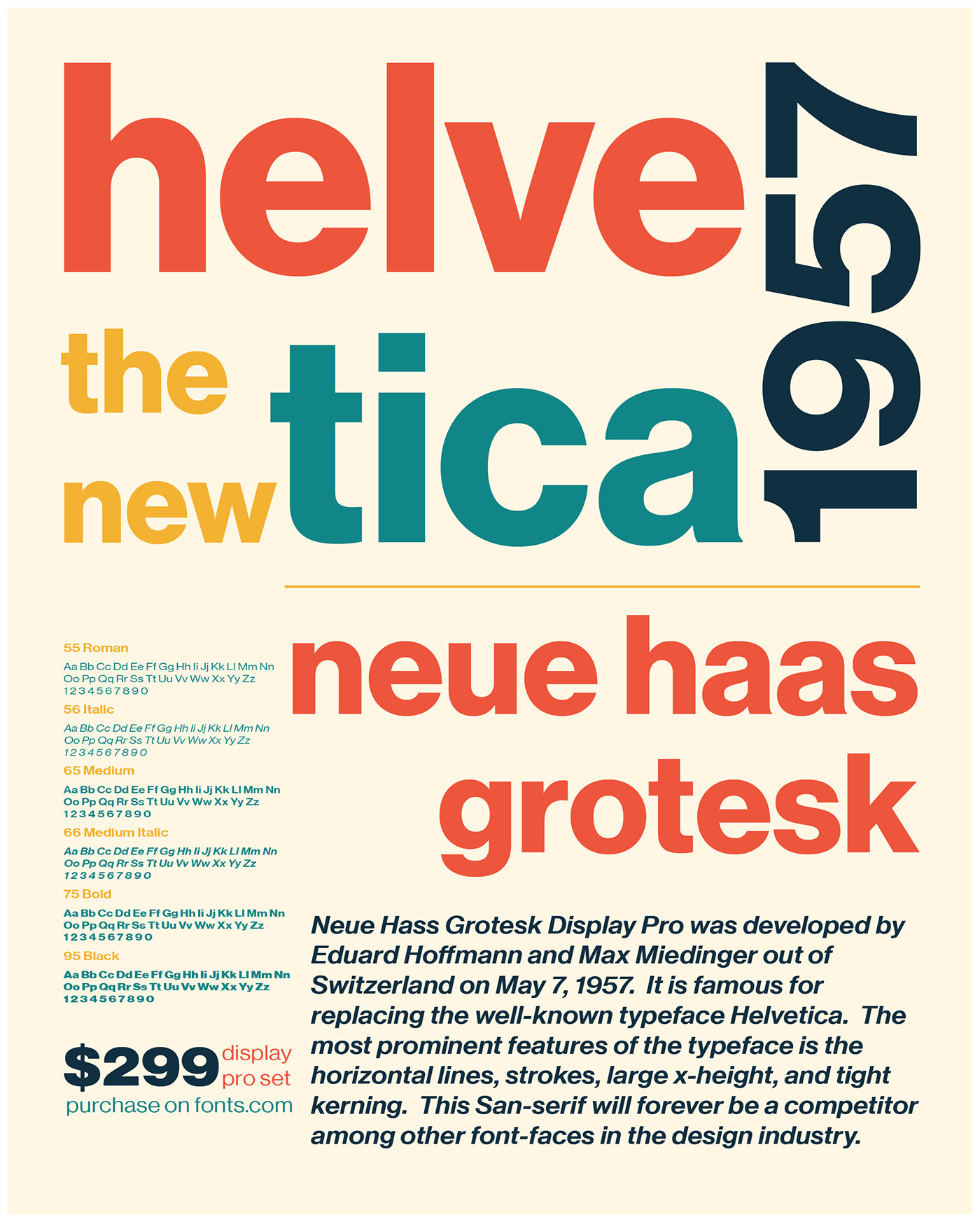
It's impressive, however, that the Helvetica font is not exactly new, but that on the contrary, it has been around since 1957, when it was invented in a Swiss printing foundry. The new font Neue Haas Grotesk immediately stood out for its clarity, essentiality and legibility, for its simple and direct way of communicating, without frills and unnecessary embellishments. It is a Gothic sans serif font, that is, without graces, without terminal strokes, with a lot of negative space (white), while the negative space contained in the lowercase 'a' resembles a tear. A few years later, in 1961, this neutral font was further enhanced by Arthur Ritzel of the German company Stempel, who was commissioned to redesign and expand the series of characters, thus giving life to the Helvetica font, which in its name pays homage to the place where the typeface was originally born. It is thanks to its versatility and simplicity that the font immediately became popular, the favourite font of the advertising world, that used it to promote the most diverse products, from Volkswagen cars to Coca-Cola. Although its "neutral" aspect, in some ways not particularly incisive, could prove to be a point against it, precisely this ability to adapt to different spheres, industries and messages are what has made Helvetica's success.
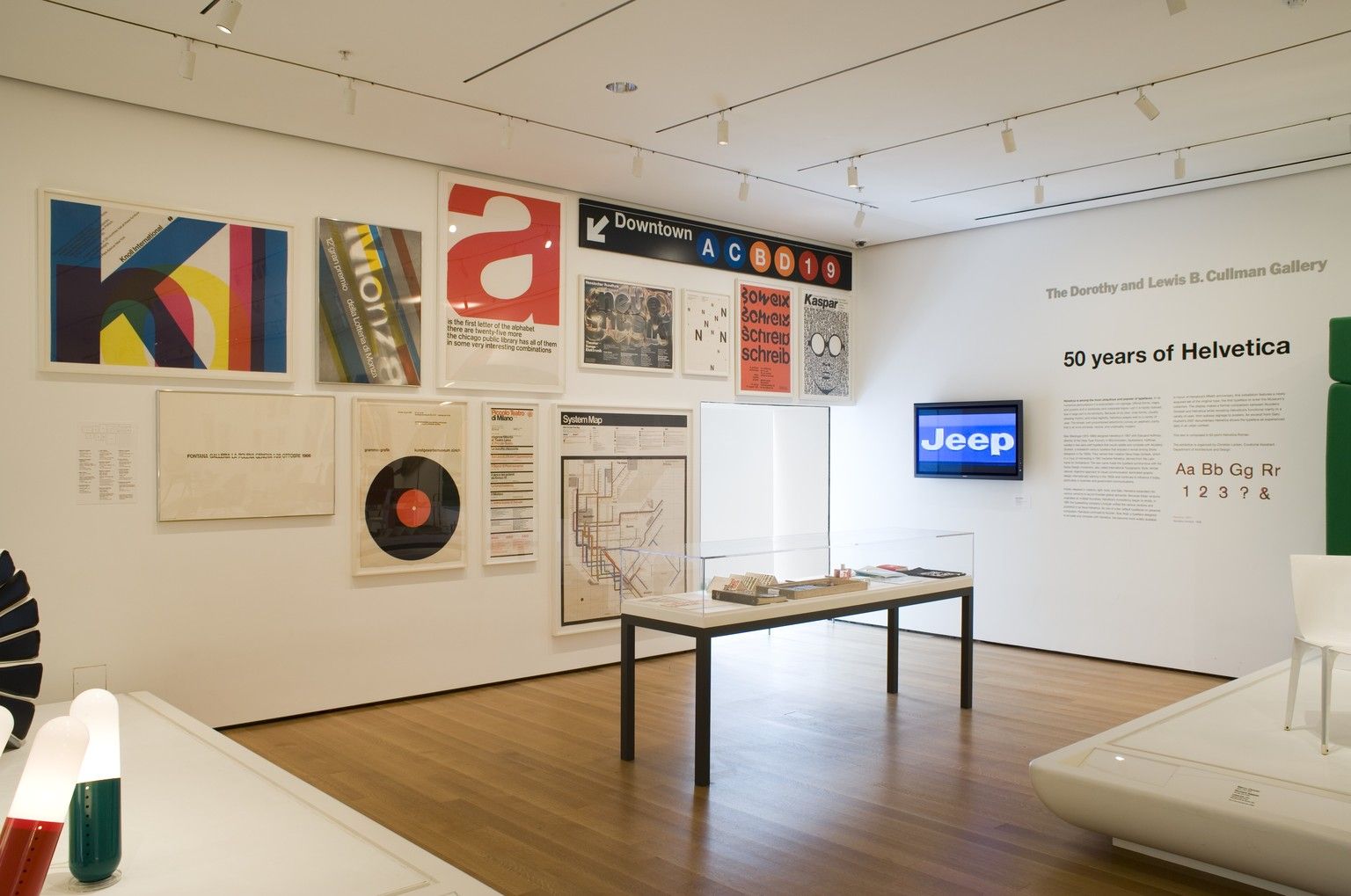
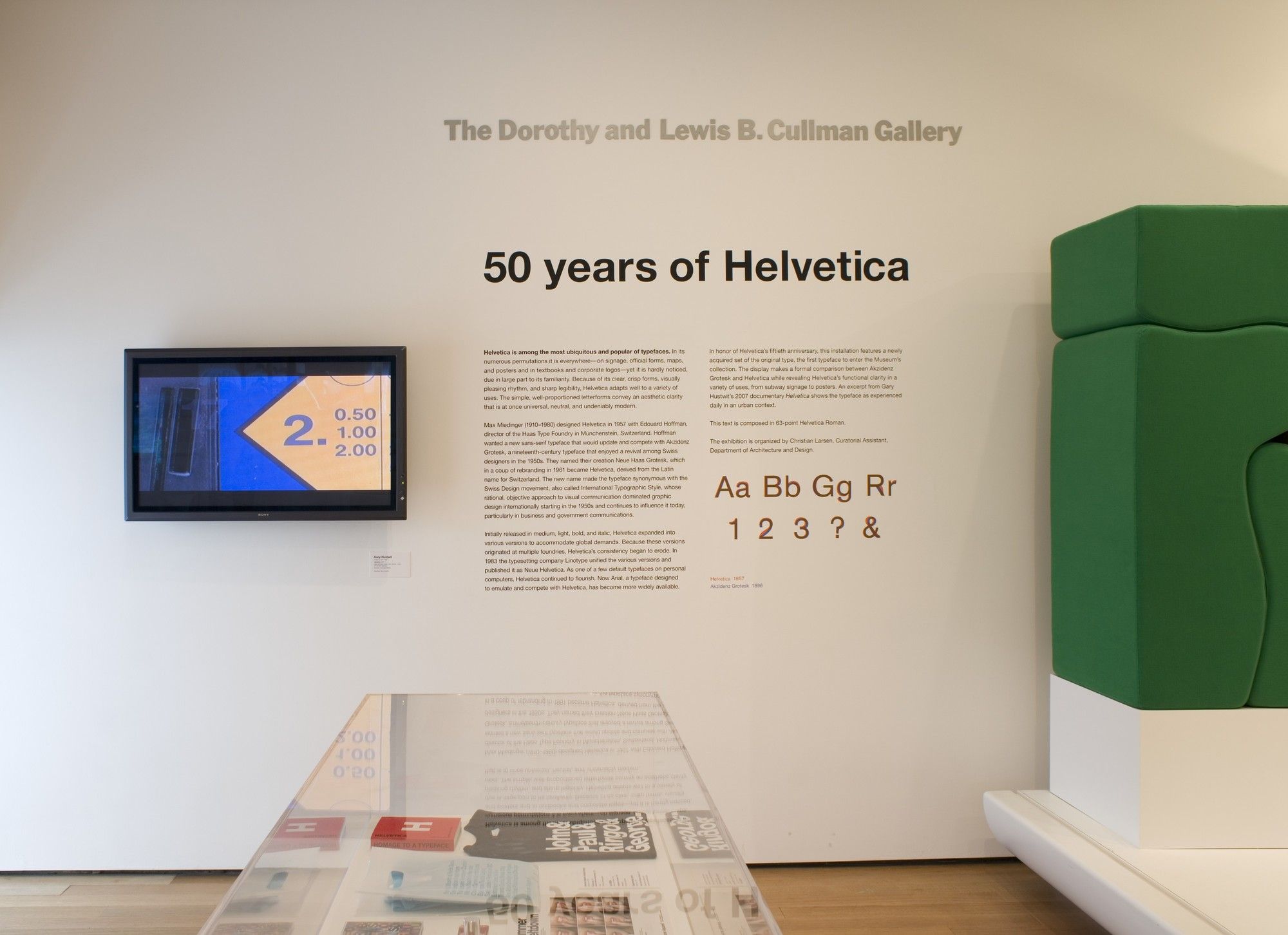
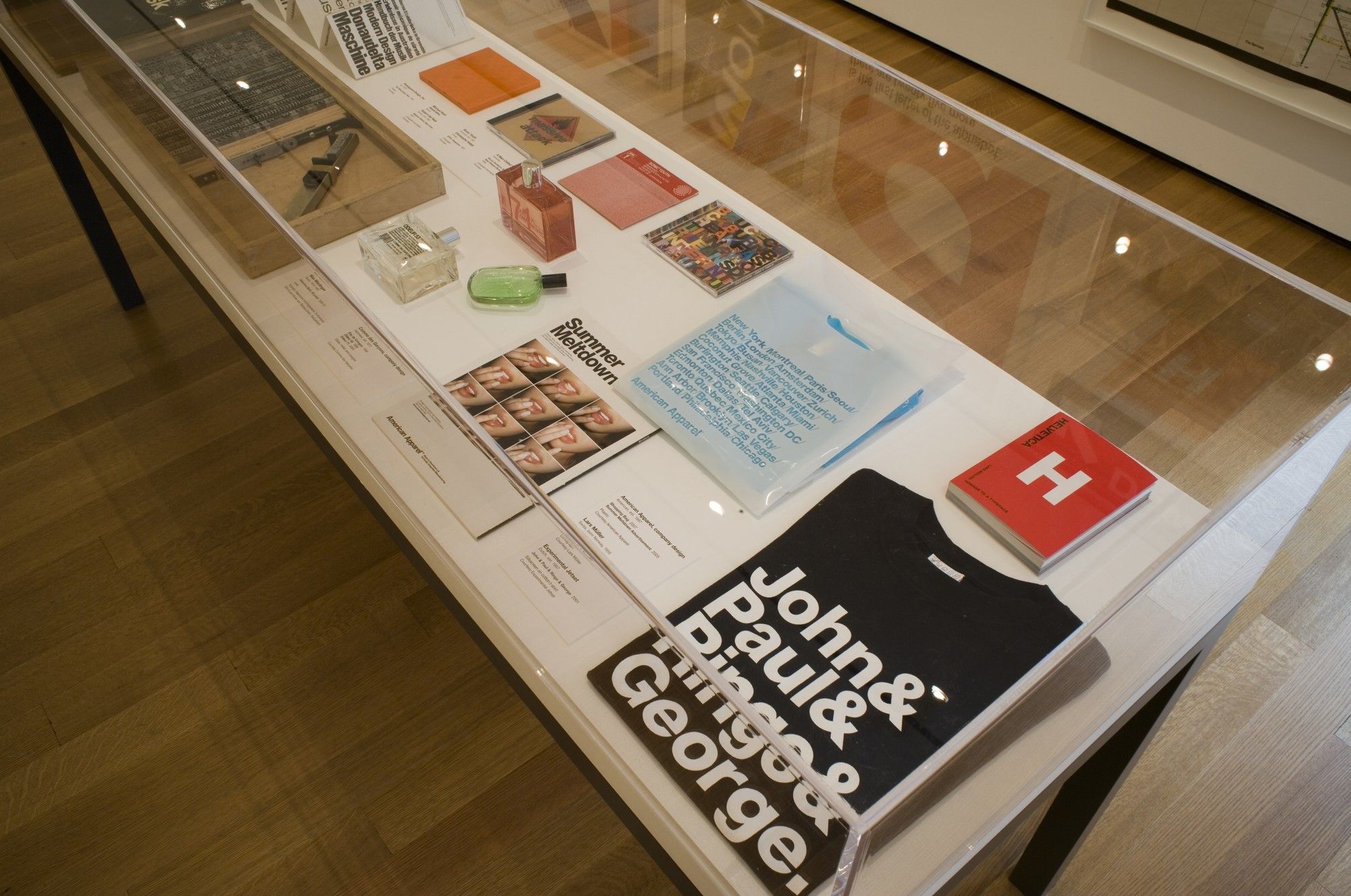
Over the years, many brands have decided to adopt Helvetica for their logos and their communication, from American Airlines to Lufthansa, from Jeep to BMW and Toyota, from Post-it to Panasonic, from Kartell to Knoll. The city of New York chose Helvetica for its maps, for its signage and for its subway, and it was the New York MoMA that dedicated an exhibition to the history of the font on the occasion of the 50th anniversary of its birth, in 2007. Helvetica is still the font we use to write on Facebook and Instagram.
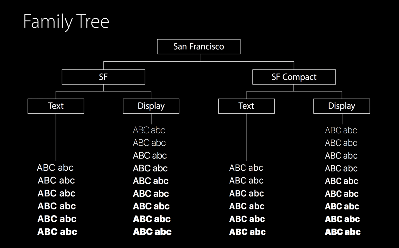
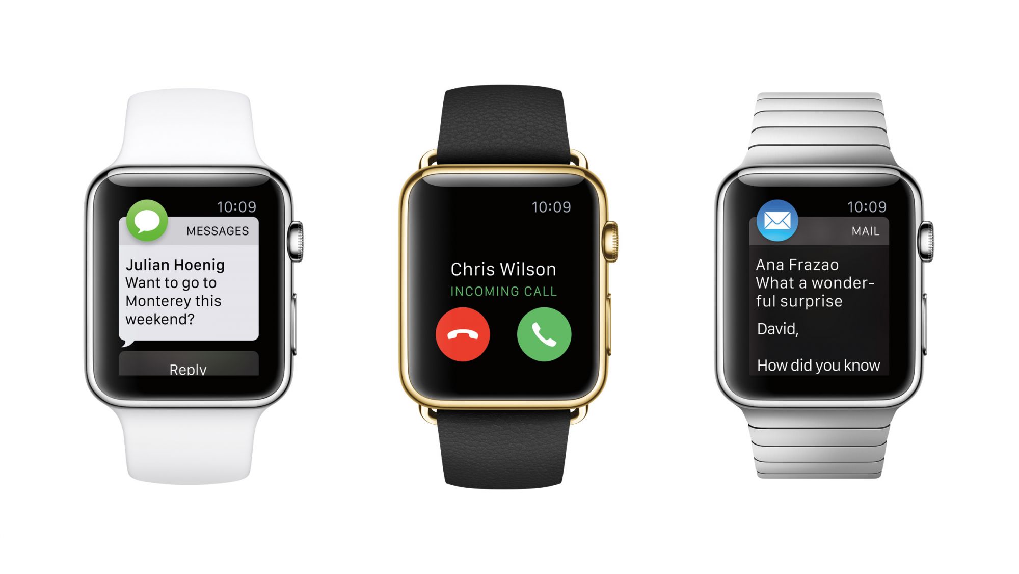
However, the character entered the collective imagination in 1984, thanks to the first Apple Macintosh computers. In fact, this was the font that was free and already installed on the computer and will remain so until 2015. In that year the Cupertino company introduced its first font designed in-house and called San Francisco, which in reality is not that different from the original typeface. The techwear giant, however, needed a font that could be read well on small screens, like those of the Apple Watch it was about to launch.
It is with the aim of adapting to every screen that Helvetica Now, the final evolution of a historical character, was introduced last year.
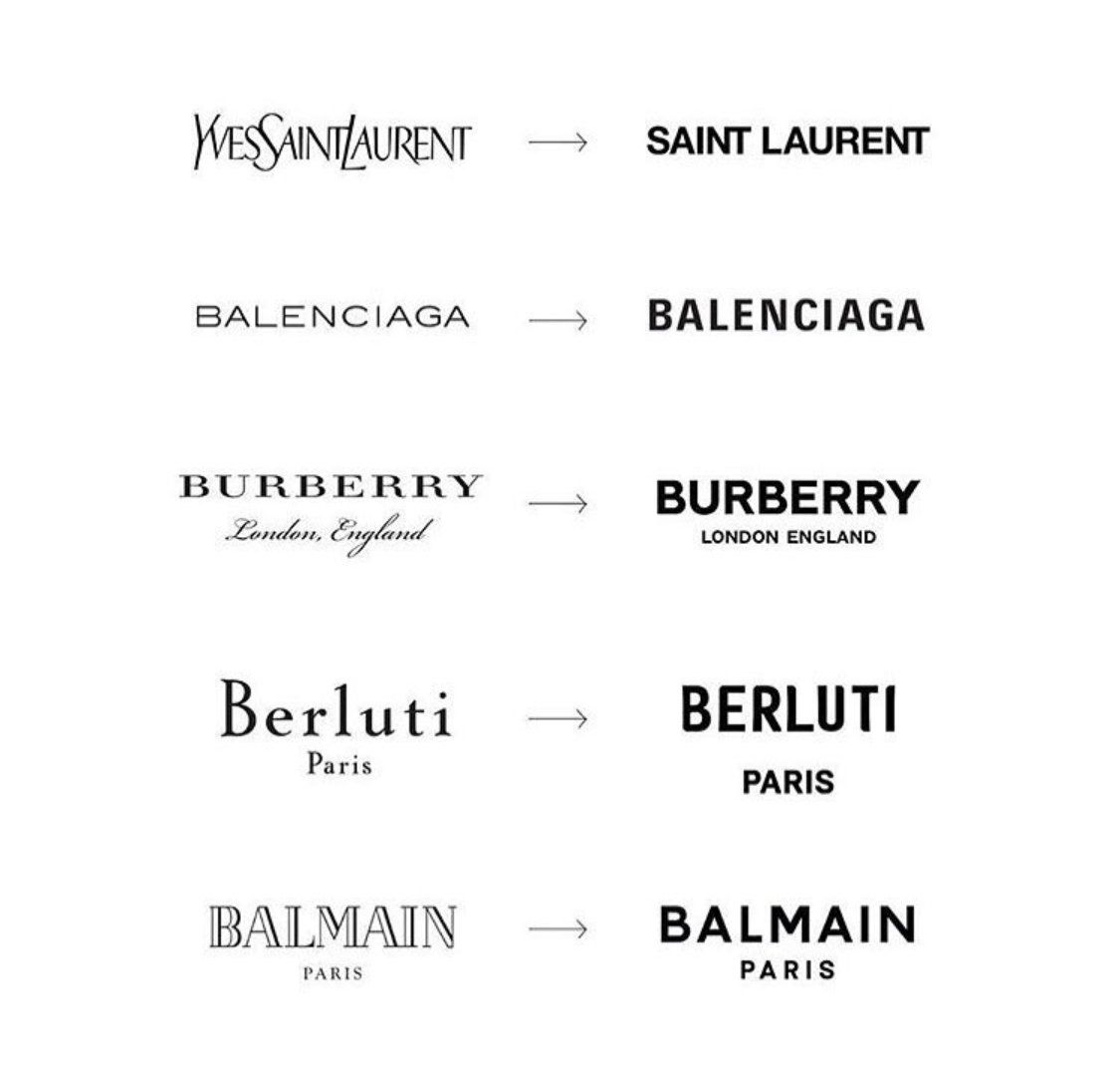
Even before Virgil Abloh's disruptive success, the fashion world had been aware of Helvetica's potential for communication for a long time. For about two years we have been hearing about blanding as well as the loss of identity of fashion brand logos, a phenomenon that also affects the logos of car manufacturers.
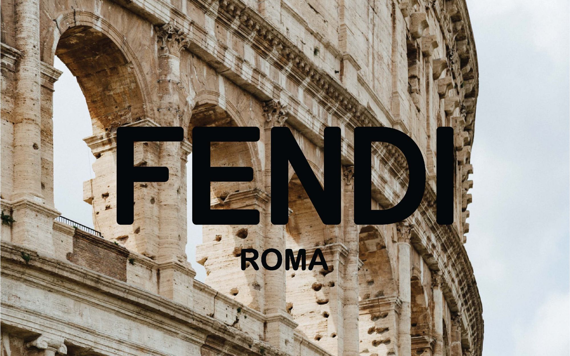
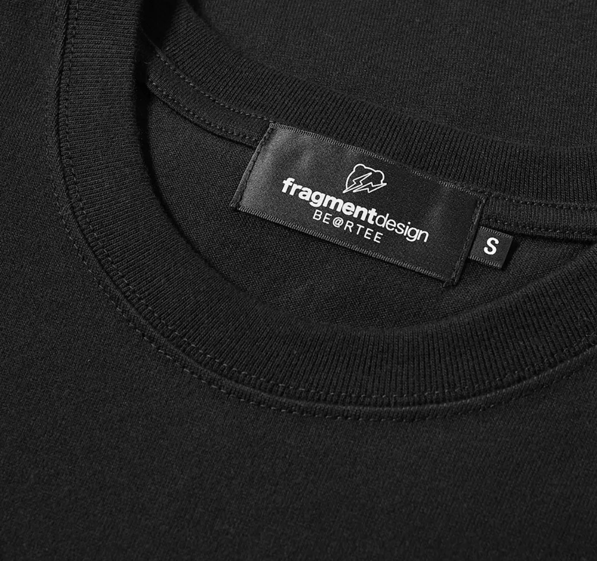
In the beginning, it was Saint Laurent, closely followed by Burberry, Balmain, Celine, Diane Von Furstenberg: the best way to signal the start of a new course - or the arrival of a new creative director - is to change the logo, making it cleaner, more immediate, easy to remember and without too many frills, effectively transforming it into something very similar to the other logos already out there. For this type of operation, there is no more used font than Helvetica, a typeface which has long been adopted by The North Face, Fendi, A.P.C., Hood By Air, Fragment Design. Only by listing them, one does realize how Helvetica has become the common denominator of very different brands, each symbol of a different aesthetic and imaginary, both in the streetwear world and in that of luxury. The typeface has thus become an empty container, an objective means of communication, empty of any artistic value, hiding little or nothing behind those letters so distant from them. Paradoxically, the font that most of all has no particular distinctive signs is the one chosen to stand out, to signal a new beginning, thus ending up creating a standardization of logos and branding that does not reflect the plurality of fashion voices. The trend is to simplify, to remove any type of stratification, to be able to speak in the best (and most immediate) way possible with the final consumer, even better if belonging to Gen Z.
Virgil Abloh, on the other hand, works on another level, and at Off-White he's been carrying out a reflection on the language of fashion through concepts and ideas always expressed in Helvetica. The American designer - who sublimated the power of the word with quotes - has chosen his own typeface with the aim of achieving an objective, unmistakable, transversal communication able to attract a varied audience.
However, a question arises. Once the start of a new era has been clearly signalled, could this homologation turn into danger, a double-edged sword? At a time when communicating your identity is essential for the success of a brand, even more so on social media, couldn't having a logo different from the others be an advantage? It would mean to get away from a traced and already successful path. Sure, it takes years to make colour the logo of a brand, but are we sure that Helvetica is still the best font out there?


