The importance of logo A new Harvard Business Review study shows which kind is most effective
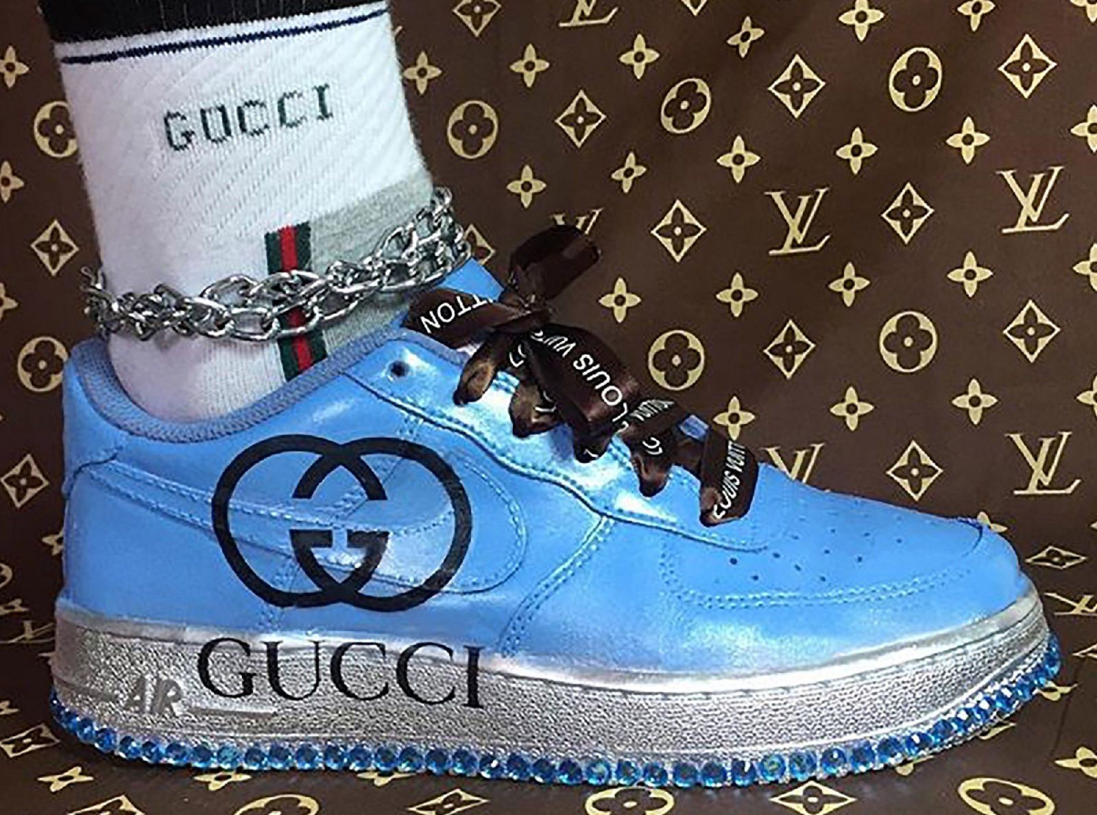
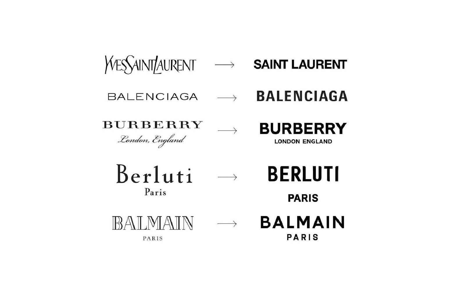
Hedi Slimane, Riccardo Tisci and Demna Gvasalia have something in common. The profession, of course, but not only. The three of them, once appointed the creative director of a historic fashion house, decided to change the company's logo as the first step. A way to affirm their presence and, together, sign the beginning of a new course. Re-branding has become such a widespread trend that many people have wondered how important logos really are. The truth is that logos help sell products, but not only. They are powerful communication tools that can "facilitate brand recognition and differentiate it from the competition, arouse consumer interest, influence investors' decisions, convey the meaning of a brand". They can even turn into trends, as happened with the logomania phenomenon.
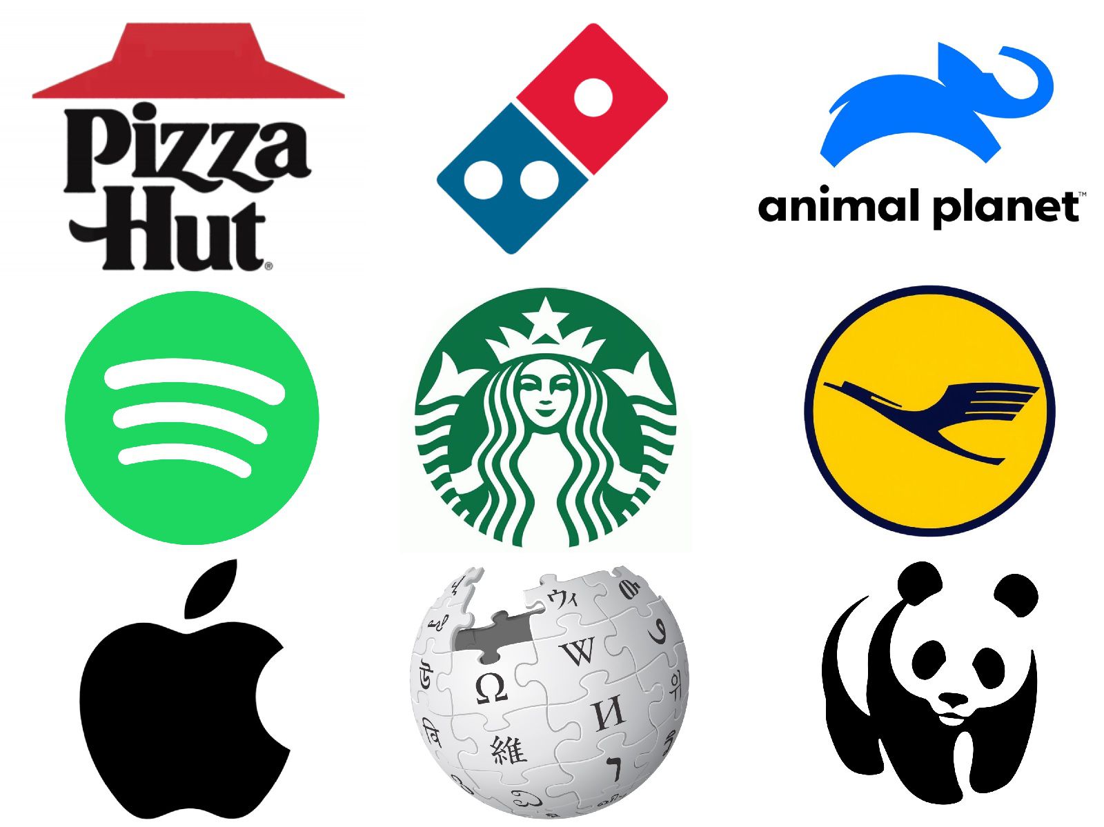
The right logo for your company is the key to success. Over the years, several studies on brand identity have tried to identify the most powerful design features to engage consumers. One of the latest and most interesting has just been published by the Harvard Business Review. A group of researchers led by marketing professors Ammara Mahmood, Mudra Mukesh and Jonathan Luffarelli explored 597 companies to determine whether brands benefit more from descriptive or nondescriptive logos. 60% of them opted for the second type, but the best results belonged to companies with logos that “includes textual or visual design elements that clearly communicate the type of product or service a brand is marketing”. It seems that the use of a descriptive logo tends to "make brands appear more authentic in consumers’ eye", increases their evaluations, willingness to buy and, consequently, also net sales. This is especially true for smaller and unfamiliar projects.
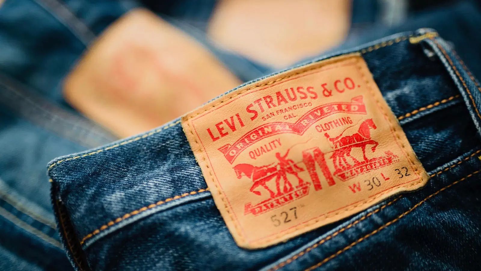
These three professors take the example of Levi's. At the late 1800s, the American company adopted its now-iconic logo: two horses attempting to pull apart a pair of Levi's pants. The graphics hinted at the idea of a resistant product and provided new consumers, even if they didn't remember the brand name, to walk into a store and ask for “those pants with the two horses”. While the fame of Levi's grew into a planetary phenomenon, its logo evolved, leaving behind the literal representation of what the American brand sells and reaching the minimalist word "Levi's" inside the "Batwing" shape. This visual de-branding confirms what researchers have discovered:
“although having an [expressive] logo had a positive effect on brand equity for both familiar and unfamiliar brands, the magnitude of this positive effect was much smaller for the familiar brands [...] it’s easily explained by the fact that, when consumers are familiar with a brand, they know more about it and are, thus, less likely to be influenced by the logo design.”
In other words, the power of a logo weakens when we talk about important and well-known companies. Victoria Buchananan, senior strategic researcher at Future Laboratory, said:
“People are demanding transparency and authenticity which means brands can’t rely on heritage and logos alone…The challenge for brands is finding ways to deliver value in new ways to a consumer who is becoming increasingly cynical.”
Jasmine De Bruycker is also of the same opinion. She believes that de-branding is the best way to win over a more conscious clientele. For the researcher and creative strategist at Base Design, focus on logo or storytelling is no longer all it takes; it is better to focus on brand value, such as sustainability. Osman Ahmed wrote in an article for BoF:
“Today, a logo is simply an aesthetic motif in a designer's arsenal of house codes.”
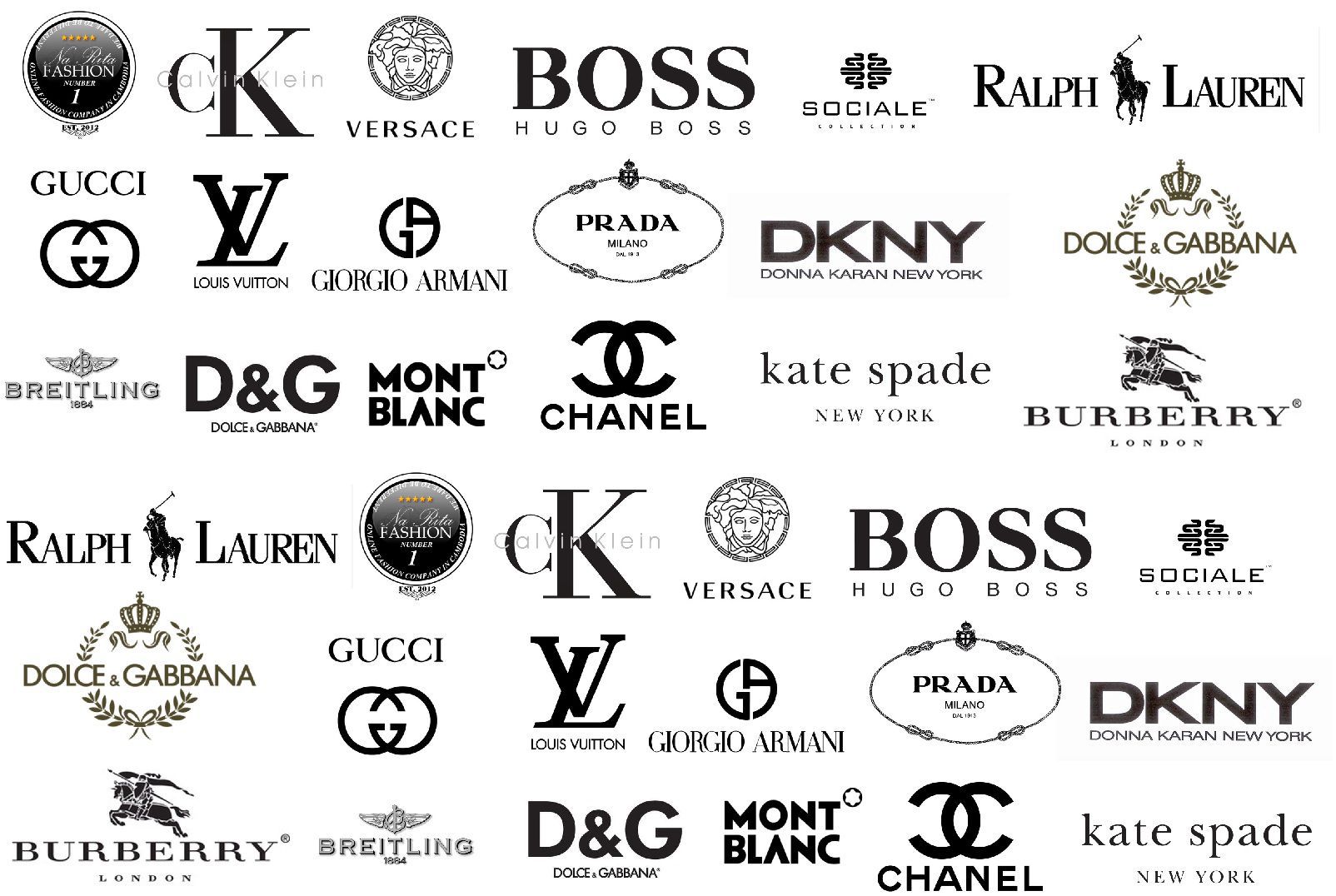
Graphically, this new, more essential and direct approach is particularly popular among luxury brands. In recent years, this category has been engaged in a considerable wave of logo renewal with a general trend for simplifying the design. Famous giants such as Saint Laurent, Calvin Klein, Balenciaga, Balmain and Burberry have chosen, almost always in conjunction with the arrival of a new creative director, new clean typography, with a particular preference for Sans Serif fonts. This is a very common choice, which for many is a sign of a loss of identity of the logos, helped by the fact that many companies have chosen the same creatives such as Peter Saville or the German studio Bureau Borsche (author, recently, of the new Marcelo Burlon County of Milan logo) for their restyling. The reasons for this minimalist aesthetic revolution are many, including symbolizing a new beginning, offering better clarity and suitability for mobile devices. Armin Vit, co-founder of the editorial site UnderConsideration, confirmed that changes to the logo can serve as “a public indication to consumers that something is different and they should pay attention.” And he added:
“When there's a new creative director with a new vision for the products, an 'easy' way to communicate this is with a logo change that, hopefully, spurs both sales and media interest."
Harvard Business Review research concludes that each brand works within its own category and with its competitors:
“Descriptive logos work best for smaller, unfamiliar companies because they make their brands sound reliable - even for consumers who have never heard about them. But for big, well-known companies, the value of descriptive logos falls: People trust major brands or not, and logos can't make any difference.”


