The streetwear's fonts What are the fonts of Nike, BAPE, Vans and Saint Laurent?
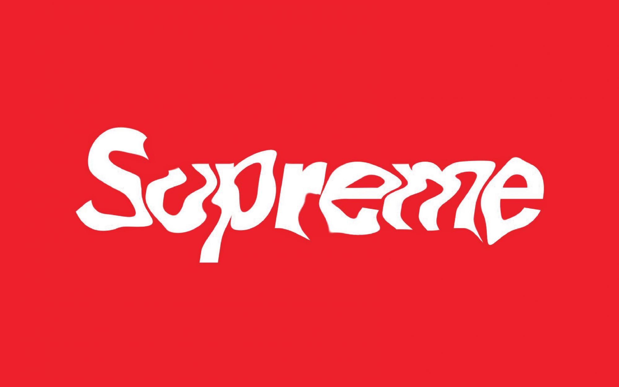
How would the perception of Supreme NY change if tomorrow James Jebbia decided to replace the Futura font with Comic Sans, that font, kryptonite for graphic designers, that makes chills down the spine just thinking about it? The brand identity owes much, if not all, to the graphic elements, the apt character, in contrast with a specific background or inserted within a shape, can speed up the relationship with which the public is trained to the values of the brand, making it more recognizable and therefore desired. The streetwear, exposing itself mainly in the streets, needs even more brand logos to be immediately recognizable, so much so that in recent years it has developed a tendency to logomania, expanding the dimensions and sacrificing in some cases the harmony of the garments. In many cases the big brands have not invented their fonts, but reworked an already known base, for example, Nike has customized Supreme's Futura, modifying the path and the apexes of the letters. On the other hand, Off-White has taken up another historical Font, such as Helvetica, born as Neue Haas Grotesk in 1957, in an identical way. Virgil Abloh's appropriation of such famous symbols has also brought him some issues with the Copyright.
As for high fashion, in recent years many brands have focused on a strong choice of restyling, replacing their historical characters with more simple and clear ones, to rewrite a new chapter in their history. Burberry, Balmain, Celine, Saint Laurent, Balenciaga, but also Fendi and Calvin Klein, all directed towards a new identity, which supports readability and visual impact. These changes have occurred in many cases in correspondence with the change of creative direction, to anonymity but that allows the brands to be able to mean every time what the market, the campaign or the garment requires.


