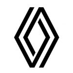
After almost thirty years, Renault has decided to update its logo with a geometric version of the famous diamond reinterpreted in a minimal way. The French company is only the latest to have updated its look in a flat key, a choice born from the desire of many brands to strengthen their online presence by adopting a logo that fits well with the needs of the web.
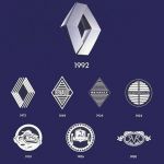
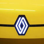
The new Renault logo, therefore, takes the place of the one presented in 1992, a three-dimensional version of the diamond successor of a 1972 version similar in style and concept to the one just presented. Not only a stylized diamond but also an optical illusion of two shapes that seem to fit together and that will represent the brand on digital media or more simply on the grille of its cars.
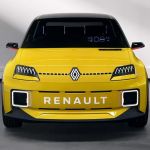
In fact, Renault's goal is to market the first "updated" car in 2022 and then implement the new logo throughout its fleet over the next two years. Defined as a renaulution, the work was done internally by the company to make the new logo "more iconic, simple and meaningful". The choice follows that undertaken by another company, Peugeot, which presented its new logo a few weeks ago. 


.jpg)


